
DevExpress Universal(英語版)
高性能なUIコントロール、レポート、分析
DevExpress 社の製品
2001 年より日本国内にてComponentSourceで販売中。
価格:¥ 477,290 (税込)〜 バージョン: 25.2.7 新機能 更新日: May 6, 2026  (83)
(83)
高性能なUIコントロール、レポート、分析
DevExpress 社の製品
2001 年より日本国内にてComponentSourceで販売中。
価格:¥ 477,290 (税込)〜 バージョン: 25.2.7 新機能 更新日: May 6, 2026 (83)
 のスクリーンショット")
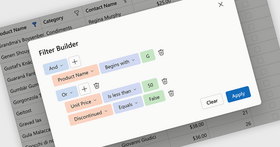
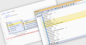
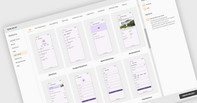
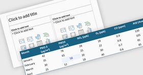
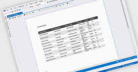
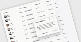
DevExpress Universal ships with the following platform specific UI components/development libraries: DevExpress WinForms, DevExpress WPF, DevExpress ASP.NET and Blazor, DevExtreme Complete, DevExpress .NET MAUI, DevExpress Reporting, DevExpress Office File API, DevExpress BI Dashboard, eXpressApp Framework (XAF), TestCafe Studio, and more.
DevExpress Universal helps you build applications for Windows, Web, mobile and tablet with all of the DevExpress single platform controls and more. The feature-complete Universal Subscription includes hundreds of Desktop UI Controls (WinForms, WPF and Desktop Reporting), Web UI Controls (Blazor, ASP.NET, ASP.NET MVC and Core, Bootstrap Web Forms, JavaScript - jQuery, Angular, React, Vue, and Web Reporting), Mobile Controls (.NET MAUI), Frameworks and Productivity Tools (XAF - Cross-Platform .NET App UI, XPO - ORM Library and CodeRush - Visual Studio Productivity and Refactoring) and Enterprise and Server Tools (BI Dashboard and Office File APIs). It also includes TestCafe Studio, the DevExpress Icon Library, and source code for all controls and libraries.


画像1 / 51
DevExpress Universal Features
Desktop Controls
今すぐ DevExpress ライセンススペシャリストとライブ チャット。


電話: (888) 850 9911
Fax: +1 770 250 6199


 (83)
(83)