公式サプライヤー
公式および認定ディストリビューターとして200社以上の開発元から正規ライセンスを直接ご提供いたします。
当社のすべてのブランドをご覧ください。

スクリーンショット: Box Plot Charts are Categorical charts which graphically render groups of numerical data through their quartiles. 0 ...

スクリーンショット: Bubble Charts are Scatter charts which display data as points with coordinates and sizes that are defined by the value of their items. 0 ...

スクリーンショット: Bullet Charts are Categorical charts which are a variation of the Bar Charts. You can use them as a replacement for dashboard gauges and meters. 0 ...
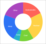
スクリーンショット: Donut Charts are circular charts which represent a variation of the Pie Charts and are capable of displaying multiple nested series. 0 ...
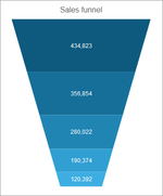
スクリーンショット: Funnel Charts display a single series of data in progressively decreasing or increasing proportions organized in segments. 0 ...

スクリーンショット: Line Charts are useful for rendering trends over time or at equal time intervals, and for comparing sets of similar data. 0 ...
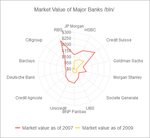
スクリーンショット: Radar Charts (also known as Spider Charts) are categorical charts which wrap the X axis in a circle or polygon. 0 ...

スクリーンショット: RangeArea Charts are categorical charts which represent a variation of the Area Charts. Unlike the Area Chart, which is filled to the axis, the Range Area chart is filled between its minimum and maximum values. 0 ...

スクリーンショット: RangeBar Charts display data as bars where each bar represents a value range that spans between its minimum and maximum levels. Unlike the standard Kendo UI Bar Charts, which have anchored bars to their X axis, RangeBar Charts render floating bars. 0 ...

スクリーンショット: Scatter Plot and Scatter Line Charts are the two main variations of Scatter charts and are suitable for displaying numerical data. 0 ...

スクリーンショット: Waterfall Charts are categorical charts which display the cumulative effect of sequentially introduced positive or negative values. 0 ...
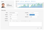
スクリーンショット: Kendo UI can be used alongside Twitter Bootstrap. In this example, the grid layout and responsive CSS is provided by Bootstrap, and widgets are provided by Kendo UI. 0 ...
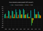
スクリーンショット: The Column chart visualizes data as vertical bars whose heights vary according to their value. It can be useful for presenting a comparison between several sets of data (e.g., snapshots of data across different points in time like the GDP growth shown in ...

スクリーンショット: This sample app was built with Kendo UI widgets. It enables users to modify, add, remove and connect shapes. Once they are happy with the diagram they have created, they can save it to a file and load it back later. 0 ...

スクリーンショット: The DropDown widget offers a simple and lightweight drop-down list of items for single selection. It brings a user-friendly experience for the end user, with enhanced mobile and keyboard support, server and client templates, rich client-side API with a ...

スクリーンショット: The Kendo UI Editor is a powerful WYSIWYG component, which allows you and your users to create rich text content in a familiar and user friendly way. 0 ...
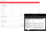
スクリーンショット: The Kendo UI grid provides server-agnostic client Excel export functionality. Additionally, you have the option to customize the rows/columns and cells of the exported file by intercepting the excelExport event. 0 ...

スクリーンショット: The Kendo UI grid allows flexible customization of its rows in terms of layout and appearance by exposing row template feature for this purpose. 0 ...

スクリーンショット: 0 ...

スクリーンショット: The Kendo UI chart lets you utilize modern browser technologies such as SVG or Canvas (with a fallback to VML for older IE versions) for interactive data visualizations. The Pie chart displays a single series of data in a two-dimensional circle. 0 ...