コンポーネント / .NET Framework WinForms / Lidor Systems - ベストセラー商品
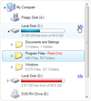
Add a combination of TreeView and ListView controls to your applications.
- Includes built-in Live Editor and advanced drag&drop support
- Supports XML encoding of nodes, columns and subitems
- Highly customizable appearance and theme support (including Vista)
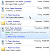
Add a detailed ListView to your .NET applications.
- Four views to display items: Details, Large Icon, Small Icon and List
- Includes built-in Live Editor and advanced drag&drop support
- Supports XML encoding of columns, items and subitems
Rich data presentation controls for .NET Winforms applications.
- Includes TreeView, ListView, TreeListView and ListBox controls
- NEW - Built-in sorting and option to add custom sort operations
- NEW - Advanced formatting options by use of XML tags
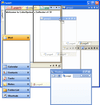
Advanced dockable windows and tabbed documents management solution.
- Change the foundation of your app's user interface with a few clicks
- Take control of color schemes, fill styles, fonts, images and more
- With Drag and Drop, Multiple Activity Groups, TabMode and TabStrip
Add rich hierarchical data presentation to your applications.
- Images, text and custom controls can be included in every node
- Provides fast list creation, XML encoding of node text, rich styling features, customizable appearance and theme support
Suite of 27+ advanced .NET User Interface components.
- Includes controls for docking & tabbed document management, data visualization, and grouping / organizing application layouts
- Controls have customizable appearance, multiple styles, XML load/save support
-
リリースノート:
Owner Draw events for drawing each part of the control. Serialization of partial set of nodes, color schemes and themes. Show nodes with their siblings and parent nodes only. Load on Demand option for partially loading data from an XML file, database or ...
続きを読む
この製品についてさらに結果を表示します。
-
リリースノート:
New RatingControl can use custom images to show rating values, includes a star image as the default image. New NumberedListControl presents a numbered list of items acting like a navigation panel. New Panel and TransparentPanel controls, presents a ...
続きを読む
-
リリースノート:
Pixel-based scrolling enabled for ListBox, TreeListView and TreeView controls New Key property in ObjectEventArgs, used to uniquely identify different objects Fully compatible with Visual Studio 2010 The Key which specifies the text from XML content is ...
続きを読む
-
リリースノート:
Multi-column sorting Span subitems in multiple columns Serialization of partial set of items, color schemes and themes Load on Demand option for loading partial data from XML file, database or memory stream Owner Draw events for drawing each part of the ...
続きを読む
この製品についてさらに結果を表示します。
-
リリースノート:
Great performance improvement during data load and control layout update Partially visible controls remain active RightToLeft support for TreeView control New XML attributes assemblypath and resource for img tag, used to get references from embedded ...
続きを読む
-
リリースノート:
8 new built-in controls which can be used as a standalone and inside list controls using XML tags: CheckBox, ComboBox, DateTimePicker, ListControl, MonthCalendar, NumericUpDown, ProgressBar, TextControl Advanced filter which allows data to be filtered by ...
続きを読む
-
リリースノート:
TabControl with nested tabs, child tabs are shown under parent tab. Expander with vertical header and horizontal expand. SplitContainer now splits content using multiple tabs. Serialization of styles for all container controls. Create groups and items ...
続きを読む
この製品についてさらに結果を表示します。
-
リリースノート:
RichContentControl - new control, presents multiple pages of various objects arranged in custom layouts using HTML tags Tabs are now repainted when mouse cursors leaves their space GetPageAt and GetButtonAt methods now return correct page and button when ...
続きを読む
-
リリースノート:
Option to show tabs in hierarchy with ability to be shown in different sides. For this purpose the following properties are added: TabStripPlacement, for each page to determine the side on which page tab will be shown UseParentTabStripPlacement, which ...
続きを読む
-
リリースノート:
TabControl with nested tabs, child tabs are shown under parent tab. Serialization of styles now available. Align tabs to left, center or right side. Tooltips for command buttons. Each tab can have a tooltip. Nested child tabs can have different shape than ...
続きを読む
この製品についてさらに結果を表示します。
-
リリースノート:
Tabs are now repainted when mouse cursors leaves their space GetPageAt and GetButtonAt methods now return correct page and button when tabs have internal padding set to greater value Selecting of tabs is now corrected when tabs are placed in multiple ...
続きを読む
-
リリースノート:
TabControl with nested tabs, child tabs are shown under parent tab. Expander with vertical header and horizontal expand. SplitContainer now splits content using multiple tabs. Serialization of styles for all container controls. Create groups and items ...
続きを読む
この製品についてさらに結果を表示します。
-
リリースノート:
Multi-column sorting Span subitems in multiple columns Serialization of partial set of items, color schemes and themes Load on Demand option for loading partial data from XML file, database or memory stream Owner Draw events for drawing each control part ...
続きを読む
-
リリースノート:
New controls including ExplorerBar, ListBar and OutlookBar Multiple display modes Independently expandable groups Support to embed controls Different item types including text, image, panel and separator Context menus for each group and item Each group ...
続きを読む
-
リリースノート:
Multi-column sorting. Span sub-items in multiple columns. Serialization of a partial set of items, color schemes and themes. Load on Demand option for partially loading data from an XML file, database or memory stream. Owner Draw events for drawing each ...
続きを読む
この製品についてさらに結果を表示します。
-
リリースノート:
Great performance improvement during data load and control layout update Partially visible controls remain active New XML attributes Option to separately show/hide the scrollbars CurrentList property, represents a flat list of all nodes that are currently ...
続きを読む
-
リリースノート:
8 new built-in controls which can be used as a standalone and inside list controls using XML tags: CheckBox, ComboBox, DateTimePicker, ListControl, MonthCalendar, NumericUpDown, ProgressBar, TextControl Advanced filter which allows data to be filtered by ...
続きを読む
-
リリースノート:
Serialization of partial set of items, color schemes and themes. Load on Demand option for partially loading data from an XML file, database or memory stream. Owner Draw events for drawing each part of the control. Different item permissions including ...
続きを読む
この製品についてさらに結果を表示します。
-
リリースノート:
Option to embed new control: RatingControl which can use custom images to show rating values, includes star image as default Option to fix items on top or bottom side which can act like header and footer A new constructor which accepts strings and creates ...
続きを読む
-
リリースノート:
Row-based and pixel-based scrolling enabled New Key property in ObjectEventArgs, used to uniquely identify different objects Fully compatible with Visual Studio 2010 The Key which specifies the text from XML content is carried with the editing events ...
続きを読む
-
リリースノート:
Multi-column sorting Span subitems in multiple columns Serialization of partial set of items, color schemes and themes Load on Demand option for loading partial data from XML file, database or memory stream Owner Draw events for drawing each part of the ...
続きを読む
この製品についてさらに結果を表示します。
-
リリースノート:
Option to show items in Card view Option to align expand box in groups Option to extend the current theme with custom colors for all controls New RatingControl which can use custom images to show rating values, includes star image as default New ...
続きを読む
-
リリースノート:
Great performance improvement during data load and control layout update Partially visible controls remain active New XML attributes: assemblypath and resource for img tag, used to get references from embedded resources selectedtextcolor for style tag, ...
続きを読む
-
リリースノート:
Flickering during drag-drop operations now works under Windows 7 Flickering of a resize line when resizing Bar or Group controls is now fixed and works under Windows 7 When UseTheme is set to true, the predefined color scheme is correctly applied to all ...
続きを読む
この製品についてさらに結果を表示します。
-
リリースノート:
IntelliSense support Floating and Framed windows can change their border size DesignTime support for inherited classes Full support of controls under Windows Vista ...
続きを読む


