Chartsのニュース

ASP.NET Coreを使用して画像形式にチャートをエクスポート

4月 25, 2024
PNGやJPGといった画像形式にグラフをエクスポートする機能をアプリケーションに提供することで、ユーザーに柔軟性を提供

英語で読み続ける:

Exporting charts as images offers several advantages. It allows for easy sharing in documents, presentations, and social media without relying on the recipient having the original software. Popular formats include JPEG, PNG, and SVG. JPEGs offer small sizes for low bandwidth scenarios, while PNGs are ideal for charts with sharp lines and flat colors. SVGs are vector-based, enabling infinite scaling without quality loss, making them perfect for charts that may be resized frequently.

Several ASP.NET Core chart controls offer the ability to export charts to images including:

  • DevExpress ASP.NET Core Chart (Part of DevExpress ASP.NET and Blazor) empowers you to export charts as images for effortless sharing in reports and presentations.
  • Telerik ASP.NET Core Chart (part of Telerik UI for ASP.NET Core) lets you export charts to image formats such as PNG and JPEG, ensuring wider usability across platforms.
  • Syncfusion ASP.NET Core Chart (part of Syncfusion Essential Studio Enterprise) facilitates seamless image export to JPEG, PNG, and SVG, promoting clear data visualization sharing.
  • Infragistics ASP.NET Core Charts (part of Infragistics Ignite UI) allows you to export charts as images for efficient communication of insights.

For an in-depth analysis of features and price, visit our ASP.NET Core chart controls comparison.

Compare ASP.NET Core Chart Controls

SVGチャートのエクスポートで共有効率を向上

4月 22, 2024
スケーラブルデータグラフィックス形式では、品質を落とさずにグラフを共有し、ファイルサイズを大幅に小さくすることが可能

英語で読み続ける:

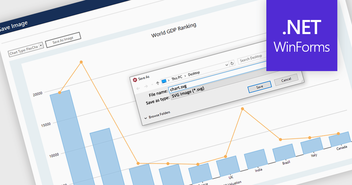
SVG export gives your users the ability to output charts in the Scalable Vector Graphics format. This offers superior quality for both print and web displays, ensuring that your charts remain crisp and detailed at any zoom level. This feature is particularly beneficial for professionals who require high-resolution graphics for presentations, reports, or publications. The SVG format also allows for easy editing and resizing without loss of quality, making it ideal for use across various media. Users can effortlessly integrate their analytical outputs into dynamically scalable projects and retain the aesthetic integrity of their visual data, streamlining the process from data exploration to communication.

Several WinForms chart controls offer SVG export including:

  • DevExpress WinForms Chart (part of DevExpress WinForms) lets users export charts as SVGs for infinite scalability and customization within reports and presentations.
  • ComponentOne Charts for WinForms (part of ComponentOne Studio WinForms by MESCIUS) offers SVG export for high-resolution, vector-based charts for various outputs.
  • ChartDirector for .NET by Advanced Software Engineering facilitates the export of charts in SVG format, ensuring crisp visuals and lossless editing potential for developers.
  • Nevron Chart for WinForms provides SVG exports, allowing developers to seamlessly integrate charts into reports and presentations with flexible resizing capabilities.
  • ProEssentials by GigaSoft equips developers with SVG export for charts, guaranteeing vector-based scalability and customization freedom for versatile use cases.

For an in-depth analysis of features and price, visit our WinForms chart controls comparison.

Compare WinForms Chart Controls

Blazorで比例データを効果的に視覚化

4月 18, 2024
円グラフを使用すると、ユーザーはデータセット内のさまざまなカテゴリの相対的なサイズを確認でき、セット全体とその構成要素をしっかりと把握可能

英語で読み続ける:

Pie charts are a useful and easily understood tool for visualizing data breakdowns at a glance, particularly when representing percentages of a whole. Their strength lies in highlighting the relative proportions between a small number of categories within a dataset. While less effective for complex comparisons or trends over time, pie charts can be an effective choice to communicate compositions and dominance within a dataset.

Several Blazor Chart controls offer Pie charts including:

  • DevExpress Blazor Chart (Part of DevExpress ASP.NET and Blazor) empowers you to create informative pie charts with customization options for clarity.
  • ComponentOne Charts for Blazor (part of ComponentOne Studio Blazor Edition by MESCIUS) offers visually striking pie charts to effectively communicate data proportions.
  • Telerik Blazor Chart (part of Telerik UI for Blazor) facilitates clear and interactive pie charts, enabling viewers to grasp data relationships.
  • Syncfusion Blazor Chart (part of Syncfusion Essential Studio Enterprise) allows you to design compelling pie charts that effectively showcase data breakdowns.
  • Infragistics Blazor Charts (part of Infragistics Ignite UI) empowers you to create user-friendly pie charts, making complex data easily digestible.

For an in-depth analysis of features and price, visit our Blazor Chart controls comparison.

Compare Blazor Chart Controls

ユーザーがグラフデータの特定のセクションに注目

4月 9, 2024
ズーム機能によって、グラフ開発者にデータ分析を強化する方法を提供し、ユーザーは選択したデータサブセット内の傾向、外れ値、または詳細を調べることが可能

英語で読み続ける:

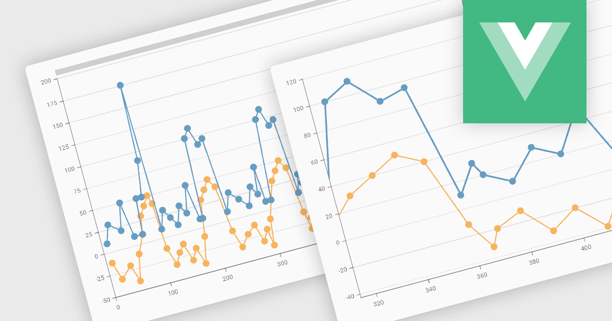
Zooming functionality in a chart component empowers users to delve deeper into complex datasets. By allowing for magnified views of specific areas, users can identify trends, outliers, and patterns that might be obscured in a broader, more generalized view. This interactivity fosters a richer understanding of the data and facilitates more informed decision-making for end users.

Several Vue.js chart controls support zooming including:

  • DevExtreme Chart (part of DevExtreme Complete by DevExpress) empowers developers with interactive chart zooming for in-depth data exploration.
  • Highcharts Core by Highsoft offers chart zooming through user interaction or programmatic control for in-depth data exploration.
  • Kendo UI for Vue Chart (part of Kendo UI by Telerik) facilitates chart exploration through intuitive zooming capabilities.
  • Wijmo FlexChart and FinancialChart (part of Wijmo by MESCIUS) enables developers to integrate customizable chart zooming for detailed data analysis.

For an in-depth analysis of features and price, visit our comparison of Vue.js Charts.

Compare Vue.js Charts

jQueryで複雑なデータを視覚化と解釈

4月 8, 2024
ヒートマップまたはツリーマップをjQueryアプリに追加すると、わかりやすく直感的な方法でデータが表示されるため、意思決定を改善

英語で読み続ける:

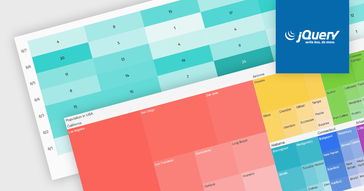
Heatmaps and treemaps are powerful data visualization tools that offer specific advantages when examining large datasets. A heatmap colorizes data values in a matrix, allowing for intuitive observation of trends, patterns, and outliers over two dimensions, making it helpful for spatial data analysis and correlation assessment. Treemaps exhibit hierarchical data as nested rectangles, with size and color variations indicating distinct quantitative values, allowing for effective use of space and fast comparison of proportions and relationships within hierarchical structures. Together, these chart types provide significant tools for visualizing and interpreting complex data, improving decision-making processes by presenting underlying data insights in a clear and actionable manner.

Several jQuery chart controls support the Heat and Treemap chart types, including:

  • DevExtreme Chart (part of DevExtreme Complete by DevExpress) offers a jQuery treemap component that allows for the hierarchical representation of data in a compact format.
  • Highcharts Core by Highsoft is a powerful and versatile JavaScript charting library that works with jQuery and supports various chart types including treemaps/heatmaps.
  • Kendo UI for jQuery Chart (part of Kendo UI by Telerik) includes jQuery heatmap and treemap controls that emphasize responsive design and rich interactivity.
  • Ignite UI jQuery Chart (part of Infragistics Professional) offers a wide range of interactive JavaScript/HTML5 charts including heatmaps/treemaps.

For an in-depth analysis of features and price, visit our comparison of jQuery chart controls.

Compare jQuery Chart Controls