


公式サプライヤー
公式および認定ディストリビューターとして200社以上の開発元から正規ライセンスを直接ご提供いたします。
当社のすべてのブランドをご覧ください。
英語で読み続ける:
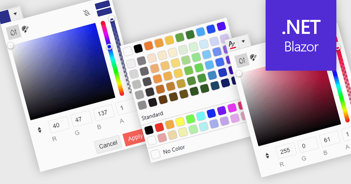
A color picker is a user interface element that allows users to choose and apply colors to specific parts of their data without writing any code. It typically appears as a small palette or input box that, when clicked, opens a panel with color options like swatches, sliders, or hex code fields. This feature supports intuitive visual customization, enabling users to highlight patterns, mark important values, or align with corporate color schemes. In advanced editors, color pickers also support themes or accessibility settings, such as high-contrast palettes.
Several .NET Blazor data editors can provide you with a color picker, including:
For an in-depth analysis of features and price, visit our .NET Blazor data editors comparison.
電話: (888) 850 9911
Fax: +1 770 250 6199


