


公式サプライヤー
公式および認定ディストリビューターとして200社以上の開発元から正規ライセンスを直接ご提供いたします。
当社のすべてのブランドをご覧ください。
英語で読み続ける:
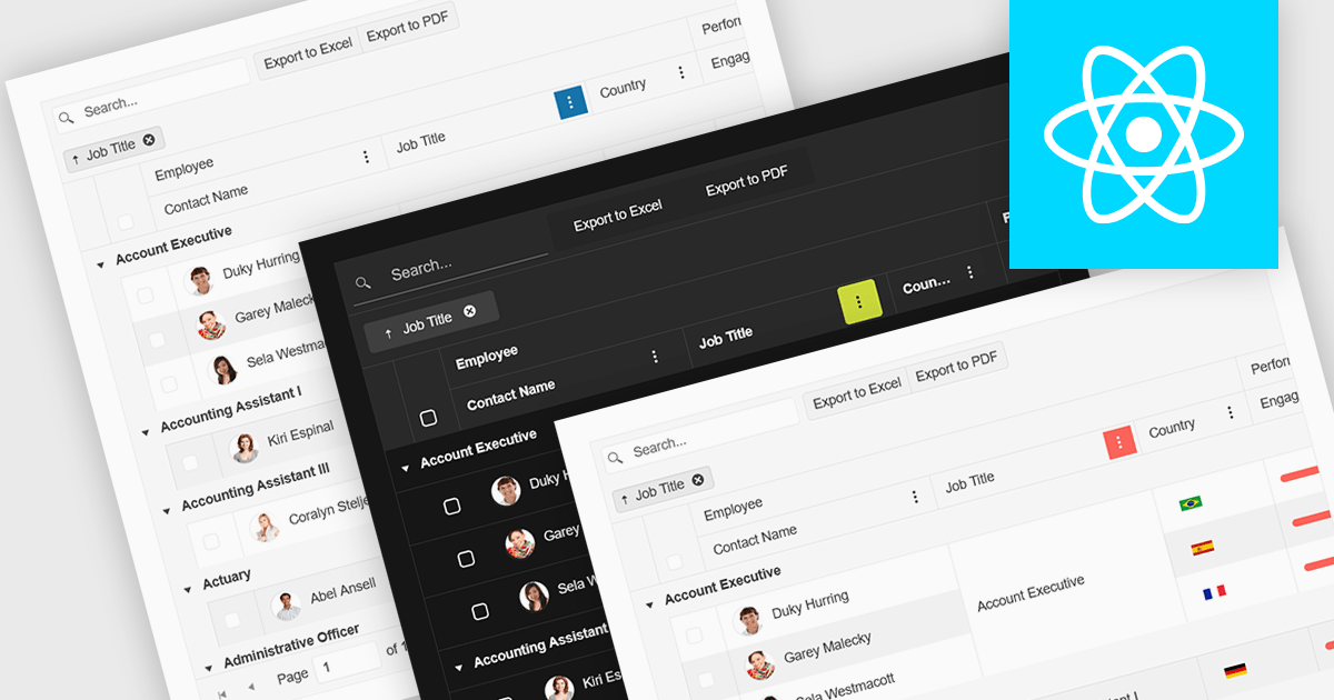
Built-in theme support in a React grid refers to the component's ability to natively integrate and adapt to predefined visual styles without requiring extensive custom CSS. This feature allows developers to quickly apply consistent, professional-looking designs that align with widely used UI frameworks such as Material UI, Bootstrap, or custom enterprise branding. It simplifies the process of maintaining visual consistency across applications, reduces front-end development time, and ensures that the grid remains visually coherent with the rest of the user interface, particularly during updates or when switching between themes.
Several React Grid controls offer support for built-in themes including:
For an in-depth analysis of features and price, visit our comparison of React Grid controls.
電話: (888) 850 9911
Fax: +1 770 250 6199


