


公式サプライヤー
公式および認定ディストリビューターとして200社以上の開発元から正規ライセンスを直接ご提供いたします。
当社のすべてのブランドをご覧ください。
英語で読み続ける:
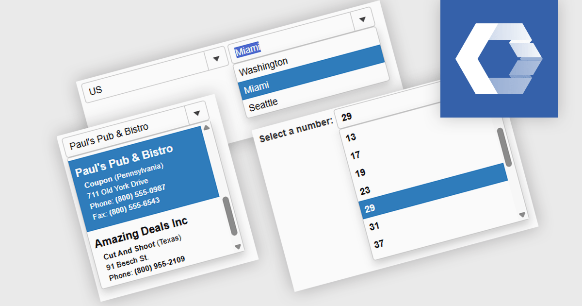
A combobox Web Components control is a user interface element that combines an input field with a dropdown list, allowing users to either type a value directly or select from predefined options. It is commonly used to simplify data entry, particularly when the input must match a set of known values. By supporting features such as filtering, autocomplete, and keyboard navigation, a combobox enhances accessibility and improves the user experience in forms or interactive components. It also helps maintain consistency and validation in data-driven applications by reducing the likelihood of input errors.
Several Web Components Data Editors offer a combobox including:
For an in-depth analysis of features and price, visit our comparison of Web Components Data Editors.
電話: (888) 850 9911
Fax: +1 770 250 6199


