


公式サプライヤー
公式および認定ディストリビューターとして200社以上の開発元から正規ライセンスを直接ご提供いたします。
当社のすべてのブランドをご覧ください。
英語で読み続ける:
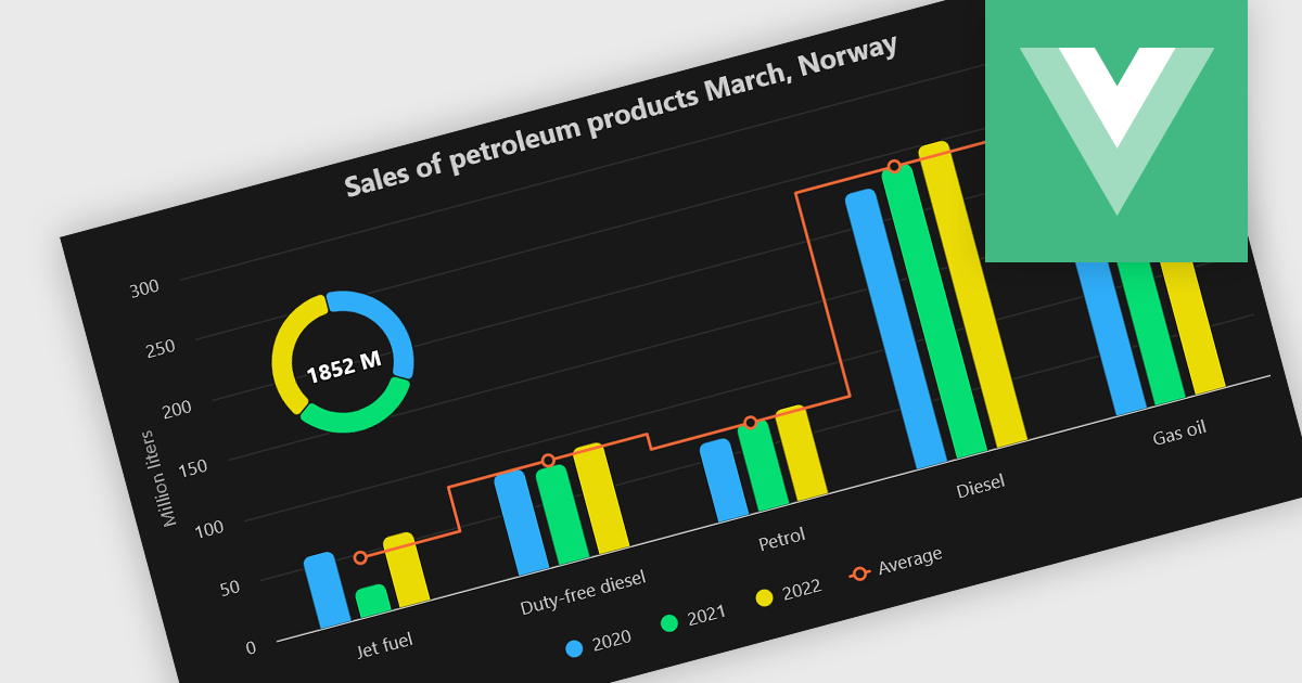
A combination chart or combo chart is a versatile type of data visualization that displays multiple chart types, such as columns, lines, or areas, to represent different data series within a single graphic. Combination charts are especially useful in scenarios where a single data type cannot fully convey the complexity of the dataset. By presenting different series types together, combination charts enhance the clarity and depth of insight available in a single view, be it on the same axis or across dual axes. This helps users to analyze complex relationships, trends and correlations between metrics more effectively than separate charts would allow.
Several Vue.js chart components allow you to combine series types on the same chart, including:
For an in-depth analysis of features and price, visit our comparison of Vue.js chart components.
電話: (888) 850 9911
Fax: +1 770 250 6199


