


公式サプライヤー
公式および認定ディストリビューターとして200社以上の開発元から正規ライセンスを直接ご提供いたします。
当社のすべてのブランドをご覧ください。
英語で読み続ける:
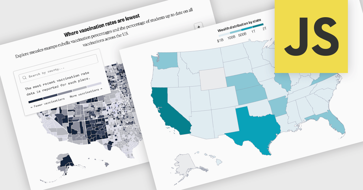
A map chart is a data visualization tool that displays information across geographic regions, helping users uncover spatial patterns, trends, and relationships. By plotting values onto countries, states, or custom areas, it transforms complex datasets into clear, location-based insights. Features like color-coding, zooming, and drill-down navigation allow for interactive exploration and comparison across regions. Common use cases include analyzing sales performance by region, tracking market coverage, visualizing customer distribution, or monitoring demographic trends, all of which support data-driven decision-making with a strong geographic context.
Several JavaScript chart controls offer map charts including:
For an in-depth analysis of features and price, visit our JavaScript chart controls comparison.
電話: (888) 850 9911
Fax: +1 770 250 6199


