


公式サプライヤー
公式および認定ディストリビューターとして200社以上の開発元から正規ライセンスを直接ご提供いたします。
当社のすべてのブランドをご覧ください。
英語で読み続ける:
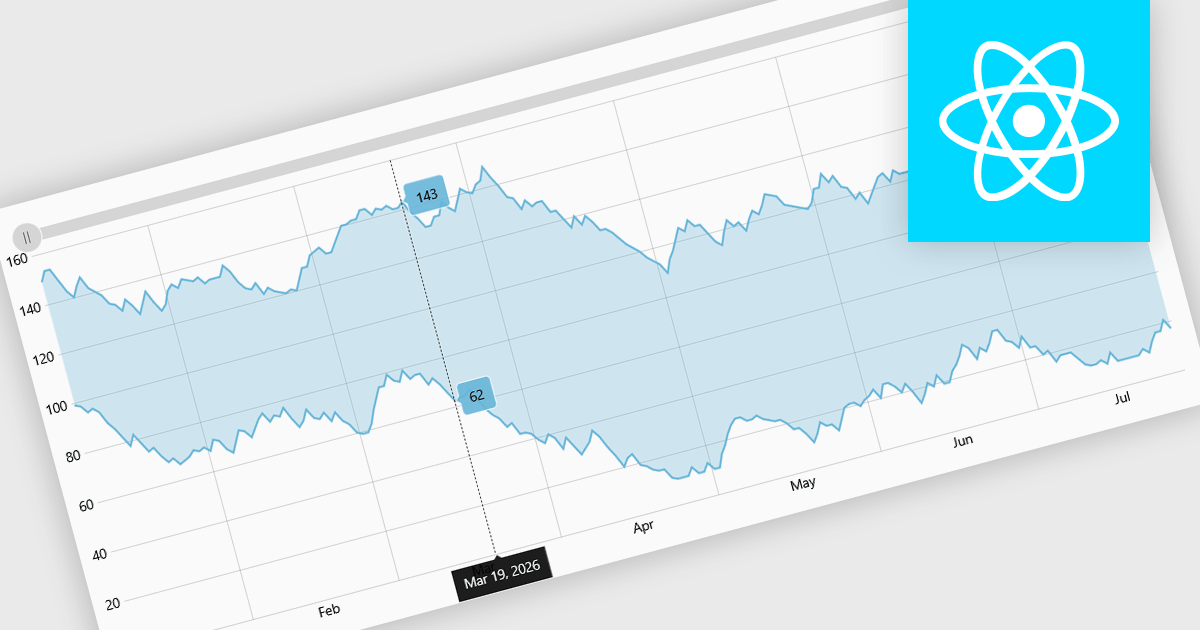
Range charts visualize financial data based on fixed price movements rather than time intervals, grouping activity into consistent ranges to highlight meaningful price action. By filtering out minor fluctuations and market noise, they make trends, volatility, support, and resistance levels easier to identify, especially in fast-moving or irregular markets. Common use cases include technical analysis for trading platforms, monitoring price volatility in equities or cryptocurrencies, and analyzing high-frequency financial data where understanding true market behavior is more important than tracking time-based changes.
Several React charting components provide you with range charts, including:
For an in-depth analysis of features and price, visit our React chart controls comparison.
電話: (888) 850 9911
Fax: +1 770 250 6199


