


公式サプライヤー
公式および認定ディストリビューターとして200社以上の開発元から正規ライセンスを直接ご提供いたします。
当社のすべてのブランドをご覧ください。
英語で読み続ける:
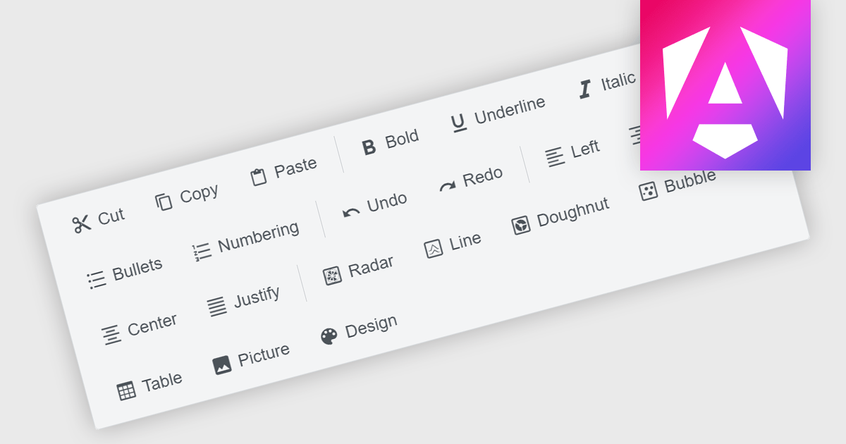
Toolbar components are a common feature in modern Angular UI suites, providing a structured way to present frequently used commands within an application. Typically displayed as a horizontal or vertical strip of buttons, icons, and interactive controls, a toolbar helps developers organize actions in a clear and accessible location. In Angular-based applications, toolbar components are often designed to work with the framework's component architecture, supporting features such as templating, responsive layouts, and integration with other UI elements like menus, dropdowns, and input controls. This allows developers to build consistent command surfaces while maintaining flexibility in how functionality is exposed to users.
Several Angular UI suites offer toolbar components including:
For an in-depth analysis of features and price, visit our Angular UI suites comparison.
電話: (888) 850 9911
Fax: +1 770 250 6199


