


公式サプライヤー
公式および認定ディストリビューターとして200社以上の開発元から正規ライセンスを直接ご提供いたします。
当社のすべてのブランドをご覧ください。
英語で読み続ける:
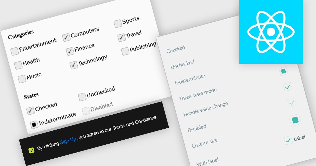
A check box is a user interface element that represents a Boolean field, allowing users to toggle between two states such as true and false directly within a form or data grid. It provides a clear and efficient way to edit logical values without requiring manual text input, reducing the risk of invalid entries and improving data consistency. For software developers, integrating check boxes into data-bound controls simplifies validation logic, and ensures that binary options are presented in a predictable and accessible format across applications.
Several React data editor collections provide check box editing capabilities including:
For an in-depth analysis of features and price, visit our comparison of React Data Editor components.
電話: (888) 850 9911
Fax: +1 770 250 6199


