


公式サプライヤー
公式および認定ディストリビューターとして200社以上の開発元から正規ライセンスを直接ご提供いたします。
当社のすべてのブランドをご覧ください。
英語で読み続ける:
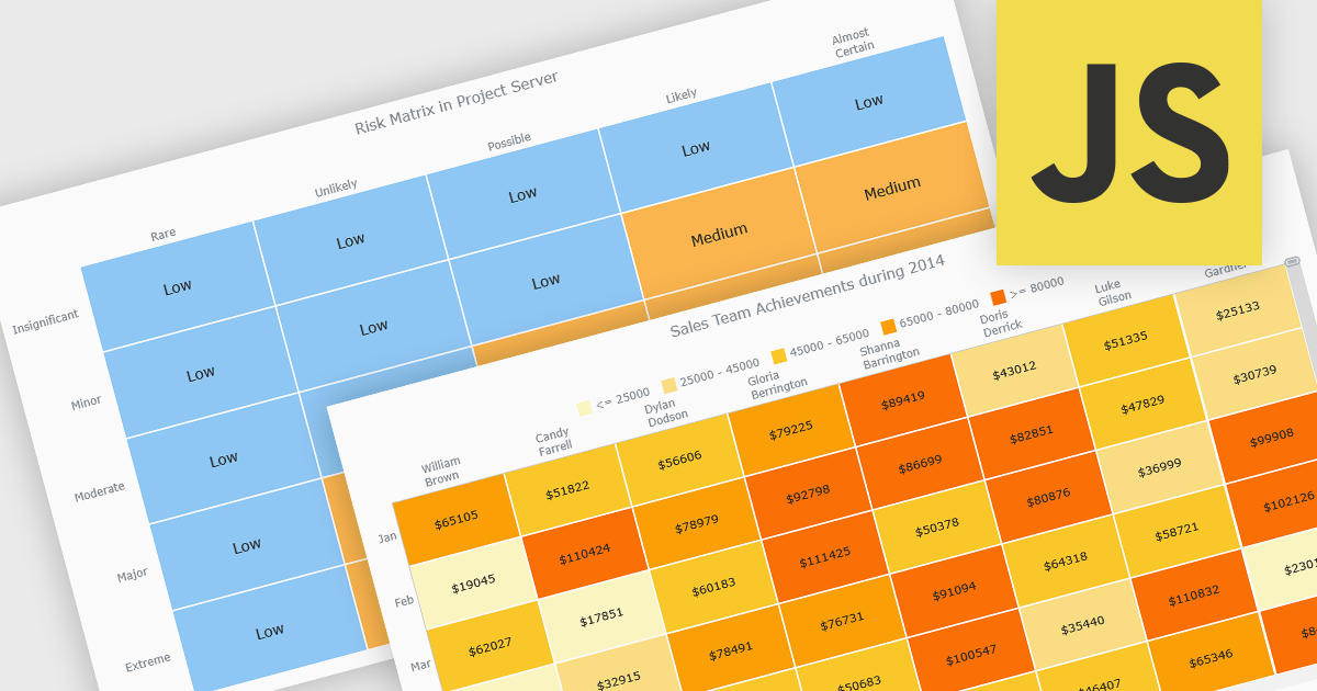
A heat map is a data visualization that displays values in a grid of colored cells, where color intensity represents the magnitude or importance of the data. This approach makes it easy to quickly identify patterns, trends, and outliers that may be difficult to see in traditional tables. Heat maps improve data analysis by visually highlighting relationships between two variables and enabling quick comparisons across datasets. They are commonly used in risk matrices, performance monitoring, sales analysis, and user behavior tracking, where color-coded insights help users focus on the most significant information.
Several JavaScript chart controls support the Heat map chart types, including:
For an in-depth analysis of features and price, visit our comparison of JavaScript chart controls.
電話: (888) 850 9911
Fax: +1 770 250 6199


