


公式サプライヤー
公式および認定ディストリビューターとして200社以上の開発元から正規ライセンスを直接ご提供いたします。
当社のすべてのブランドをご覧ください。
英語で読み続ける:
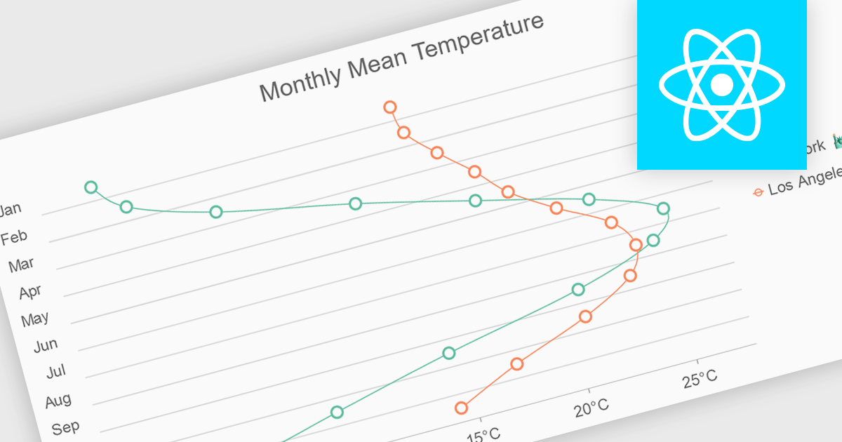
Spline charts are a type of line chart that uses smooth curves to connect data points, offering a visually appealing and intuitive representation of trends over time. Unlike traditional line charts with straight segments, spline charts emphasize the continuous nature of data, making them particularly effective for visualizing patterns, cycles, and gradual changes, commonly used in fields like finance, economics, and engineering to highlight the evolution of metrics and predict future trajectories
Several React chart controls offer spline charts including:
For an in-depth analysis of features and price, visit our React chart controls comparison.
電話: (888) 850 9911
Fax: +1 770 250 6199


