


公式サプライヤー
公式および認定ディストリビューターとして200社以上の開発元から正規ライセンスを直接ご提供いたします。
当社のすべてのブランドをご覧ください。
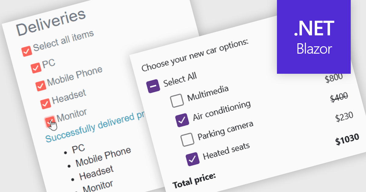
A checkbox data editor is a user interface element that enables users to view and modify Boolean values within forms, data grids, or other data-bound components. It provides an intuitive way to represent true/false, enabled/disabled, or selected/unselected states while maintaining synchronization between the user interface and the underlying data model. For developers, checkbox data editors simplify data entry and validation, improve usability by presenting state-based values in a familiar format, reduce input errors compared to manual text entry, and integrate with Blazor’s data binding and event-handling capabilities to support responsive, maintainable applications.
Several .NET Blazor data editor collections contain checkbox editors including:
For an in-depth analysis of features and price, visit our comparison of .NET Blazor data editors.
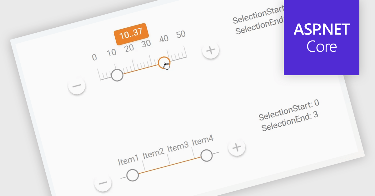
A Range Trackbar in ASP.NET Core Data Editor controls is an interactive input component that lets users select a numeric range by moving two handles along a track, rather than typing minimum and maximum values into separate fields. This makes range-based data entry faster, clearer, and less error-prone, especially when the valid values are bounded, such as prices, dates, percentages, ratings, quantities, or performance thresholds. For developers, it provides a more intuitive way to capture structured range input while maintaining control over validation, step intervals, formatting, and default values. In real-world applications, a Range Trackbar can be used in product filters to select a price range, reporting dashboards to define a date or score interval, booking systems to choose acceptable time windows, analytics tools to adjust threshold limits, or administrative forms where users need to configure minimum and maximum values without manually entering exact numbers.
Many ASP.NET Core Assembly Data Editors collections contain Range Trackbar controls including:
For an in-depth analysis of features and price, visit our comparison of ASP.NET Core Assembly Data Editors.
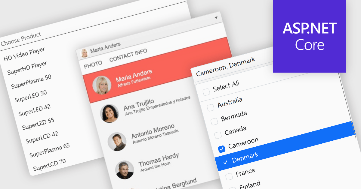
Dropdowns and lists provide structured ways for users to select and manage values within grids, forms, or tables. By constraining input to predefined options, these controls help maintain data consistency, reduce entry errors, and improve overall usability. They are commonly used in business applications where accuracy and efficiency are important, such as configuration panels, data management tools, and enterprise systems.
Common features include:
For an in-depth analysis of features and price, visit our ASP.NET Core data editor components comparison.
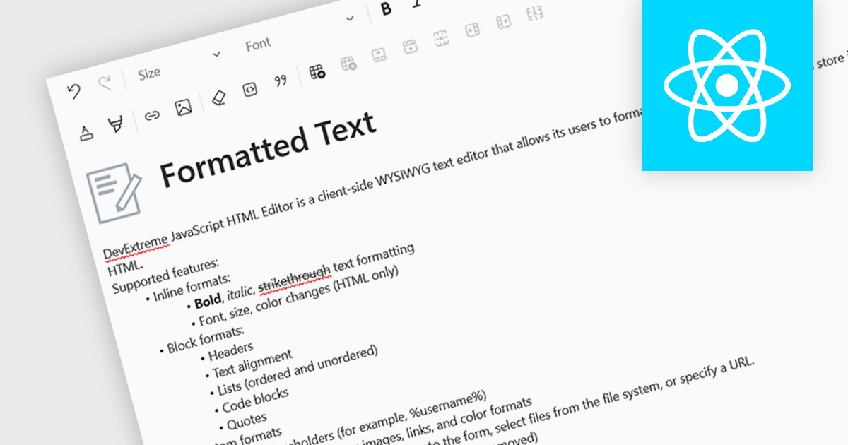
An RTF (Rich Text Format) editor allows users to create and modify formatted text, such as bold, italics, fonts, colors, and embedded elements. This capability is particularly useful in applications where descriptive or user-generated content must retain presentation alongside data, such as CMS platforms, reporting tools, or enterprise data grids. By integrating rich text editing at the component level, it enables more expressive data entry, reduces the need for external editors, and ensures formatting consistency when storing and rendering content across systems.
Several React data editor collections include RTF (rich text format) functionality, including:
For an in-depth analysis of features and price, visit our comparison of React data editors.
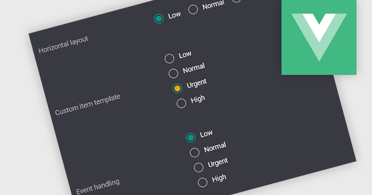
A radio group is a user interface element that presents a set of predefined options where only one value can be selected at a time for a particular field. It allows users to choose a single state, category, or configuration directly within the editing interface, with the selected option mapped to the underlying data value. This approach improves data consistency by preventing invalid combinations, simplifies validation logic by constraining input to known values, and accelerates data entry by replacing manual text input with clear, clickable choices that reduce ambiguity and input errors.
Several Vue.js data editor collections include radio group functionality, including:
For an in-depth analysis of features and price, visit our comparison of Vue.js data editor collections.
電話: (888) 850 9911
Fax: +1 770 250 6199


