


公式サプライヤー
公式および認定ディストリビューターとして200社以上の開発元から正規ライセンスを直接ご提供いたします。
当社のすべてのブランドをご覧ください。
DevExpress Blazor (part of DevExpress ASP.NET and Blazor) helps you create high-impact user experiences for both Blazor Server and Blazor WebAssembly using C#. The Blazor UI Component Library ships with a comprehensive set of native components including a Grid, Pivot Table, Scheduler, Chart, Data Editors and Reporting.
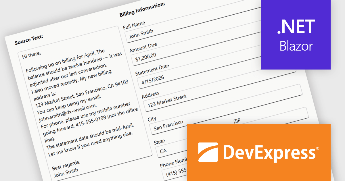
The DevExpress Blazor Form Layout component now includes Smart Paste, a new AI-powered capability designed to reduce manual data entry. Smart Paste can analyse unstructured content, such as email messages, support requests, or free-form notes, identify relevant information, and automatically populate matching form fields. This helps users transfer data into applications more quickly while reducing the risk of errors, making form-based workflows more efficient and easier to manage.
To see a full list of what's new in version 26.1, see our release notes.
DevExpress ASP.NET and Blazor is licensed per developer and is available as a Perpetual License with a 12 month support and maintenance subscription. See our DevExpress ASP.NET and Blazor licensing page for full details.
DevExpress Blazor is available in the following products:
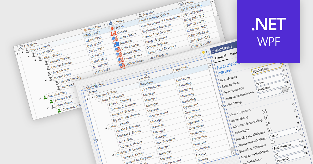
Treelist components present hierarchical data in a tabular format, combining the structure of a tree view with many of the capabilities commonly found in data grids. They allow users to expand and collapse parent-child relationships while viewing multiple data fields within the same interface. Treelists are commonly used to display organizational structures, project task hierarchies, file and folder systems, product categories, and other datasets that contain parent-child relationships. This approach helps organize complex datasets, improves navigation through large hierarchies, and can support tasks such as data viewing, editing, and management without requiring users to switch between different views.
Several WPF UI suites provide you with treelist functionality, including:
For an in-depth analysis of features and price, visit our comparison of WPF UI suites.
Infragistics Ultimate is a comprehensive development toolkit designed to improve the creation of high-performance, visually rich applications across multiple platforms. It includes a wide range of user interface (UI) components and development tools for web, desktop, and mobile applications, supporting frameworks such as Angular, React, Blazor, .NET, and more.
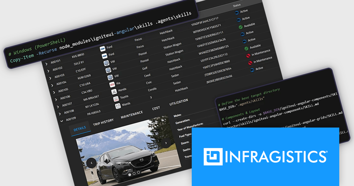
The Infragistics Ultimate 26.1 release includes an AI-Assisted Development Toolchain which helps ensure AI coding assistants generate applications using the correct Ignite UI components, APIs, import paths, and design tokens, reducing the risk of inaccurate code suggestions. Designed to keep AI-generated development aligned with established design systems and component libraries, the toolchain is available as three independently usable layers. All three layers now support Angular, React, Web Components, and Blazor, giving development teams greater flexibility when incorporating AI-assisted workflows into modern application projects.
To see a full list of what's new in version 26.1, see our release notes.
Infragistics Ultimate is licensed per developer and is available as a Perpetual License with a 1, 2 or 3 year support and maintenance subscription. See our Infragistics Ultimate licensing page for full details.
For more information, visit our Infragistics Ultimate product page.
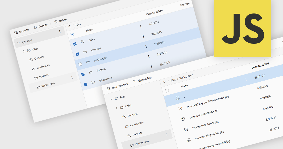
File management and shell components provide developers with tools for working with files, folders, and operating system resources within their applications. These components can provide capabilities such as file browsing, file operations, document handling, and integration with operating system features including file dialogs, shortcuts, shell metadata, and special folders. By providing pre-built functionality for these tasks, file management and shell components can reduce implementation effort and help deliver a familiar user experience.
Several JavaScript UI suites provide you with file management components, including:
For an in-depth analysis of features and price, visit our comparison of JavaScript UI suites.
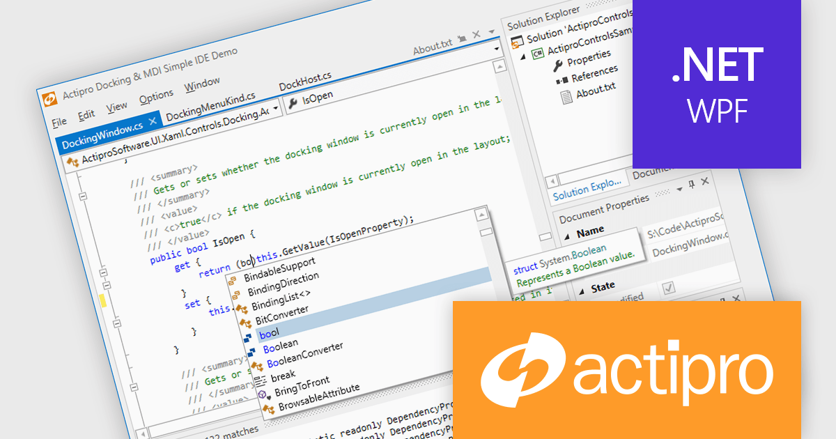
Actipro WPF Studio is a complete suite of WPF UI controls and components for building modern Windows desktop applications, including charts, docking, syntax editing, grids, navigation, gauges, editors, and Microsoft Office style interfaces. Designed to simplify complex application development, it helps developers create professional, feature rich business applications, developer tools, and data driven solutions faster while improving usability and user experience.
Actipro WPF Studio improves WPF application development by providing a comprehensive set of integrated UI controls and components that help developers build professional desktop applications faster and with less custom code. Its included features such as advanced docking, syntax editing, charts, grids, editors, navigation controls, and Microsoft Office style interfaces simplify the creation of complex user experiences while maintaining consistency, performance, and usability across applications. Designed for enterprise software, business tools, and data driven applications, it enables developers to deliver modern, feature rich interfaces more efficiently while reducing development and maintenance effort.
Actipro WPF Studio is licensed per developer and is available as a Perpetual license with 1 year support and maintenance. See our Actipro WPF Studio licensing page for full details.
For more information, see our Actipro WPF Studio product page.
電話: (888) 850 9911
Fax: +1 770 250 6199


