


公式サプライヤー
公式および認定ディストリビューターとして200社以上の開発元から正規ライセンスを直接ご提供いたします。
当社のすべてのブランドをご覧ください。
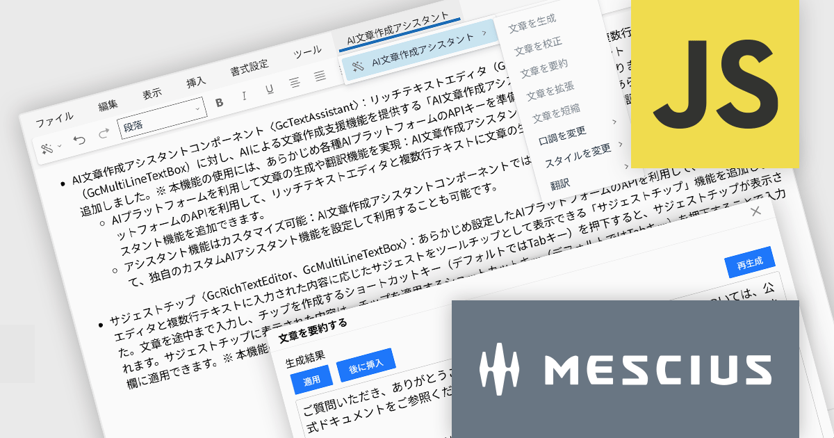
InputManJS(日本語版)V6Jでは、AI文章作成アシスタントコンポーネントGcTextAssistantが新たに追加されました。GcRichTextEditorやGcMultiLineTextBoxと連携し、これまで手作業だった文章作成やブラッシュアップをAIに任せられます。
GcTextAssistantは、事前に設定したAIプラットフォームのAPIを利用して、文章の生成、校正、要約、翻訳といったアシスタント機能を提供します。開発者は既存の入力画面にこのコンポーネントを追加するだけで、高度な文章支援をユーザーに提供できます。また、組み込みの機能だけでなく、用途に応じた独自のアシスタントを定義できる点も特徴です。自社の文書テンプレートに沿った文章提案や、特定ドメインの専門用語を意識した校正など、業務シナリオに合わせたカスタマイズが行えます。
ご利用には各種AIプラットフォームのAPIキーを準備し、InputManJS側に設定しておく必要があります。既存のWebアプリケーションにAIを取り入れたい場合、GcTextAssistantは最小限の改修で高い付加価値を加えられる有力な選択肢なります。
V6Jの新機能については、リリースノートをご覧ください。
製品詳細及び販売情報に関しては、InputManJS(日本語版)のサイトご参考ください
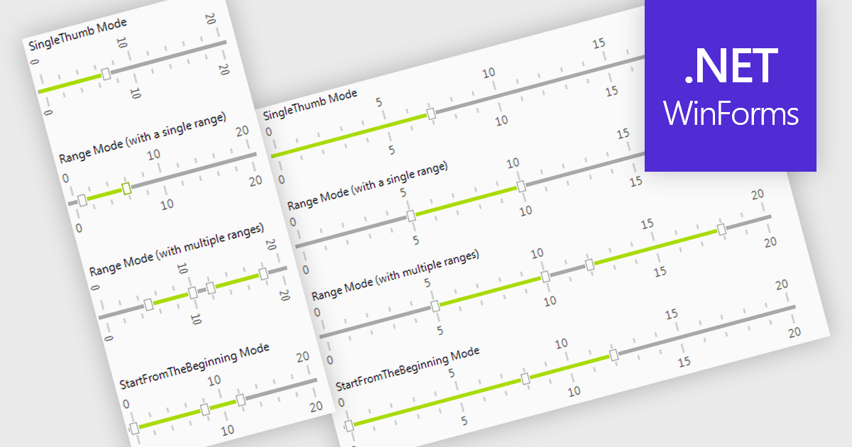
A trackbar in data editors provides a sliding control that allows users to adjust numeric values within a defined range through an interactive visual interface. It reduces the need for manual text entry, prevents invalid inputs by enforcing minimums, maximums and step increments, and offers immediate feedback as values change. Trackbars are especially useful in scenarios where users need to fine tune settings such as selecting volume levels, adjusting brightness, setting filter thresholds or choosing time or price ranges, making them ideal for applications that benefit from quick, intuitive and precise value selection.
Several .NET WinForms components offer Trackbar Data Editors including:
For an in-depth analysis of features and price, visit our comparison of .NET WinForms Data Editors.
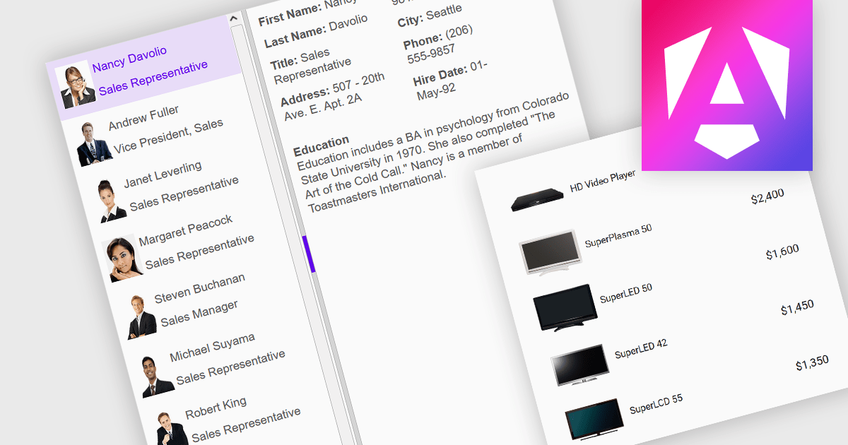
An image listbox is a type of data editor and user interface component that, like the standard listbox, presents a list of selectable items but with the ability to display images alongside or instead of the textual items. By using an associated icon, thumbnail or other graphic for improved visual recognition, this format provides a visual reference for each item, allowing users to browse and select their input more efficiently when the items are more easily identified by appearance than by label. The combination of images with text in a structured, selectable list makes the image listbox valuable in applications that involve data selection, as visually enriched items are well suited in scenarios where users must choose from items that are better identified via imagery (such as product catalogs, avatars, icons, or file previews) rather than by text alone.
Several Angular data editor collections provide image listbox support, including:
For an in-depth analysis of features and price, visit our comparison of Angular data editor components.
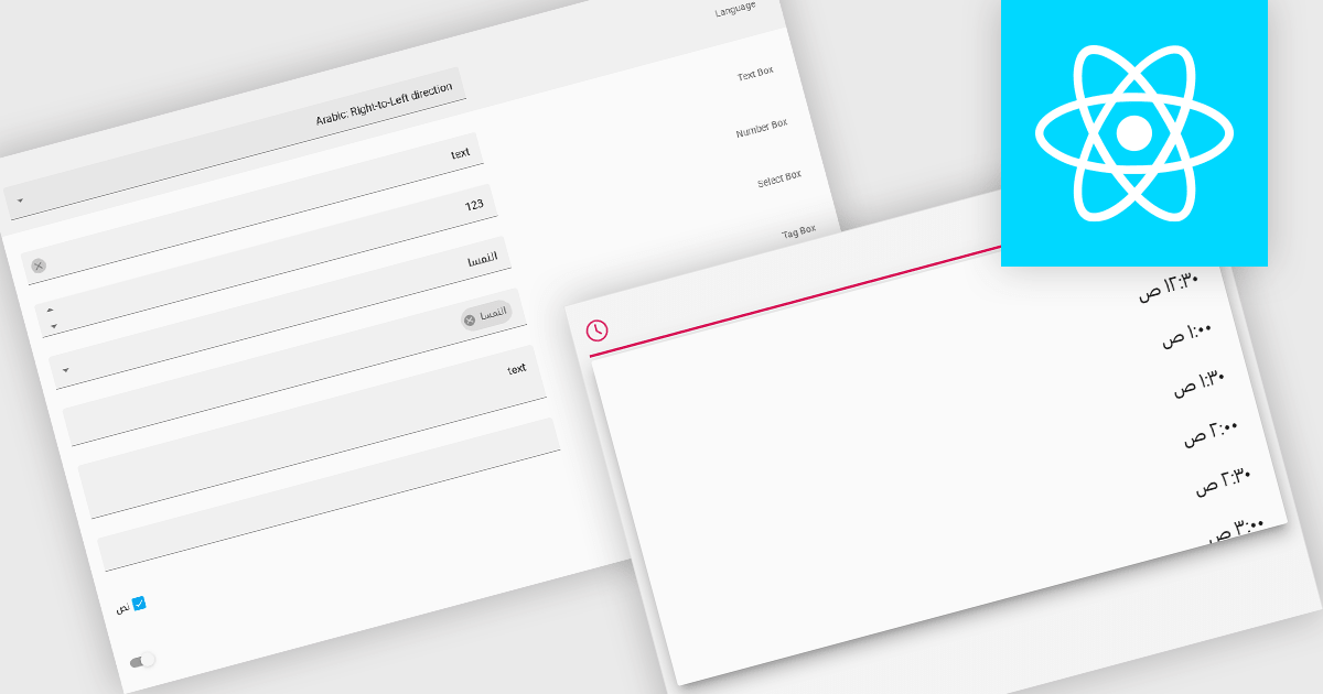
Right-to-left (RTL) support in a data editor component enables the user interface and content layout to be displayed in a direction consistent with languages that are read from right to left, such as Arabic or Hebrew. This includes aligning text, input fields, table structures, and control elements to the right side of the screen, while preserving correct data formatting and interaction behavior. For software developers, RTL support ensures that applications can be properly localized for RTL language audiences without compromising usability or data readability.
Several React data editors offer right to left (RTL) support including:
For an in-depth analysis of features and price, visit our React data editors comparison.
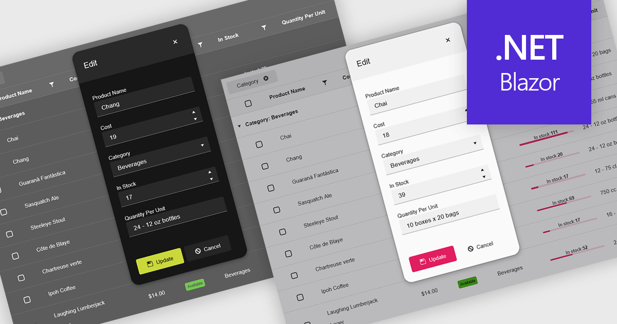
Themes in data editors provide a simple and efficient way to customize the visual appearance of data editing controls, including elements such as color schemes, fonts, and overall styling. By applying themes, developers and designers can create a consistent and professional look across multiple components, ensuring that applications align with brand guidelines and deliver a polished user experience. This flexibility enhances readability and usability while improving the design process, allowing visual updates to be made globally without modifying individual controls. For example, a dark theme can improve focus in data-intensive dashboards, while a light and minimalist theme can enhance clarity in business forms or reporting tools. Overall, themed data editors help maintain design consistency, reduce development time, and elevate the overall aesthetic of modern applications.
Several .NET Blazor data editor collections offer support for themes including:
For an in-depth analysis of features and price, visit our .NET Blazor data editor controls comparison.
電話: (888) 850 9911
Fax: +1 770 250 6199


