


公式サプライヤー
公式および認定ディストリビューターとして200社以上の開発元から正規ライセンスを直接ご提供いたします。
当社のすべてのブランドをご覧ください。
英語で読み続ける:
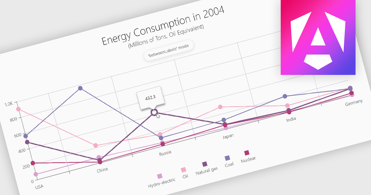
Line charts are a fundamental data visualization tool used to represent quantitative values over a continuous interval, such as time, by connecting data points with straight lines. They are particularly effective for analyzing trends, comparing multiple data sets, and identifying relationships or patterns within large or complex datasets. For software developers, line charts provide a clear and efficient way to present dynamic data, support interactive features for deeper analysis, and enhance decision-making by making critical insights easily accessible through a customizable and intuitive format.
Several Angular chart controls offer line charts including:
For an in-depth analysis of features and price, visit our comparison of Angular Charts.
電話: (888) 850 9911
Fax: +1 770 250 6199


