


公式サプライヤー
公式および認定ディストリビューターとして200社以上の開発元から正規ライセンスを直接ご提供いたします。
当社のすべてのブランドをご覧ください。
英語で読み続ける:
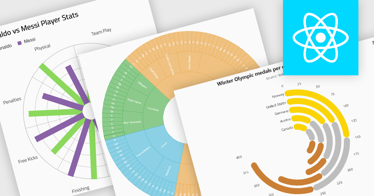
Radial charts provide an intuitive way to visualize hierarchical and categorical data. They display bars on a polar coordinate system instead of a cartesian system, which uses an x-y grid for positioning data. These charts represent values in a circular layout, making it ideal for comparing proportions and relationships between data points. Circular bar charts, a variation of the traditional bar chart, arrange data in a radial format for displaying comparisons between categories. They are particularly useful for visualizing periodic or cyclical data, such as time-based metrics. Sunburst charts break down hierarchical structures into concentric rings. The center of the chart typically represents the root category, while outer rings depict subcategories. These are used for visualizing part-to-whole relationships within a dataset.
Several React chart controls offer radial charts including:
For an in-depth analysis of features and price, visit our React chart controls comparison.
電話: (888) 850 9911
Fax: +1 770 250 6199


