


公式サプライヤー
公式および認定ディストリビューターとして200社以上の開発元から正規ライセンスを直接ご提供いたします。
当社のすべてのブランドをご覧ください。
英語で読み続ける:
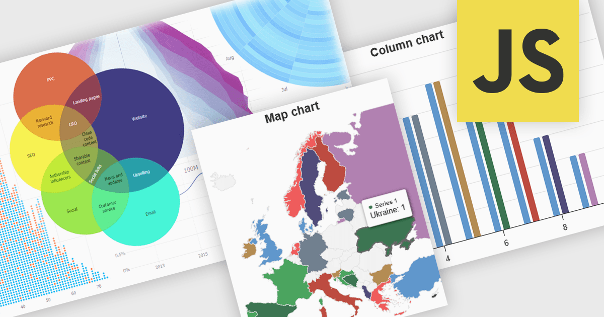
High contrast charts use distinct and contrasting color palettes within data visualizations to improve clarity, particularly for individuals with visual impairments. This involves choosing colors with noticeably different hues and brightness for elements such as lines, bars, labels, and backgrounds, so that differences in data are easy to spot. These charts improve data understanding, make information accessible to more people, reduce eye strain for some users, and support accessibility standards. They are useful in many areas, such as financial reports, scientific papers and public health dashboards that must be clear and designed for a everyone regardless of visual ability.
Several JavaScript charting components provide accessible high contrast features, including:
For an in-depth analysis of features and price, visit our JavaScript chart components comparison.
電話: (888) 850 9911
Fax: +1 770 250 6199


