


公式サプライヤー
公式および認定ディストリビューターとして200社以上の開発元から正規ライセンスを直接ご提供いたします。
当社のすべてのブランドをご覧ください。
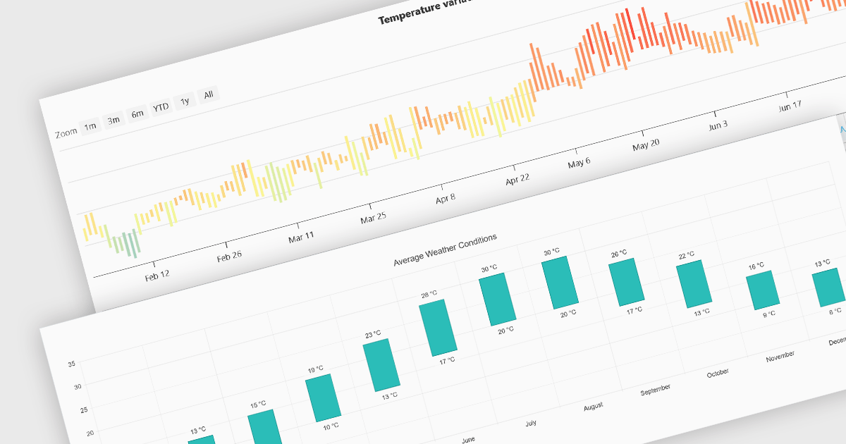
Range bar charts provide a way to visualize data that includes both minimum and maximum values. The bars displayed represent a value range, spanning between the minimum and maximum levels, rather than a single point. This type of chart makes it easier for users to compare variations across different categories or time periods, detect anomalies, and identify trends. This makes them particularly useful for scenarios where understanding variations within a range is important, such as stock price fluctuations, project timelines, or performance metrics. Their structured layout improves readability, making them a valuable tool in financial analysis, scheduling, and business intelligence applications.
Several Angular charting components provide you with range bar charts, including:
For an in-depth analysis of features and price, visit our Angular chart controls comparison.
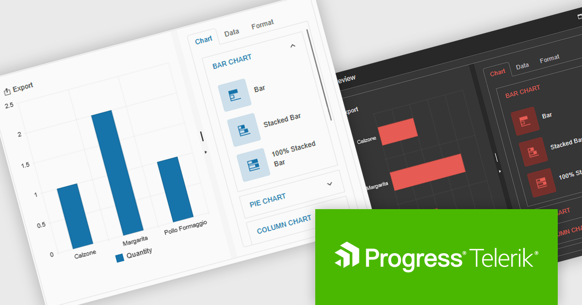
Kendo UI by Telerik is a comprehensive suite of JavaScript UI components designed to accelerate web application development. Offering pre-built, customizable elements for grids, charts, schedulers, and more, it streamlines UI creation across popular frameworks like jQuery, Angular, React, and Vue. Key features include responsive design, accessibility, and high performance, enhancing user experience. Developers benefit from reduced development time, consistent UI patterns, and the ability to build feature-rich applications faster.
The Kendo UI for jQuery v2025 Q1 update introduces the Chart Wizard, a streamlined tool that simplifies chart creation by allowing developers to generate data-driven visualizations directly from grids, data-bound components, or external sources. This feature reduces manual configuration, enhances workflow efficiency, and ensures a seamless integration process, enabling developers to quickly transform raw data into meaningful insights while maintaining full customization control.
To see a full list of what’s new in v17.1.0 (2025 Q1), see our release notes.
Kendo UI is licensed per developer and has two licensing models: an annual Subscription License and a Perpetual License. The Subscription license provides access to the latest product updates, technical support, and exclusive benefits for a flat annual fee, and must be renewed to continue using the software. The Perpetual license is a one-time purchase granting access to the current released version and includes a one-year subscription for product updates and technical support. After this initial period, users can choose to renew the subscription element to continue receiving updates and support; otherwise, they may continue using the installed version available during their active subscription term but will forgo future updates and support. See our Kendo UI licensing page for full details.
Kendo UI is also available to buy individually or as part of:
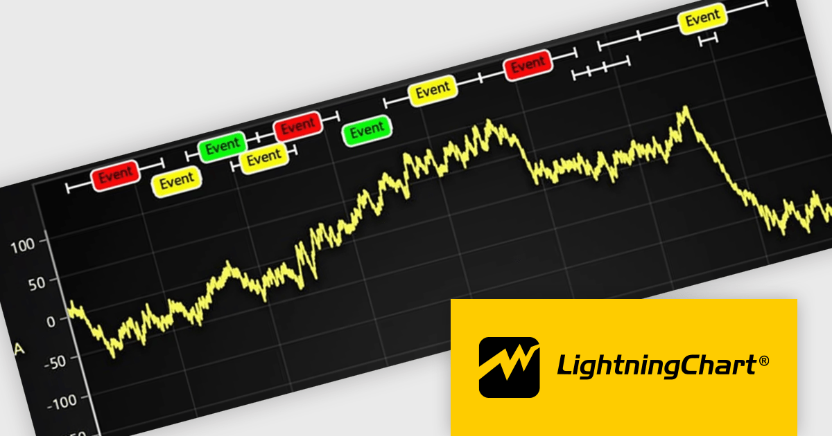
LightningChart JS is a JavaScript/TypeScript library developed by LightningChart that specifically targets the creation of financial and trading applications. It provides high-performance, 2D, 3D, and real-time charting controls and a comprehensive suite of visualizations including candlestick, bar, line, and various technical indicators and drawing tools. This library enables software developers to craft interactive technical analysis tools without the need for server-side setup as it runs completely on the client device.
The LightningChart JS v7.0.1 update introduces the Text Series API, providing a more efficient and flexible way to render text within ChartXY. This new approach enhances performance by optimizing text rendering, supports viewport clipping to maintain clean chart visuals, and offers precise control over text size and boundaries. Designed as a more seamless alternative to chart.addUIElement(), it simplifies development by integrating text elements directly within the chart while ensuring scalability for large datasets.
To see a full list of what's new in v7.0.1, see our release notes.
LightningChart JS is licensed per developer and is available as an annual license with 1 year support. See our LightningChart JS licensing page for full details.
For more information, see our LightningChart JS product page.
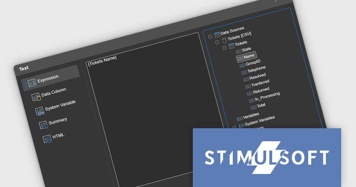
Stimulsoft Reports.JS provides a robust reporting toolkit designed specifically for JavaScript applications. This library leverages a client-side architecture, offering a pure JavaScript report engine for efficient report rendering directly within web browsers. The solution includes a user-friendly report designer for building reports with various data sources and visualizations, along with a report viewer for seamless integration and display within your JavaScript applications. This eliminates the need for server-side dependencies or browser plugins, simplifying the development process for embedding powerful reporting functionalities into your web projects.
The Stimulsoft Reports.JS 2025.1.1 update introduces integrated access to the data dictionary within component editors, enhancing the efficiency and precision of report design. This improvement enables developers to quickly reference and utilize data dictionary elements without switching contexts, simplifying the process of configuring and editing report components. By streamlining access to structured data, the update reduces the risk of errors, promotes consistency across reports, and accelerates the overall workflow, making it an essential enhancement for developers focused on creating complex and data-driven reports.
To see a full list of what's new in 2025.1.1, see our release notes.
Stimulsoft Reports.JS is licensed per developer and is available as a Perpetual license with 1 year support and maintenance. See our Stimulsoft Reports.JS licensing page for full details.
Stimulsoft Reports.JS is available individually or as part of Stimulsoft Ultimate.
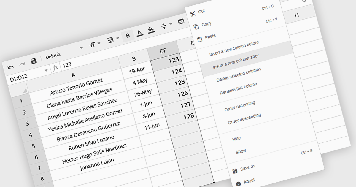
The option to insert columns in a spreadsheet gives users the flexibility to expand or reorganize their data as needed. This functionality allows for seamless adjustments, making it easier to add new data fields or restructure existing information. By enabling column insertion, users can customize their data views for more effective analysis and manipulation. This not only enhances productivity but also delivers a more responsive and adaptable interface that evolves with their data requirements, improving the overall user experience.
Several Angular spreadsheet controls offer the ability to insert columns including:
For an in-depth analysis of features and price, visit our Angular spreadsheet controls comparison.
電話: (888) 850 9911
Fax: +1 770 250 6199


