


公式サプライヤー
公式および認定ディストリビューターとして200社以上の開発元から正規ライセンスを直接ご提供いたします。
当社のすべてのブランドをご覧ください。
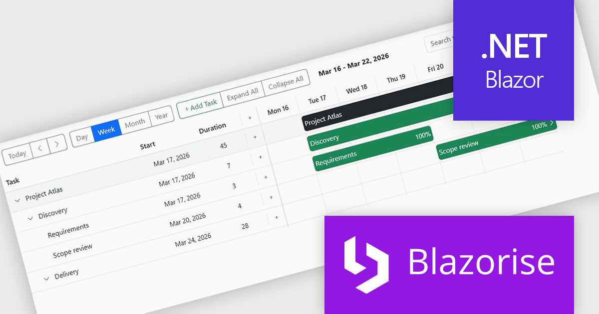
Blazorise is a versatile component library that empowers developers to build modern and feature-rich web applications using Blazor, a client-side web development framework from Microsoft. It offers a comprehensive collection of user interface components, including buttons, forms, charts, and navigation elements, all built with accessibility and responsiveness in mind.
The Blazorise 2.0.3 update introduces a Gantt component that enables developers to implement advanced project planning and timeline visualization directly within their applications, reducing the need for custom development or third party tools while supporting complex scheduling scenarios through features such as task editing, hierarchical data structures, dependency management, filtering, and drag and drop interactions, all within a consistent and theme aligned UI framework.
To see a full list of what’s new in version 2.0.3, see our release notes.
Blazorise is licensed per developer and includes a 1 year subscription for updates and support. Professional, Enterprise, and Enterprise Plus editions are available, each offering tailored levels of support and service to meet varying business needs. See our Blazorise licensing page for full details.
For more information, visit our Blazorise product page.
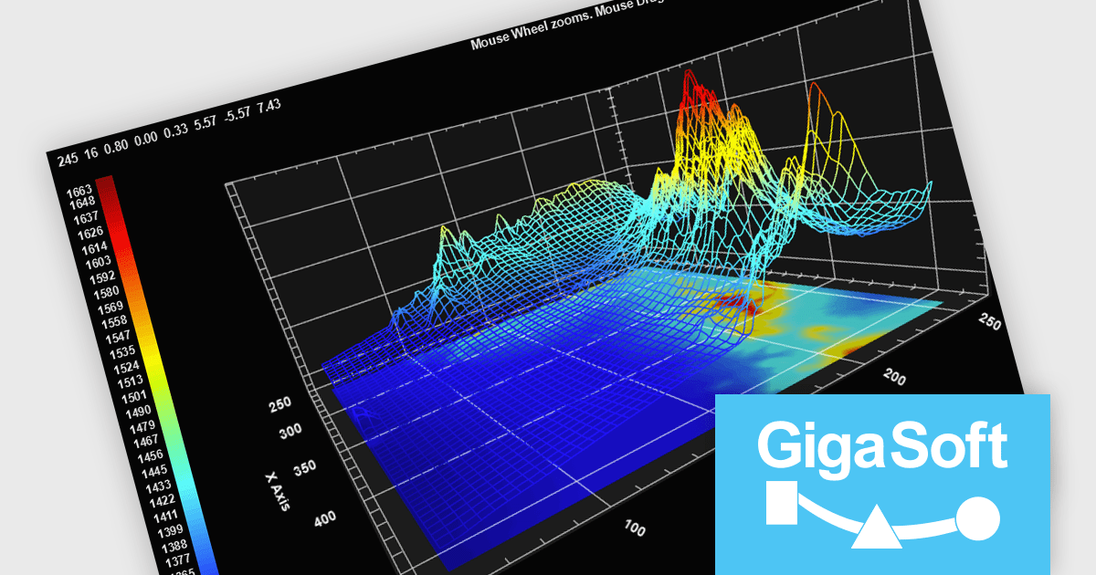
Gigasoft ProEssentials is a robust charting library for Windows development, providing a wide array of 2D and 3D chart types. The product offers a versatile suite of components, such as Graph, Scientific Graph, and 3D Scientific Graph, enabling the creation of sophisticated visualizations. It's extensive support for various platforms and development environments, including WPF, WinForm, and integration with popular IDEs like Visual Studio, enhances flexibility and empowers developers to efficiently visualize data within their applications.
Gigasoft ProEssentials enables developers to work more efficiently with its charting components by giving AI assistants direct, real-time access to validated API data, allowing them to generate accurate chart configurations, suggest correct property usage, and troubleshoot issues based on the actual capabilities of the library. By dynamically querying structured data rather than relying on static documentation, the feature ensures that responses reflect the current state of the API, reducing the likelihood of invalid property paths or unsupported configurations. This leads to more reliable code generation, faster resolution of integration challenges, and greater confidence when implementing or modifying charts within production applications across different environments.
Gigasoft ProEssentials is licensed per developer and is available as a perpetual license with free technical support and maintenance for the life of the version. See our Gigasoft ProEssentials licensing page for full details.
For more information, visit our Gigasoft ProEssentials product page.
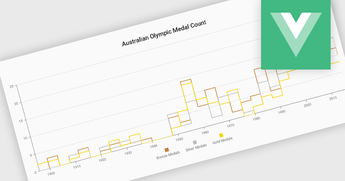
Step line charts are a variation of line charts that display changes between data points as a series of horizontal and vertical segments rather than diagonal lines. This structure highlights discrete transitions between values, making it easier to show when a change occurs and how long a value remains constant before the next update. Step line charts are useful for representing processes where values shift at specific moments, such as pricing tiers, system states, or configuration thresholds. By clearly separating periods of stability from points of change, the chart type helps developers and analysts interpret state-based or event-driven data with greater precision.
Several Vue.js chart components support the step line chart type, including:
For an in-depth analysis of features and price, visit our comparison of Vue.js charting components.
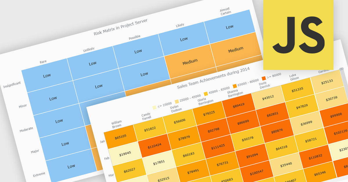
A heat map is a data visualization that displays values in a grid of colored cells, where color intensity represents the magnitude or importance of the data. This approach makes it easy to quickly identify patterns, trends, and outliers that may be difficult to see in traditional tables. Heat maps improve data analysis by visually highlighting relationships between two variables and enabling quick comparisons across datasets. They are commonly used in risk matrices, performance monitoring, sales analysis, and user behavior tracking, where color-coded insights help users focus on the most significant information.
Several JavaScript chart controls support the Heat map chart types, including:
For an in-depth analysis of features and price, visit our comparison of JavaScript chart controls.
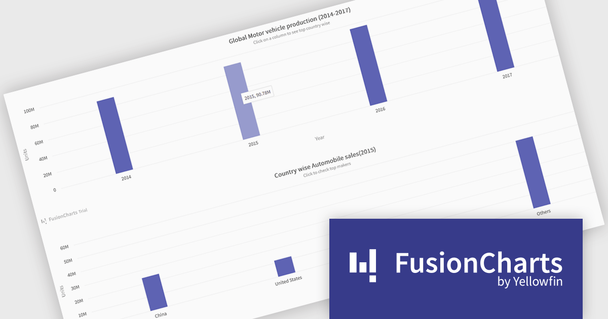
FusionCharts Suite XT is a collection of charting and mapping tools that helps developers create interactive and data-driven dashboards for their web and mobile applications. It provides a wide range of features, including over 100 chart types, data-driven maps, and a variety of customization options. FusionCharts Suite XT helps you visualize and present data in a clear and engaging way.
FusionCharts Suite XT allows developers to implement drill down charts that let users click individual data points to view related charts with more detailed information. This functionality helps developers present large or complex datasets in a structured way, allowing applications to display high level summaries while providing access to deeper data when required. By supporting multiple levels of drill down across most chart types, it supports scalable and interactive data exploration without overloading the initial visualization.
FusionCharts Suite XT is licensed through tiered plans, including Basic, Pro, Enterprise, and Enterprise+, available as annual or perpetual licenses for different developer and deployment needs. See our FusionCharts Suite XT licensing page for full details.
For more information, visit our FusionCharts Suite product page.
電話: (888) 850 9911
Fax: +1 770 250 6199


