


公式サプライヤー
公式および認定ディストリビューターとして200社以上の開発元から正規ライセンスを直接ご提供いたします。
当社のすべてのブランドをご覧ください。
RubyMine by JetBrains is a powerful Integrated Development Environment (IDE) specifically designed for Ruby and Ruby on Rails development. It offers a comprehensive suite of features to boost your coding efficiency, including smart code completion, syntax highlighting, code refactoring tools, built-in debugging and testing frameworks, and seamless integration with popular libraries and databases. Whether you're a seasoned Rails developer or just starting out, RubyMine's intuitive interface and robust features can help you write cleaner, more maintainable code and accelerate your development workflow.
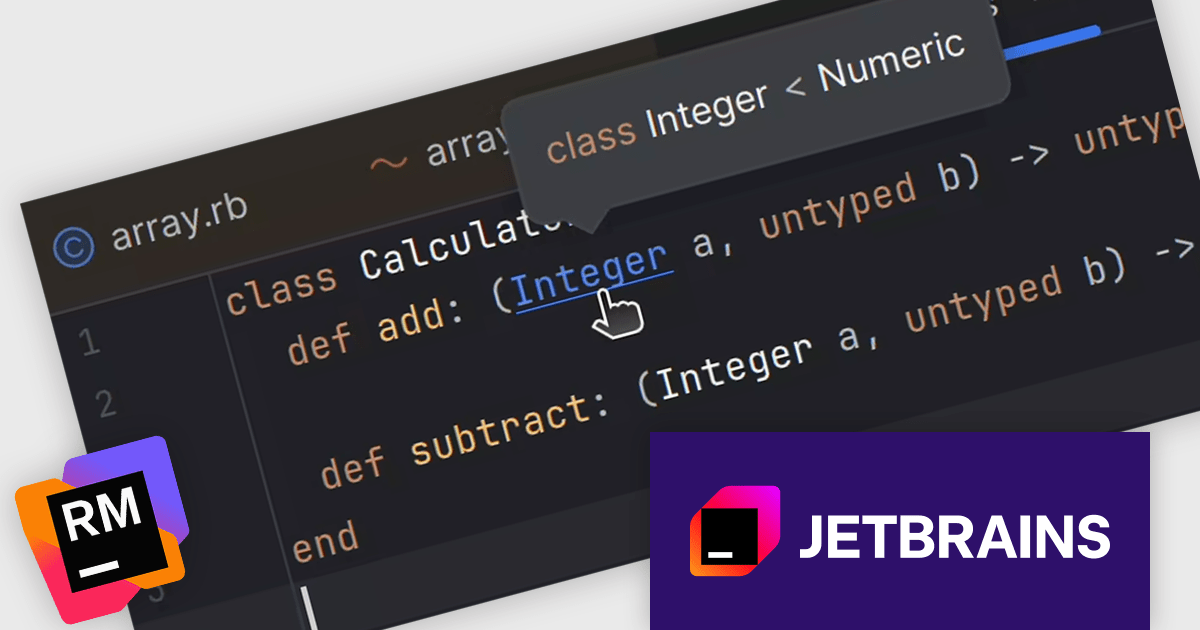
The RubyMine 2025.2 release introduces a feature that adds hover hints for Ruby Signature (RBS) declarations and references. This enhancement is especially useful for developers working with type annotations, as it enables quick access to type information directly within the editor. Instead of navigating away from your code, you can now hover over an RBS reference to instantly view details such as type alias definitions. This feature helps maintain coding focus and speeds up understanding of typed Ruby code.
To see a full list of what's new in version 2025.2, see our release notes.
RubyMine is licensed per user, and is available as a commercial annual subscription license. We can supply new subscriptions, subscription renewals, lapsed renewals, and additional user licenses. See our RubyMine licensing page for full details.
RubyMine is available to buy in the following products:
RAD Studio by Embarcadero is a integrated development environment (IDE) used to build applications for various platforms. It allows programmers to create native apps for Windows, macOS, mobile devices (Android and iOS), and more using C++ or Delphi. RAD Studio is known for its rapid application development features and is targeted towards professional developers building data-rich and visually appealing applications.
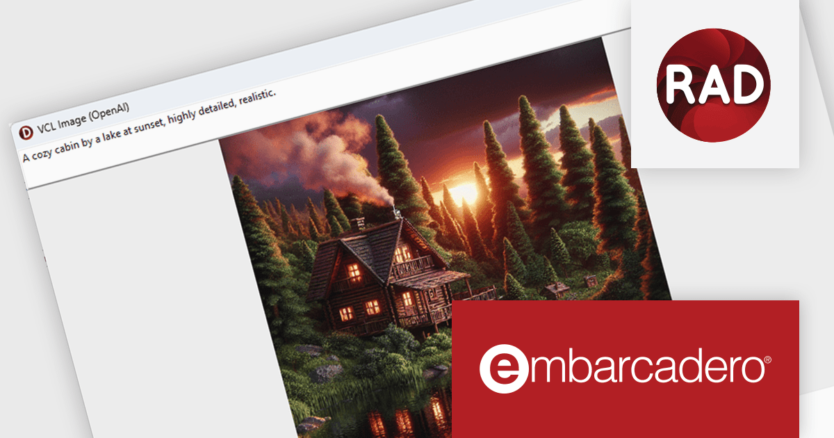
The RAD Studio 13 Florence release brings a significant step forward in application development with the introduction of the SmartCore AI Component Pack. This new feature provides runtime components that allow AI capabilities to be embedded directly into your applications. Designed as a foundation for future AI integrations, it supports building intelligent features into both new and existing apps using Delphi or C++Builder. The architecture is extensible, enabling developers and third-party vendors to expand on it with support for additional AI engines and custom user interface elements.
To see a full list of what's new in version 13 Florence, see our release notes.
RAD Studio is licensed per Named, Network Named or Concurrent user and is available as a Perpetual License with an Update Subscription that includes support and free upgrades for 1 Year. See our RAD Studio licensing page for full details.
RAD Studio is available to buy in the following products:

Chart themes provide a simple yet powerful way to standardize the appearance of charts by applying predefined color schemes, fonts, and styling options across visualizations. Instead of manually adjusting each element, users can quickly switch between themes to achieve a consistent, professional look that aligns with brand guidelines or presentation needs. The benefits include improving readability, enhancing accessibility - with inclusive color palettes - and ensuring visual consistency across multiple charts or entire dashboards. Chart themes improve the process of creating impactful, audience-ready data visualizations.
Several .NET WPF chart components offer the ability to add themes, including:
For an in-depth analysis of features and price, visit our .NET WPF charts comparison.
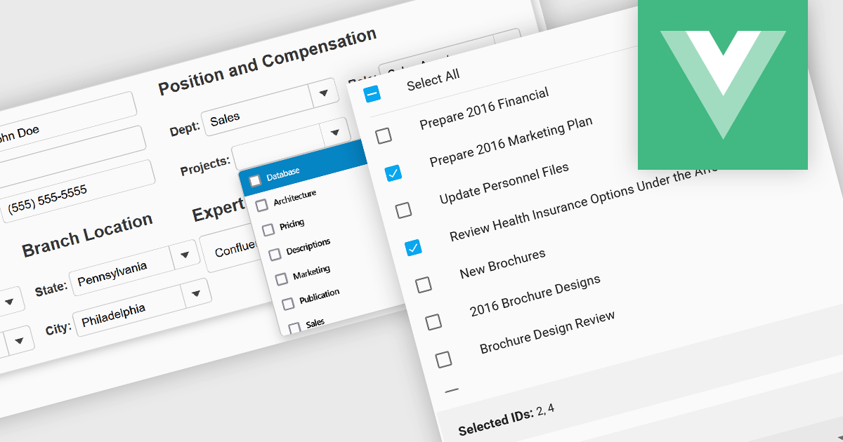
Checked listboxes provide users with a convenient interface for selecting multiple items within data editor controls. They enhance user workflows by combining the visual clarity of list presentations with the functionality of checkboxes, enabling intuitive multi-selection capabilities. Typically data-bound, these controls support both manual and programmatic manipulation of items, including checking, unchecking, and layout customization, facilitating dynamic and interactive list management in enterprise-grade applications.
Several Vue.js data editor collections include a checked listbox, including:
For an in-depth analysis of features and price, visit our Vue.js data editors comparison.
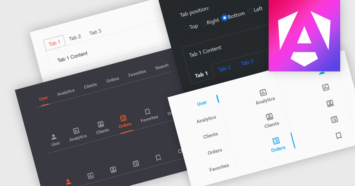
Tabs are a common user interface element that allows users to navigate between multiple sections or views within the same window by clicking on labeled tabs, typically displayed in a row. Each tab presents a different set of information or controls, helping to organize content in a way that reduces clutter and makes it easier to find relevant features without switching between multiple windows or pages. Creating a tabbed UI to switch between sections provides faster access to key areas, and improves usability by maintaining context. This approach is especially useful in applications with layered data or multiple tool sets, where managing space and context is critical.
Several Angular UI suites provide you with tab functionality, including:
For an in-depth analysis of features and price, visit our comparison of Angular UI suites.
電話: (888) 850 9911
Fax: +1 770 250 6199


