


公式サプライヤー
公式および認定ディストリビューターとして200社以上の開発元から正規ライセンスを直接ご提供いたします。
当社のすべてのブランドをご覧ください。
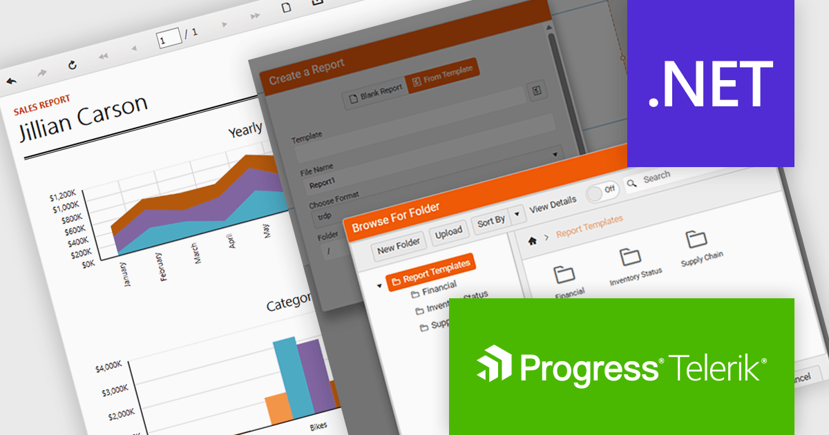
Telerik Reporting is a comprehensive and lightweight embedded reporting tool for .NET web and desktop applications. It enables developers and reporting users to create, design, and export visually appealing, interactive, and reusable reports to effectively present analytical and business data. It supports various technologies, including ASP.NET Core, Blazor, ASP.NET MVC, ASP.NET AJAX, HTML5/JS, Angular, WPF, WinForms, and WinUI.
The Telerik Reporting 2025 Q4 update introduces customizable report templates in the Web Report Designer, giving developers a faster and more controlled way to produce consistent, production-ready reports. By allowing teams to define, save and reuse templates that include predefined layout structures, styling rules and data components, the feature reduces repetitive setup work, maintains uniform design standards across projects and ensures every new report begins with a reliable, compliant foundation.
To see a full list of what's new in 2025 Q4 (19.3.25.1111), see our release notes.
Telerik Reporting is licensed per developer and is available as a perpetual license with a one year support subscription, which is offered in three tiers: Lite, Priority or Ultimate. See our Telerik Reporting licensing page for full details.
Telerik Reporting is available to buy in the following products:
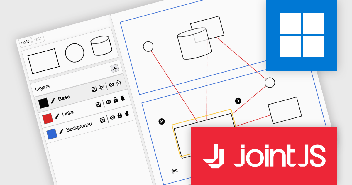
JointJS+ is a diagramming library that offers advanced features like custom shapes, data binding, and advanced layout algorithms, enabling you to create complex, interactive, and visually appealing diagrams. It includes a ready-to-use demo application that showcases its functionality and serves as a starting point for your own diagramming projects.
The JointJS+ 4.2 update introduces a redesigned Layers API that gives developers more control over diagram structure, interaction, and presentation by allowing cells to be grouped into independent layers with their own attributes, stacking context, and event flow. This enables clearer organization of complex graphs, more predictable z-index behavior, and the ability to apply targeted styling, filters, and animations at the layer level, all while maintaining backward-compatible event handling for smoother integration into existing applications.
To see a full list of what's new in v4.2, see our release notes.
JointJS+ is licensed per developer and is available as a Perpetual license with 1 year support and maintenance. See our JointJS+ licensing page for full details.
Learn more on our JointJS+ product page.
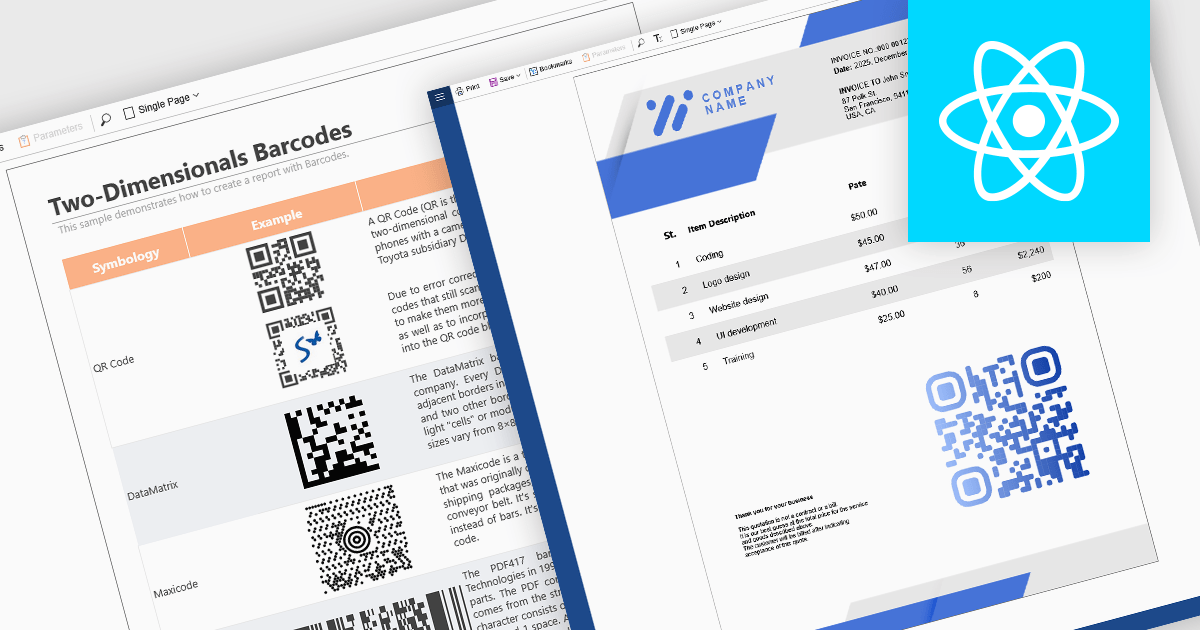
Barcode support in reporting components enables developers to embed machine-readable codes (barcodes, QR codes, DataMatrix, etc.) directly into reports. This feature is especially useful when printed or digital reports need to integrate with scanning systems, for example, in inventory management, shipping labels, product catalogs, or document tracking. By using a barcode component within a report template, reports can dynamically encode data fields (such as item IDs, order numbers, or URLs), ensuring that each generated report contains a barcode that corresponds to its data. This promotes automation, reduces manual errors, and improves interoperability with external scanning or inventory systems.
Several React reporting controls offer barcode support including:
For an in-depth analysis of features and price, visit our React reporting controls comparison.
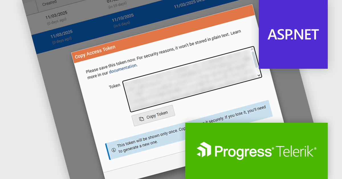
Telerik Report Server is a comprehensive and flexible end-to-end solution for managing reports. Built with the Telerik Reporting library, it is a server-based Windows web application that provides centralized storage, organization, and previewing of reports, along with features for scheduling, delivery, and user management. Report Server can act as a standalone solution or be integrated within an application, allowing developers to create, manage, and distribute reports across multiple platforms including Blazor, Angular and Windows Forms.
The Telerik Report Server 2025 Q4 update introduces Access Token Provisioning directly in the RS.NET UI, giving developers a more efficient and controlled way to authenticate applications and services without relying on external scripts or manual API calls. This enhancement centralizes token management by allowing tokens to be generated, reviewed, and maintained within the interface itself. It also enables developers to create time-bound sharing links backed by temporary user permissions, providing a secure and predictable method for distributing report documents while maintaining clear control over access duration and scope.
To see a full list of what's new in 2025 Q4 (11.3.25.1111), see our release notes.
Telerik Report Server is available as a perpetual or annual license and is licensed per domain. Each domain license contains 15 Client Access Licenses and 1 year support and maintenance. See our Telerik Report Server licensing page for full details.
Telerik Report Server is available individually or as part of Telerik DevCraft Ultimate.
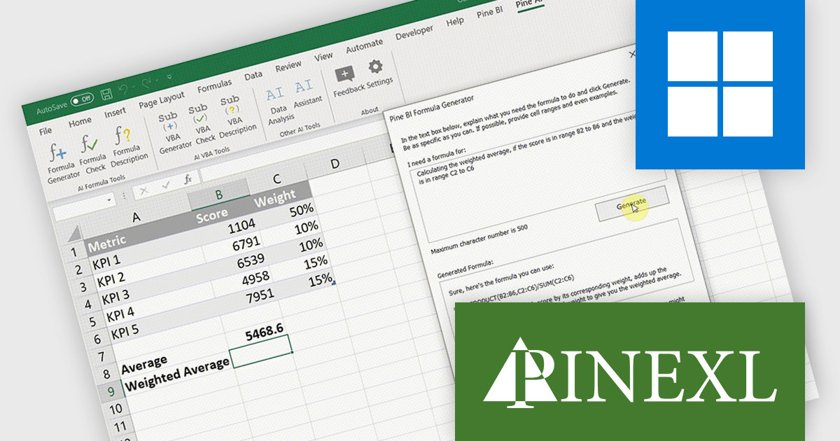
Pine AI Excel Add-In, developed by Pinexl, integrates AI into Microsoft Excel, enabling users to generate, debug, and interpret complex formulas and Visual Basic for Applications (VBA) code by simply describing their requirements. This tool enhances productivity by automating tasks such as data analysis, summarization, transformation, and translation directly within Excel spreadsheets. For instance, users can extract specific information from unstructured data, fill in missing details like country names based on city data, and translate text without leaving the Excel environment.
Pine AI improves formula creation by converting natural language instructions into accurate Excel formulas directly within the workbook, allowing developers to focus on core logic rather than memorizing syntax or troubleshooting complex expressions. It supports multiple languages, minimizes manual errors, and accelerates spreadsheet development, making it easier to incorporate precise calculations into data-driven applications.
Pine AI Excel Add-In is licensed per user on an annual subscription basis. To continue using the software you will need an active subscription. See our Pine AI Excel Add-In licensing page for full details.
Learn more on our Pine AI Excel Add-In product page.
電話: (888) 850 9911
Fax: +1 770 250 6199


