


公式サプライヤー
公式および認定ディストリビューターとして200社以上の開発元から正規ライセンスを直接ご提供いたします。
当社のすべてのブランドをご覧ください。
SpreadJS is a high-performance JavaScript spreadsheet and data presentation component designed for enterprise web applications. It enables developers to deliver Excel-like functionality directly within their web solutions, providing advanced features such as data binding, complex calculations, pivot tables, charts, and extensive formatting options. Fully compatible with modern JavaScript frameworks like React, Angular, and Vue, SpreadJS allows seamless integration and customization, empowering development teams to create interactive, data-driven user experiences without relying on external spreadsheet applications.
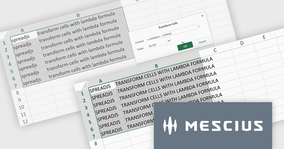
The SpreadJS 18.2 adds a new Transform command which enables you to apply LAMBDA functions directly to a selected range of cells and replace the original content with calculated results. This simplifies data transformations - whether mapping, filtering, or reshaping - into a clean, single-step process. With this feature, you can select any range and apply a custom LAMBDA formula - for example, converting units, adjusting values, or formatting entries - and have SpreadJS overwrite the selection with the computed results immediately. This removes manual steps like inserting formulas in separate cells, copying values, or pasting back as values. This feature integrates with SpreadJS’s existing LAMBDA capabilities to offer more interactive and efficient spreadsheet manipulation.
To see a full list of what's new in 18.2, see our release notes.
SpreadJS is licensed per developer and includes 1 Year Maintenance (major and minor version releases and unlimited support phone calls). SpreadJS requires an Annual or Perpetual Deployment License. The optional Add-ons are available at an additional cost, and require a SpreadJS license. See our SpreadJS licensing page for full details.
For more information, visit our SpreadJS product page.
SurveyJS Dashboard is a JavaScript UI component that visualizes survey responses in real time using interactive charts and tables, helping teams analyze data quickly and efficiently. It integrates with any JavaScript framework, including Angular, React, Vue, and vanilla JS. The dashboard renders data based on JSON schemas created in Survey Creator and filled with responses from the Form Library. Its flexible, backend-independent design allows integration with any custom backend. With a variety of chart types, it supports use cases such as customer feedback, employee surveys, and market research by turning raw data into clear visual insights.
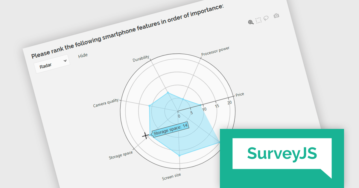
The SurveyJS Dashboard v2.3.0 update introduces support for radar charts, which developers can use to represent rank-based responses more intuitively, helping users gain clearer insights into survey data without additional configuration. This new chart type is automatically available for Ranking questions and can be selected directly from the chart type menu within the Dashboard.
To see a full list of what's new in version 2.3.0, see our release notes.
SurveyJS Dashboard is licensed per developer with a one-time payment for indefinite use. Access to updates and technical support is available through a subscription. See our SurveyJS Dashboard licensing page for full details.
Learn more on our SurveyJS Dashboard product page.
Cell-level editing and interaction features are essential components of any modern spreadsheet application, as they directly influence how users enter, modify, and manage data at the most granular level. These capabilities go beyond basic typing to provide enhanced flexibility, control, and context, enabling users to maintain accuracy while streamlining workflows. A well-designed set of cell-level tools supports both data integrity and user productivity, ensuring that spreadsheets can handle everything from quick updates to complex, structured datasets with efficiency and precision.
Common features include:
For an in-depth analysis of features and price, visit our Angular spreadsheet components comparison.

RadiantQ is a globally recognized developer of high-quality .NET-based UI components, with a clear focus on delivering robust scheduling and planning solutions. Their suite of products empowers developers to create sophisticated project management and resource scheduling interfaces within modern applications. Their offerings span a range of platforms, making them a go-to partner for organizations building cross-platform enterprise solutions.
At the core of RadiantQ’s product line is RadiantQ WPF Gantt, a powerful control set built natively in WPF for performance and elegance. With features like effort-driven scheduling, progress tracking, localization, flexible printing, and intuitive data binding, developers gain a complete toolkit for building dynamic, enterprise-grade scheduling applications.
Through its partnership with RadiantQ, ComponentSource is able to extend a compelling catalog of UI components to its global customer base. By offering RadiantQ’s specialized Gantt solutions, ComponentSource addresses a niche for customers seeking advanced project visualization tools, while ensuring worldwide access, licensing support, and regional purchasing convenience. This collaboration reinforces ComponentSource’s role as a trusted distributor of software components from leading vendors around the world.
RadiantQ WPF Gantt is licensed per named developer. It allows royalty-free distribution within your organization. It includes a one-year subscription with support and updates, while the Source Edition adds full source code and priority support. See our RadiantQ WPF Gantt licensing page for more details.
Learn more on our RadiantQ brand page.
SmartClient is a powerful JavaScript component suite compatible with React, Vue, Angular, and more, designed for building large-scale, high-performance web apps. It offers advanced UI components, dynamic data handling, customizable grids, and responsive design. Ideal for enterprise use cases like financial analytics and real-time reporting, SmartClient supports seamless backend integration and delivers optimized performance and scalability.
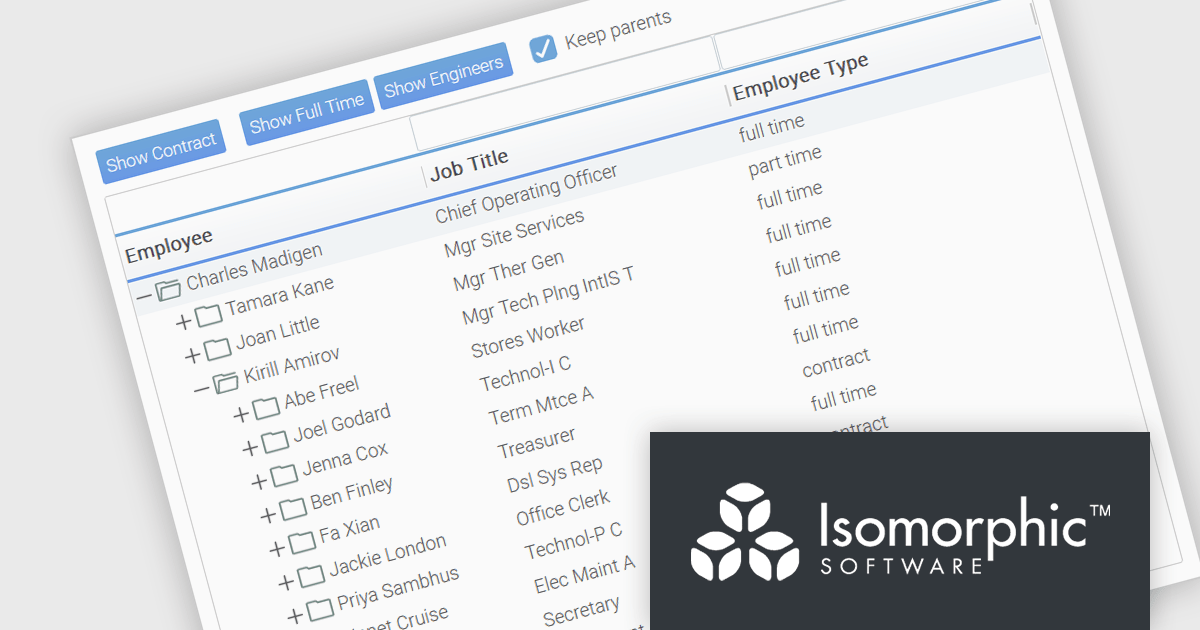
SmartClient has enhanced hierarchical data handling with the included KeepParentsOnFilter setting, ensuring that parent nodes remain visible in filtered views, even when data is loaded dynamically. It loads "skeleton branches" via a complex client-driven algorithm, automatically managed by SmartClient, to maintain high performance without preloading the entire tree, meaning it doesn't require server-side programming. This is particularly useful in large datasets with load-on-demand trees, as it allows users to maintain full visibility into the structure of filtered results without losing context. By preserving the hierarchical path to matching records, this feature improves usability and clarity in tree-based components, especially in applications where understanding the parent-child relationship is critical.
SmartClient is licensed per developer and is available as both perpetual and subscription licenses. Product updates and technical support is also available. See our SmartClient licensing page for full details.
For more information, visit our SmartClient product page.
電話: (888) 850 9911
Fax: +1 770 250 6199


