


公式サプライヤー
公式および認定ディストリビューターとして200社以上の開発元から正規ライセンスを直接ご提供いたします。
当社のすべてのブランドをご覧ください。

ONLYOFFICE Docs is a comprehensive online editor, allowing users to create text documents, spreadsheets, presentations, and forms. It enables your users to edit, share, and collaborate on documents online in their preferred browser, within your own application. It is fully compatible with OOXML (Office Open XML) formats and supports popular Microsoft Office and other document formats such as CSV, DOC, DOCX, EPUB, HTML, ODP, ODS, ODT, PDF, PPT, PPTX, RTF, TXT, XLS, and XLSX.
The ONLYOFFICE Docs v8.2 update adds support for performing iterative calculations. This enables formulas to be repeatedly recalculated until a specific, stable result is reached or a set number of attempts is made. By setting iteration limits and defining acceptable precision levels, iterative calculations enable users to control the number of recalculations, allowing the formula to reach an approximation or convergence point that serves as the final value. This process is particularly useful when dealing with circular references, where a formula refers to its own cell either directly or through a sequence of references involving other cells. Without iterative calculations, such formulas would produce errors, as they would require an infinite loop of recalculations. This is widely used in scenarios requiring complex dependencies, such as financial projections, engineering simulations, and scientific modeling.
To see a full list of what's new in v8.2.0, see our release notes.
ONLYOFFICE Docs is licensed by the number of simultaneous document connections and is available as an annual license with 1 year support and upgrades. See our ONLYOFFICE Docs licensing page for full details.
For more information, see our ONLYOFFICE Docs product page.
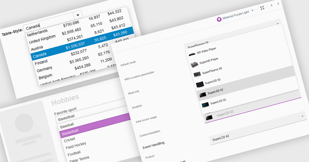
ComboBoxes for Angular are versatile form controls that allow users to select from a predefined list of options or input custom values directly. They provide a flexible and efficient way to handle data entry by combining the ease of selection with the ability to manually input text. For developers, ComboBoxes streamline the user experience by reducing the need for additional input fields while maintaining a clean interface. They enhance data validation and user efficiency, as they can filter large datasets based on user input and bind seamlessly to Angular models, ensuring smooth integration within dynamic forms and grid-based editors.
For an in-depth analysis of features and price, visit our Angular Data Editors controls comparison.
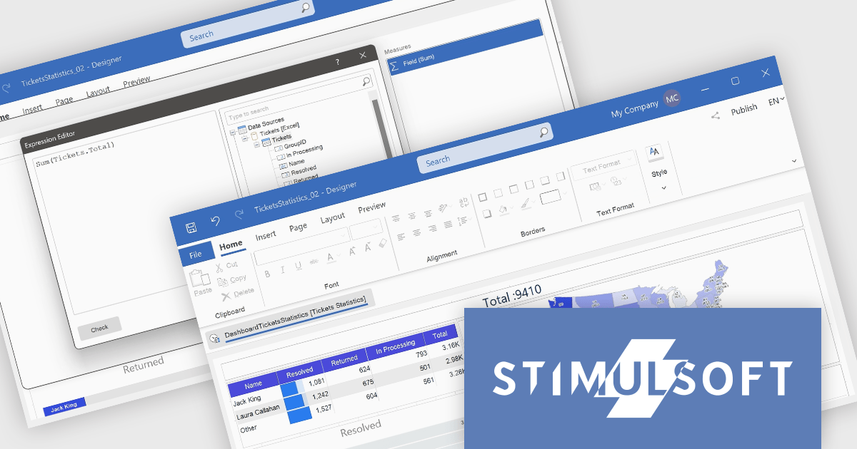
Stimulsoft Dashboards.WEB is a versatile suite of tools for crafting interactive data visualizations for web and desktop applications. It empowers developers to embed intuitive dashboards across various platforms, using the platform-specific components or a centralized cloud designer. With rich data analysis elements, extensive customization options, and pre-built templates, Stimulsoft Dashboards helps you transform complex data into clear, actionable insights for any audience.
The Stimulsoft Dashboards.WEB 2024.4.1 release adds the ability to create Measures within the Text dashboard element, which significantly enhances the flexibility and functionality of dashboards by allowing users to dynamically incorporate calculated values into text elements. This feature enables more informative and contextualized reports, as users can seamlessly display and update relevant metrics directly within the text, eliminating the need for separate data visualization components. This not only streamlines dashboard creation but also improves data accessibility and understanding for end-users.
To see a full list of what's new in 2024.4.1, see our release notes.
Stimulsoft Dashboards.WEB is licensed per developer and is available as a perpetual license with 1 year support and maintenance. See our Stimulsoft Dashboards.WEB licensing page for full details.
Stimulsoft Dashboards.WEB is available in the following products:

ActiveReportsJS by MESCIUS is a JavaScript reporting toolkit that empowers developers to design and embed interactive reports within web applications. It offers a standalone report designer for crafting reports and a JavaScript report viewer component for seamless integration into web frameworks like React or vanilla JavaScript. This solution streamlines report creation, facilitates data visualization, and delivers a user-friendly report experience.
The ActiveReportsJS 5.1 update introduces a Master Report feature, which improves report design efficiency by allowing developers to create reusable templates that define common elements such as headers, footers, and styles. Multiple reports can inherit shared components, reducing redundancy and simplifying maintenance. Developers can ensure consistency across reports and make global updates more efficiently, making it easier to scale for larger applications. Using a master report template is valuable in dynamic web applications, where maintaining uniform reporting structures is crucial for delivering a cohesive user experience.
To see a full list of what's new in 5.1, see our release notes.
ActiveReportsJS is licensed on an annual subscription or perpetual basis and is available as a Single Deployment License for non-commercial use, and as a Single Domain License or Unlimited Domain License for commercial and/or SaaS use. See our ActiveReportsJS licensing page for full details.
Learn more on our ActiveReportsJS product page.
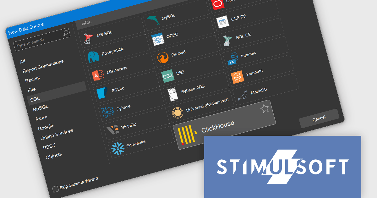
Stimulsoft Reports.WEB is a cross-platform reporting solution designed for integration within web applications. It leverages a client-server architecture for report generation, viewing, printing, and exporting directly in web browsers. Its powerful .NET report engine offers efficient report processing, a user-friendly HTML5 report designer for building reports with various data sources and visualizations, and an interactive HTML5 viewer for seamless report display within web applications. This integration allows developers to implement robust reporting functionalities without browser plugins or additional client-side dependencies.
The Stimulsoft Reports.WEB 2024.4.1 release adds the ability to connect to the ClickHouse online data storage and exchange service directly from the report designer. This eliminates the need for complex data extraction and transformation processes, streamlining the reporting workflow and improving efficiency. By connecting to ClickHouse, users can leverage its powerful analytical capabilities and real-time data processing features to generate dynamic and informative reports.
To see a full list of what's new in 2024.4.1, see our release notes.
Stimulsoft Reports.WEB is licensed per developer and is available as a perpetual license with 1 year support and maintenance. See our Stimulsoft Reports.WEB licensing page for full details.
Stimulsoft Reports.WEB is available in the following products:
電話: (888) 850 9911
Fax: +1 770 250 6199


