













公式サプライヤー
公式および認定ディストリビューターとして200社以上の開発元から正規ライセンスを直接ご提供いたします。
当社のすべてのブランドをご覧ください。
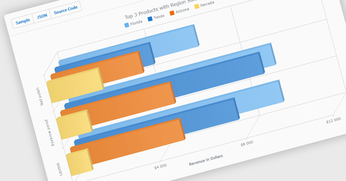
A selection of jQuery chart controls offer 3D capabilities, allowing data visualization to extend beyond the flat plane. This enables a more immersive and engaging user experience, particularly for complex datasets. Three-dimensional charts can be beneficial for highlighting patterns and relationships between multiple variables, making them ideal for scientific visualizations, financial data representation, or showcasing product features in a unique way.
Several jQuery chart controls offer 3D charts including:
For an in-depth analysis of features and price, visit our comparison of jQuery chart controls.
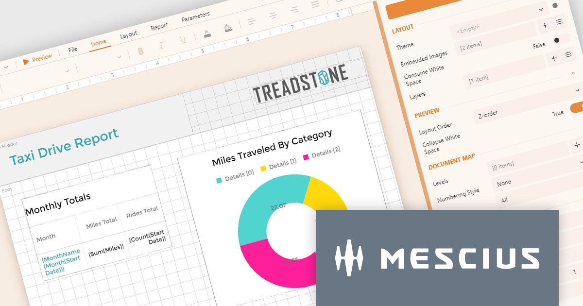
ActiveReportsJS by MESCIUS is a JavaScript reporting toolkit that empowers developers to design and embed interactive reports within web applications. It offers a standalone report designer for crafting reports and a JavaScript report viewer component for seamless integration into web frameworks like React or vanilla JavaScript. This solution streamlines report creation, facilitates data visualization, and delivers a user-friendly report experience.
The ActiveReportsJS 5.0 update modernizes the development experience by refreshing the look and feel of both the Report Designer and Report Viewer components with new icons and colors. This enhances clarity and consistency and improves the design environment. Improved theming capabilities empower you to effortlessly apply pre-defined themes or customize the designer's appearance to match your application's branding, fostering a more cohesive user experience within your web applications.
To see a full list of what's new in 5.0, see our release notes.
ActiveReportsJS is licensed on an annual subscription or perpetual basis and is available as a Single Deployment License for non-commercial use, and as a Single Domain License or Unlimited Domain License for commercial and/or SaaS use. See our ActiveReportsJS licensing page for full details.
Learn more on our ActiveReportsJS product page.
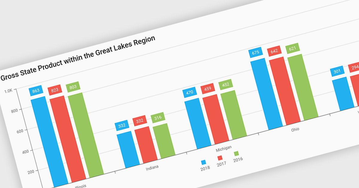
Bar and column charts, though sometimes referred to interchangeably, are vital tools for visualizing data within software applications. Their simple format, with bars representing categories and their lengths proportional to corresponding values, allows users to quickly grasp comparisons between different data sets. This makes them ideal for dashboards displaying sales figures across regions, project management tools tracking task completion rates, or any scenario where users need to compare metrics at a glance. Their effectiveness lies in their ability to present complex information in a clear and concise manner, facilitating informed decision-making within software applications.
Several React Chart controls offer column and bar charts including:
For an in-depth analysis of features and price, visit our React Chart controls comparison.
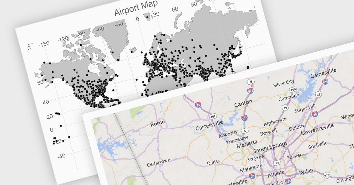
UI suites often include map components that streamline the development process for applications displaying geographical data. These components integrate seamlessly with the chosen framework, offering features like base map selection, zoom controls, and location markers. They can be customized to display real-time data visualizations, allowing users to explore trends and patterns across geographic regions. This functionality is valuable for applications in logistics, e-commerce, and any industry where location plays a key role.
Several Vue.js UI suites offer mapping functionality, including:
For an in-depth analysis of features and price, visit our comparison of Vue.js UI suites.
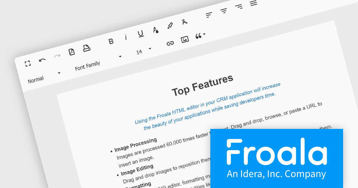
Froala Editor is a JavaScript-based WYSIWYG HTML editor that empowers developers to seamlessly integrate rich text editing functionalities into their applications. Despite its extensive feature set of over 100 options, Froala prioritizes user experience through a cleverly designed toolbar. Actions are categorized into four intuitive scopes, ensuring every feature is readily accessible while maintaining a clean and uncluttered interface. This balance of power and usability makes Froala Editor a versatile solution for a wide range of content creation scenarios.
Froala Editor's powerful features for creating dynamic page content include:
View the full blog post to learn more about this customizable editor for your business.
Froala Editor is licensed on an annual or perpetual basis, with annual licenses available for 1, 2, or 3 years. See our Froala Editor licensing page for full details.
For more information, see our Froala Editor product page.
電話: (888) 850 9911
Fax: +1 770 250 6199


