


公式サプライヤー
公式および認定ディストリビューターとして200社以上の開発元から正規ライセンスを直接ご提供いたします。
当社のすべてのブランドをご覧ください。
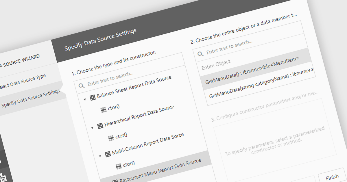
IEnumerable data connectivity allows for easy binding of reports to in-memory collections or objects that implement the IEnumerable interface, such as list
Several .NET reporting components offer IEnumerable data connectivity including:
For an in-depth analysis of features and price, visit our comparison of .NET reporting controls.
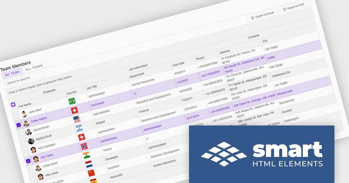
Smart UI by Smart HTML Elements is an enterprise-grade UI library offering pre-built web components for developers in Angular, React, Vue, Blazor, and JavaScript. It boasts over 60 ready-to-use components like grids, charts, schedulers, and editors, all featuring two-way data binding, responsiveness, accessibility, and theming capabilities. This library helps developers rapidly build dynamic and modern web applications with consistent look-and-feel and rich functionalities, accelerating development time and ensuring professional quality.
The Smart UI v21.0.0 release introduces significant enhancements to grid Excel export functionality. Users can now export one or more images from grids or components directly into Excel files and limit exports to selected rows or cells. These features provide greater flexibility, enabling users to include precisely the data they need while adding visual context to enhance understanding. The ability to tailor exports in this way ensures clearer communication of the underlying meaning and significance of the data.
To see a full list of what's new in v21.0.0, see our release notes.
Smart UI (Smart HTML Elements) is licensed per developer and is available as a perpetual license with 1 year support and maintenance. It includes distribution to unlimited Web applications, SaaS projects, Intranets and Websites. Team, OEM and Enterprise licensing options are also available. See our Smart UI licensing page for full details.
Learn more on our Smart UI product page.
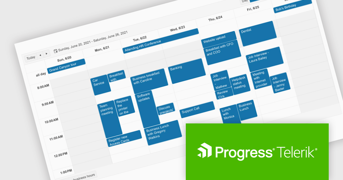
Telerik UI for Blazor is a comprehensive UI library that provides over 110 native and customizable Blazor components for building modern and feature-rich web applications. This professional-grade solution offers a complete set of components to satisfy all user interface requirements, saving time and effort in UI design.
The Telerik UI for Blazor v7.0.0 update (part of the 2024 Q4 release) makes customization even easier with a number of enhancements to the Scheduler component. The Agenda View provides a concise, scrollable list of scheduled events. The ToolbarTemplate allows for custom toolbar configurations, while the Resource Grouping Template enables tailored resource-based layouts. Additionally, the option to hide the "All Day" panel creates a more streamlined display. These features enable developers to deliver highly customizable and user-centric scheduling solutions, improving clarity, usability, and adaptability in applications.
To see a full list of what's new in 2024 Q4 (v7.0.0), see our release notes.
Telerik UI for Blazor is licensed per developer and is available as a perpetual license with a one year support subscription, which is available in three tiers: Lite, Priority or Ultimate. See our Telerik UI for Blazor licensing page for full details.
Telerik UI for Blazor is available individually or as part of the following products:
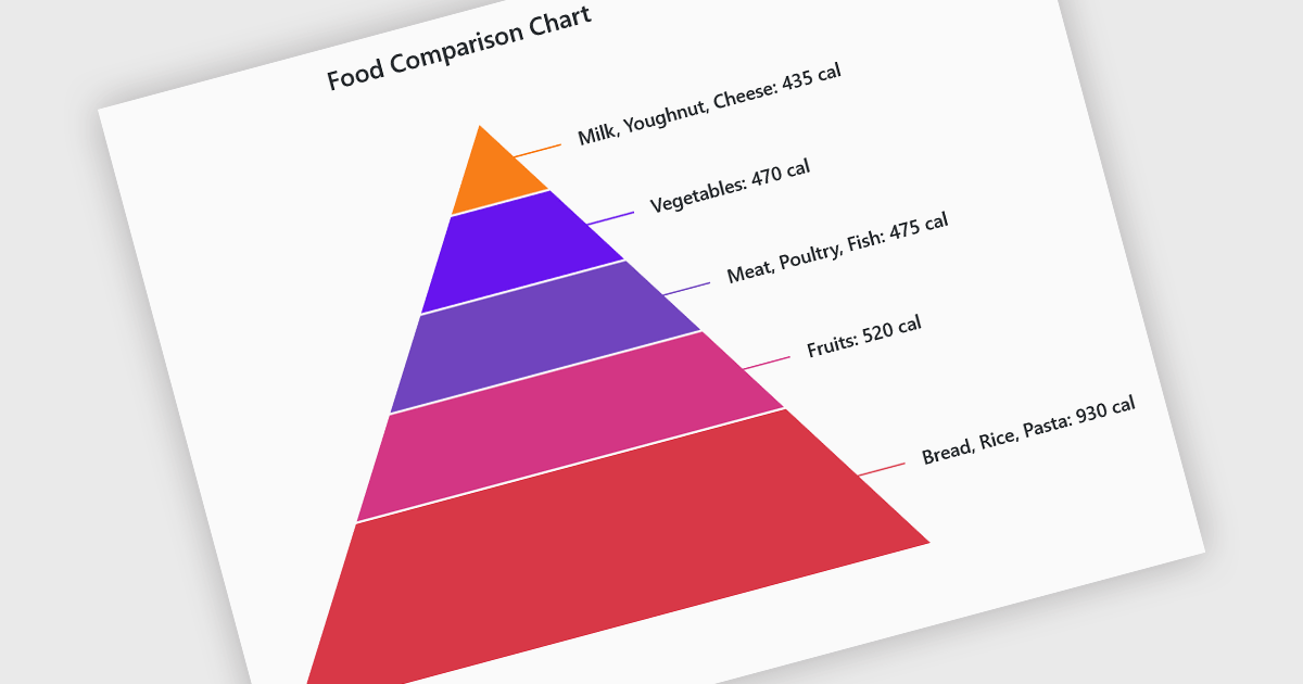
Pyramid charts are a type of graphical representation that organizes data hierarchically, with each layer of the pyramid representing a category or level within the dataset. These charts are particularly useful for displaying proportions, relationships, or workflows where data is segmented into tiers, such as organizational structures, population distributions, or sales funnels. Their clear visual hierarchy makes it easy to compare the relative size of categories or levels at a glance. Pyramid charts are beneficial in highlighting the relative contribution of parts to a whole, visualizing attrition or progression across stages, and presenting data in an intuitive and compact format. Popular use cases include illustrating business sales funnels, demographic distributions in marketing, and resource allocation in project management, making them a versatile tool in both strategic planning and data analysis.
Several Blazor chart controls offer pyramid charts including:
For an in-depth analysis of features and price, visit our Blazor chart controls comparison.
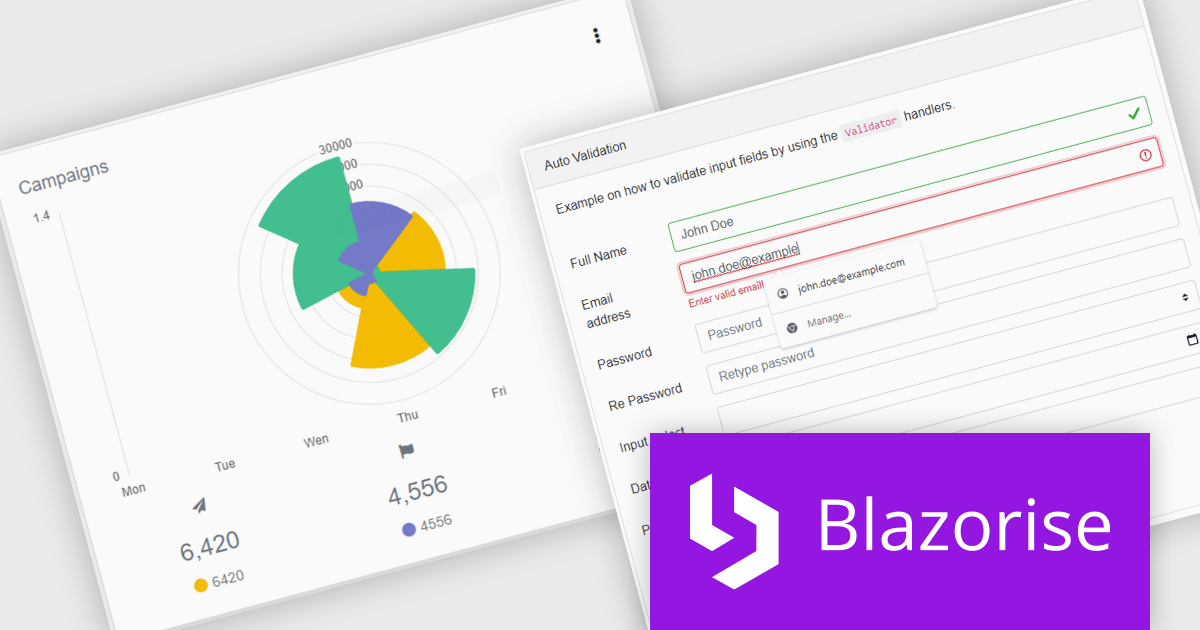
Blazorise is a versatile component library that empowers developers to build modern and feature-rich web applications using Blazor, a client-side web development framework from Microsoft. It offers a comprehensive collection of user interface components, including buttons, forms, charts, and navigation elements, all built with accessibility and responsiveness in mind.
The Blazorise 1.7 update brings full compatibility with .NET 9, providing software developers with access to the latest features and enhancements in the .NET ecosystem. This integration ensures improved application performance, streamlined workflows, and strengthened security measures, aligning with the latest industry standards. By leveraging .NET 9, developers can build more efficient, scalable, and secure web applications while ensuring long-term compatibility with modern frameworks and tools. This update underscores Blazorise's commitment to delivering cutting-edge solutions that enhance developer productivity and project outcomes.
To see a full list of what’s new in version 1.7, see our release notes.
Blazorise is licensed per developer and is runtime royalty free. Licenses include a 1 year subscription for updates and premium support. Professional, Enterprise, and Enterprise Plus editions are available, each offering tailored levels of support and service to meet varying business needs. See our Blazorise licensing page for full details.
For more information, visit our Blazorise product page.
電話: (888) 850 9911
Fax: +1 770 250 6199


