


公式サプライヤー
公式および認定ディストリビューターとして200社以上の開発元から正規ライセンスを直接ご提供いたします。
当社のすべてのブランドをご覧ください。
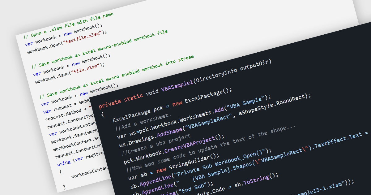
.NET spreadsheet components with VBA code and macro support empower developers to integrate existing Excel automation functionalities within their applications. This unlocks the benefits of the .NET framework, enhancing performance, security, and scalability of spreadsheet operations. Developers can access, modify, and save embedded VBA scripts, ensuring seamless operation in environments that support VBA execution. This fosters continued automation and functionality even when legacy systems or non-VBA-enabled environments are involved, while also enabling code updates, debugging, and preparation for code-execution-friendly settings.
Several .NET spreadsheet components offer VBA code/macro support, including:
For an in-depth analysis of features and price, visit our comparison of .NET spreadsheet components.

Grial UI Kit by UXDivers is a collection of pre-designed user interface components and templates specifically built for Xamarin.Forms and .NET MAUI app development. It offers a wide range of customizable XAML code snippets, custom controls, and helpers, allowing developers to rapidly build modern and visually appealing mobile applications for Android and iOS platforms while focusing on the core functionalities of the app.
The Grial UI Kit 2024.3 release introduces a highly requested feature: the Grial Calendar control. Designed to streamline the process of selecting dates and date ranges, this intuitive calendar is perfect for a variety of use cases. Whether you are scheduling appointments, booking events, or simply allowing users to pick dates in your .NET MAUI applications, the Grial Calendar provides a beautiful and user-friendly experience. The control is also fully customizable, giving you the freedom to style and configure it to perfectly match the look and feel of your app.
To see a full list of what's new in 2024.3, see our release notes.
Grial UI Kit is licensed per application and is available as an perpetual license. See our Grial UI Kit licensing page for full details.
For more information, see our Grial UI Kit product page.
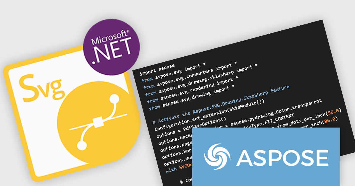
Aspose.SVG for Python via .NET is a comprehensive software development library that empowers developers working in Python to seamlessly manipulate and manage SVG (Scalable Vector Graphics) files. This on-premise class library integrates .NET functionality within the Python environment, providing a robust suite of tools for SVG creation, editing, optimization, and conversion. Aspose.SVG for Python via .NET adheres to official SVG specifications, ensuring compatibility and efficient development.
This powerful solution unlocks a variety of use cases for developers. They can leverage Aspose.SVG for Python via .NET to construct SVG graphics from scratch, modify existing SVG content, and optimize file size for efficient storage and transmission. The library facilitates effortless conversion of SVGs into popular formats like PDF, PNG, and JPEG, fostering greater versatility within development projects. Aspose.SVG for Python via .NET empowers developers to create applications like SVG editors, image vectorizers, and document converters, streamlining SVG processing workflows.
Aspose.SVG for Python via .NET is offered as Developer Small Business, Developer OEM, Developer SDK, Site Small Business, Site OEM, and Site SDK licenses catering to a range of business needs. Licenses are perpetual, and include 1 year of support and maintenance. Subscription renewals are also available. See our Aspose.SVG for Python via .NET licensing page for full details.
Aspose.SVG for Python via .NET is available in the following products:
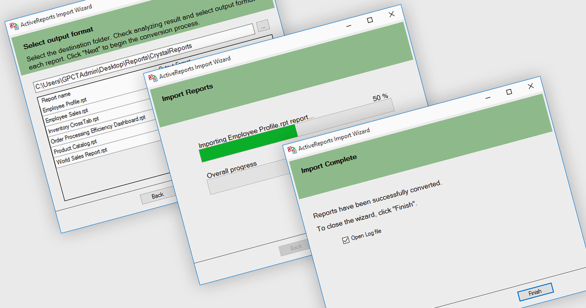
.NET reporting controls address the challenge of integrating existing reports into new .NET applications. These controls offer conversion tools that can import reports from popular third-party vendors, allowing you to seamlessly migrate your reporting functionality without starting from scratch. This not only saves development time but also ensures continuity for users familiar with the previous report format. These controls are ideal for scenarios where legacy applications are being modernized or when integrating reports from acquired systems.
Several .NET reporting controls offer third party report conversion, including:
For an in-depth analysis of features and price, visit our comparison of .NET reporting controls.
Syncfusion Essential Studio WPF, available as part of Syncfusion Essential Studio Enterprise, is a powerful suite of over 95 UI controls, 50+ charts, and document processing libraries designed to boost the development of high-performance line-of-business applications for the Windows Presentation Foundation (WPF) framework. With built-in themes, touch-friendly interfaces, and seamless Visual Studio integration, it empowers developers to craft modern, feature-rich, and cross-platform experiences with ease.
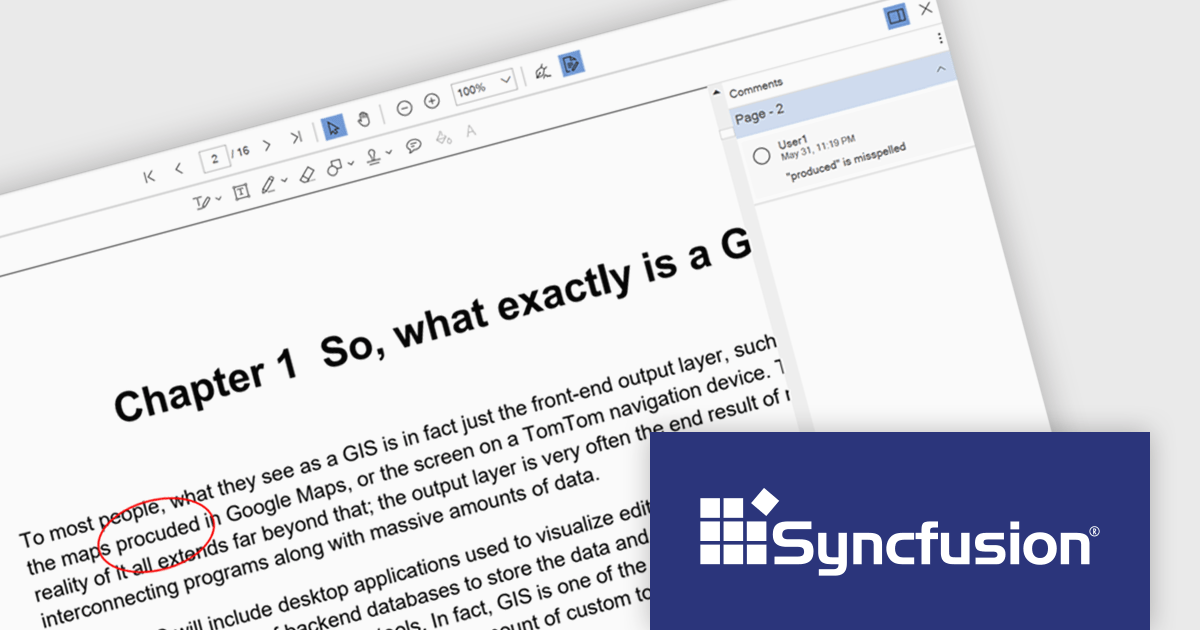
The Syncfusion Essential Studio WPF 2024 Volume 2 (26.1.35) release enhances the PDF Viewer by allowing users to add, edit, and delete comments on annotations within PDF documents. Users can reply to comments and set their status through the comment panel, facilitating dynamic and interactive document review. By enabling replies and status tracking, reviewers can have threaded discussions and ensure all feedback is addressed, improving the overall efficiency and clarity of the review process.
To see a full list of what's new in 2024 Volume 2 (26.1.35), see our release notes.
Syncfusion Essential Studio WPF is available as part of Syncfusion Essential Studio Enterprise which is licensed per developer starting with a Team License of up to five developers. It is available as a 12 Month Timed Subscription License which includes support and maintenance. See our Syncfusion Essential Studio Enterprise licensing page for full details.
Learn more on our Syncfusion Essential Studio WPF product page.
電話: (888) 850 9911
Fax: +1 770 250 6199


