


公式サプライヤー
公式および認定ディストリビューターとして200社以上の開発元から正規ライセンスを直接ご提供いたします。
当社のすべてのブランドをご覧ください。
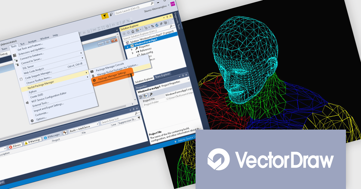
VectorDraw Developer Framework (VDF) is a software development toolkit that equips you to create, edit, and manage 2D and 3D drawings directly within your applications. This framework provides a comprehensive graphics engine library compatible with popular vector formats and includes tools for exporting drawings to various file types, including PDF. VDF utilizes an object-oriented approach and offers ActiveX and .NET integration for seamless incorporation into your development workflow.
The VectorDraw Developer Framework (VDF) v11 update streamlines the integration of advanced drawing capabilities into your .NET 6 applications with the introduction of a new core library. The added VectorDraw.Drawing.Framework.Net-6.x nuget library (now available alongside the VectorDraw.Drawing.Framework.Net-4.x) leverages the performance and features of .NET 6, providing a more efficient and robust foundation for incorporating vector graphics into your projects.
To see a full list of what's new in v11, see our release notes.
VectorDraw Developer Framework (VDF) is licensed per developer, per year. During the annual license period you will receive all major and minor upgrades of the VDF libraries plus support from the VDF support team. To continue to use the software you will need to renew your license each year. See our VectorDraw Developer Framework (VDF) licensing page for full details.
Learn more on our VectorDraw Developer Framework (VDF) product page.
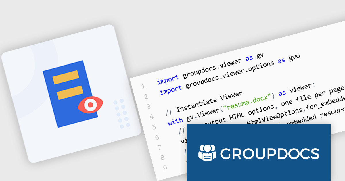
GroupDocs.Viewer for Python via .NET is a software development library that empowers developers to integrate document viewing capabilities into their Python applications. It acts as a bridge between the Python programming language and the .NET framework, enabling developers to leverage the robust document processing functionalities of GroupDocs.Viewer within their Python codebase.
GroupDocs.Viewer for Python via .NET unlocks a variety of use cases for Python developers. It allows for the creation of desktop and web-based applications that can view and render over 170 file formats, including popular document types including PDF, images, Microsoft Word, Excel, PowerPoint, Visio, Project, Outlook and OneNote. Developers can leverage this functionality to build document management systems, online collaboration tools, or internal file viewers within their Python applications. This flexible library also enables customization of the rendering process, allowing for control over output formats and watermarking.
GroupDocs.Viewer for Python via .NET is offered as Developer Small Business, Developer OEM, Site Small Business, and Site OEM licenses catering to a range of business needs. Licenses are perpetual, and include 1 year of support and maintenance. Subscription renewals are also available. See our GroupDocs.Viewer for Python via .NET licensing page for full details.
GroupDocs.Viewer for Python via .NET is available in the following products:
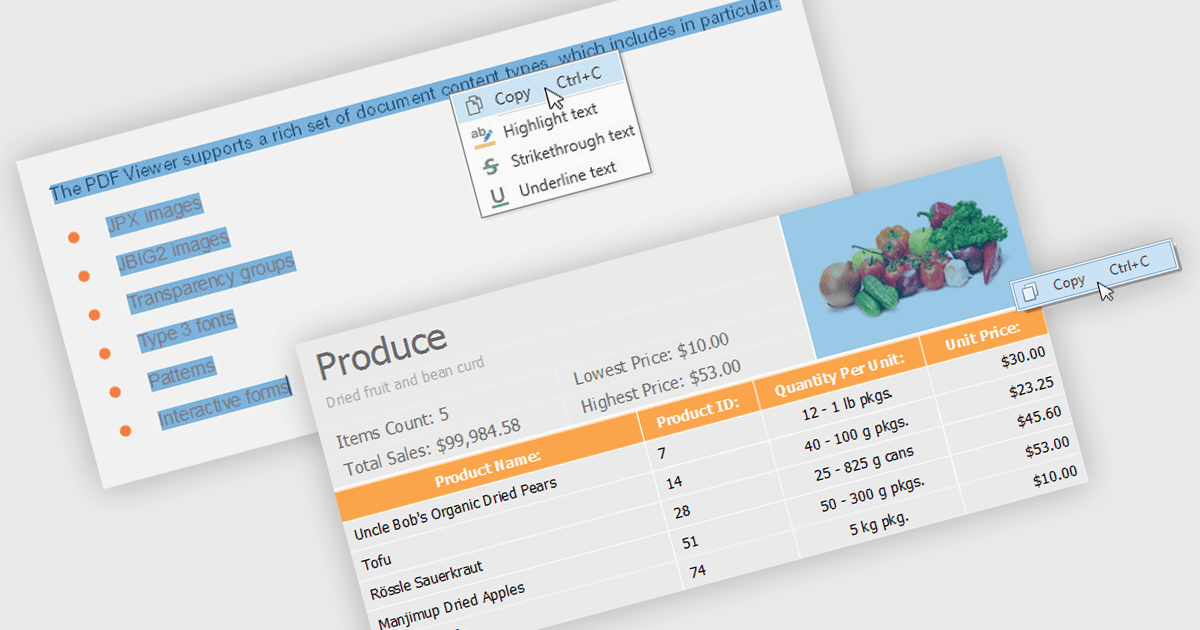
.NET 8 WPF PDF viewers with content extraction capabilities empower end users to unlock valuable information from PDF documents. This functionality goes beyond simply viewing the document and allows users to extract both text and image content. This extracted data can then be saved for further analysis, integrated into other applications, or used to populate forms and reports, streamlining workflows and enhancing the overall user experience.
Several .NET 8 WPF PDF viewer components enable content extraction from PDFs including:
For an in-depth analysis of features and price, visit our .NET 8 WPF PDF viewer components comparison.

DevExpress BI Dashboard (part of DevExpress Universal) empowers you to craft interactive dashboards for desktop, web and mobile applications. It provides a visual designer for building dashboards without writing code, allowing you to drag-and-drop various data visualization widgets onto the canvas. These widgets connect to your data sources and update dynamically, offering real-time insights to end users. The tool also supports customization through properties and events, enabling you to tailor the look and feel of the dashboards to perfectly integrate with your application's design.
The DevExpress BI Dashboard 24.1 release adds support for cascading parameters. This powerful feature allows you to create intuitive filter hierarchies within your dashboards. Imagine selecting a value in a parent parameter, then watching as the options in a dependent parameter automatically update to reflect the chosen filter. This eliminates the need for users to manually navigate through potentially overwhelming dropdown lists, fostering a more focused and efficient experience. Cascading parameters empower you to design dashboards that guide users towards deeper insights within your data.
To see a full list of what's new in version 24.1, see our release notes.
DevExpress BI Dashboard is included as part of DevExpress Universal which is licensed per developer and is available as a Perpetual License with a 12 month support and maintenance subscription. See our DevExpress Universal licensing page for full details.
DevExpress BI Dashboard is available in the following products:
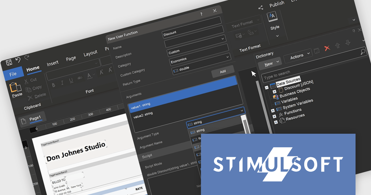
Stimulsoft Reports.WEB is a cross-platform reporting solution designed for integration within web applications. It leverages a client-server architecture for report generation, viewing, printing, and exporting directly in web browsers. Its powerful .NET report engine offers efficient report processing, a user-friendly HTML5 report designer for building reports with various data sources and visualizations, and an interactive HTML5 viewer for seamless report display within web applications. This integration allows developers to implement robust reporting functionalities without browser plugins or additional client-side dependencies.
The Stimulsoft Reports.WEB 2024.3 release empowers developers with user-defined functions within the data dictionary. This functionality extends report capabilities by allowing creation of custom logic using either the visual programming tool Blockly or directly in supported scripting languages. These user-defined functions can be seamlessly integrated into reports enabling developers to address complex calculations, data transformations, or custom formatting logic without code modifications in the main application. This streamlines development, promotes code reusability, and fosters a more dynamic reporting environment.
To see a full list of what's new in version 2024.3, see our release notes.
Stimulsoft Reports.WEB is licensed per developer and is available as a Perpetual license with 1 year support and maintenance. See our Stimulsoft Reports.WEB licensing page for full details.
Stimulsoft Reports.WEB is available in the following products:
電話: (888) 850 9911
Fax: +1 770 250 6199


