


公式サプライヤー
公式および認定ディストリビューターとして200社以上の開発元から正規ライセンスを直接ご提供いたします。
当社のすべてのブランドをご覧ください。
Stimulsoft Dashboards.WIN is a versatile suite of tools for crafting interactive data visualizations for web and desktop applications. It empowers developers to embed intuitive dashboards across various platforms, using platform-specific components or a centralized cloud designer. With data analysis elements, customization options, and pre-built templates, Stimulsoft Dashboards helps you transform complex data into clear, actionable insights for any audience.
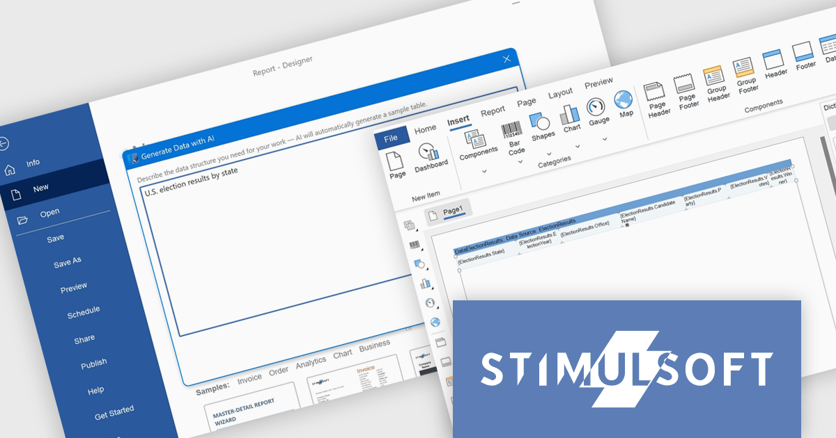
The latest Stimulsoft Dashboards.WIN update introduces AI-powered data generation, enabling developers to quickly create realistic sample datasets using natural language prompts directly within the report designer. This improves the prototyping process by removing the need for manual data setup or external demo files, allowing for faster iteration, testing, and visualization of report layouts.
Stimulsoft Dashboards.WIN is licensed per developer and is available as a perpetual license with 1 year support and maintenance. See our Stimulsoft Dashboards.WIN licensing page for full details.
Stimulsoft Dashboards.WIN is available individually or as part of Stimulsoft Ultimate.
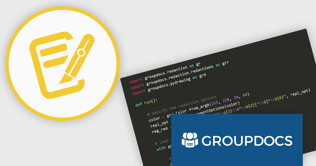
GroupDocs.Redaction for Python via .NET is a powerful, cross-platform API designed to enable Python developers to remove sensitive or confidential information from documents by leveraging the GroupDocs.Redaction engine built on .NET. It provides a unified interface for redacting text, metadata, annotations, images, spreadsheets, and even scanned content using optical character recognition (OCR) across more than 50 file types, including PDFs, Microsoft Office formats, OpenDocument formats, and common images.
By integrating GroupDocs.Redaction for Python via .NET, organizations benefit from a comprehensive and format-agnostic solution for sanitizing documents in Python-based workflows. It supports precise control through exact phrase, regex, metadata, annotation, and image-area redactions, plus filters for defining page ranges and regions. OCR integration allows secure redaction of scanned and image-based documents. Users can export redacted files either in their original format for further editing or as rasterized PDFs to prevent text extraction. The API is well-suited for automating compliance-related tasks in legal, healthcare, finance, or government systems. It also simplifies bulk processing with redaction policies, protects sensitive metadata, and ensures redaction consistency across diverse file types, all without requiring additional software dependencies.
GroupDocs.Redaction for Python via .NET is offered as Developer Small Business, Developer OEM, Site Small Business, and Site OEM licenses catering to a range of business needs. Licenses are perpetual, and include 1 year of support and maintenance. Subscription renewals are also available. See our GroupDocs.Redaction for Python via .NET licensing page for full details.
GroupDocs.Redaction for Python via .NET is available individually or as part of the following products:
Devolutions Server is a secure, on-premises solution designed to centralize and manage privileged access, credentials, and remote connections for organizations. It enables IT professionals and software developers to securely store and share sensitive data like passwords, API keys, and remote session details within a centralized vault, with robust user access controls and role-based permissions. Devolutions Server integrates with existing infrastructure, supports multi-factor authentication, and provides auditing and logging capabilities to track activities and ensure compliance with security policies.
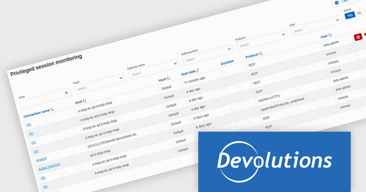
Devolutions Server now includes a centralized privileged sessions view that lets developers and administrators track and manage all active privileged sessions initiated through the Devolutions Gateway, accessible via Remote Desktop Manager when connected to a Devolutions Server data source. This view provides immediate visibility into who is connected, enables real‑time session shadowing, lets you manage session recordings even after the originating entry is closed, and empowers authorized users to terminate sessions directly. By consolidating active session status, recordings, and controls in one place, it enhances oversight, auditing, and incident response capabilities without needing to switch between tools.
Devolutions Server is available as part of the Devolutions Starter Pack, which is licensed per user and offered as an annual subscription. See our Devolutions Server licensing page for full details.
For more information, visit our Devolutions Server product page.
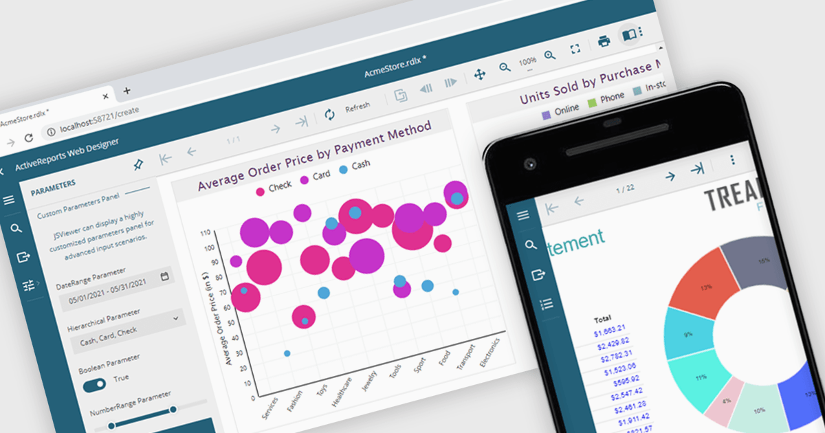
A JavaScript report viewer in a .NET reporting component is a client-side web interface that allows users to view, navigate, and interact with reports generated by a .NET-based reporting engine. It enables embedding of reports into web applications built with JavaScript frameworks such as Angular, React, or Vue, while relying on the .NET backend to handle report generation and data processing. This setup allows developers to deliver responsive, interactive report viewing experiences within modern browser environments, without requiring full-page reloads or complex server-side rendering.
Several .NET reporting controls feature a JavaScript report viewer including:
For an in-depth analysis of features and price, visit our comparison of .NET reporting controls.
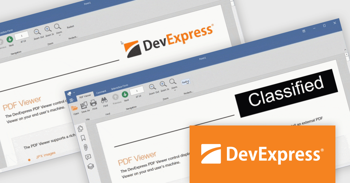
The DevExpress Office File API is a robust library designed to simplify the creation, editing, and processing of popular office document formats, including Word, Excel, PowerPoint, and PDF. It allows developers to integrate advanced document management features into their applications without relying on external software like Microsoft Office. Key features include document generation, data import/export, template customization, and seamless integration with modern platforms. The API supports advanced formatting, encryption, and digital signatures, ensuring secure and professional-grade output. Ideal for enterprise applications, it streamlines workflows for reporting, data analysis, and document automation, saving time and enhancing productivity for developers and end-users alike.
The DevExpress Office File API v25.1 update introduces a powerful redaction feature for PDF files. With the new API, developers can programmatically mark content for redaction and apply redaction annotations, allowing for the secure concealment or removal of sensitive information. In addition to hiding content, the API supports the use of colored text overlays across redacted areas, ensuring clarity and compliance when handling confidential documents. This enhancement is especially valuable for industries where privacy and data protection are essential.
To see a full list of what's new in version 25.1, see our release notes.
DevExpress Office File API is licensed per developer and is available as a Perpetual License with a 12 month support and maintenance subscription. See our DevExpress Office File API licensing page for full details.
DevExpress Office File API is available individually or as part of DevExpress Universal.
電話: (888) 850 9911
Fax: +1 770 250 6199


