


公式サプライヤー
公式および認定ディストリビューターとして200社以上の開発元から正規ライセンスを直接ご提供いたします。
当社のすべてのブランドをご覧ください。
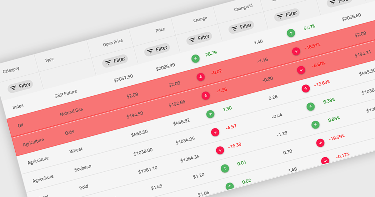
Conditional formatting in a grid refers to the dynamic application of visual styles—such as colors, icons, or font changes—to cells based on the values they contain or rules defined by the developer. This feature enables developers to visually differentiate data patterns, identify anomalies, or highlight critical values directly within a data grid without additional processing or user interaction. By presenting real-time visual cues tied to data content, conditional formatting enhances readability, supports quick analysis, and improves user decision-making, particularly in data-heavy applications where clarity and immediacy are essential.
Several Angular grid controls offer conditional formatting, including:
For an in-depth analysis of features and price, visit our comparison of Angular Grid controls.
KendoReact by Telerik is a comprehensive library of UI components specifically designed for building modern, feature-rich React applications, enabling developers to create intuitive, responsive, and visually appealing interfaces with ease. It includes robust components like data grids, charts, form elements, and navigation tools, optimized for high performance with features such as virtualization for large datasets and adherence to accessibility standards. Ideal for dashboards, enterprise apps, and data-driven applications, KendoReact enables teams to accelerate development, ensure design consistency, and deliver inclusive user experiences.
Telerik UI for Blazor is a comprehensive UI library that provides over 110 native and customizable Blazor components for building modern and feature-rich web applications. This professional-grade solution offers a complete set of components to satisfy all user interface requirements, saving time and effort in UI design.
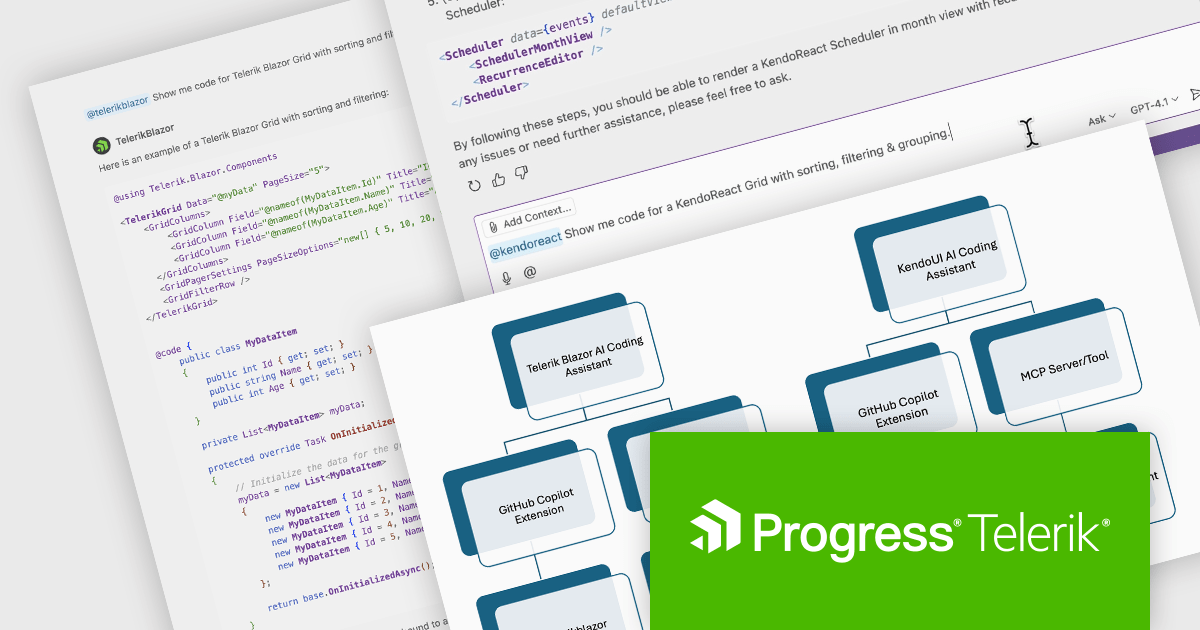
The Telerik 2025 Q2 update adds an IDE-integrated AI Coding Assistant to the KendoReact and Telerik UI for Blazor component libraries. Each coding assistant is an AI code generator that provides proprietary context to AI models in order to produce higher quality code samples based on the Telerik components and APIs for React and Blazor respectively. Developers are now able to generate and insert production-ready components via natural language prompts into their codebase.
To see a full list of what's new for each product in 2025 Q2, see our KendoReact and Telerik UI for Blazor release notes.
Both KendoReact and Telerik UI for Blazor are licensed per developer and have two licensing models: an annual Subscription License and a Perpetual License. The Subscription license provides access to the latest product updates, technical support, and exclusive benefits for a flat annual fee, and must be renewed to continue using the software. The Perpetual license is a one-time purchase granting access to the current released version and includes a one-year subscription for product updates and technical support. After this initial period, users can choose to renew the subscription element to continue receiving updates and support; otherwise, they may continue using the installed version available during their active subscription term but will forgo future updates and support. See our KendoReact licensing page and Telerik UI for Blazor licensing page for full details.
KendoReact is available individually or as part of the following products:
Telerik UI for Blazor is available individually or as part of the following products:
RubyMine by JetBrains is a powerful Integrated Development Environment (IDE) specifically designed for Ruby and Ruby on Rails development. It offers a comprehensive suite of features to boost your coding efficiency, including smart code completion, syntax highlighting, code refactoring tools, built-in debugging and testing frameworks, and seamless integration with popular libraries and databases. Whether you're a seasoned Rails developer or just starting out, RubyMine's intuitive interface and robust features can help you write cleaner, more maintainable code and accelerate your development workflow.
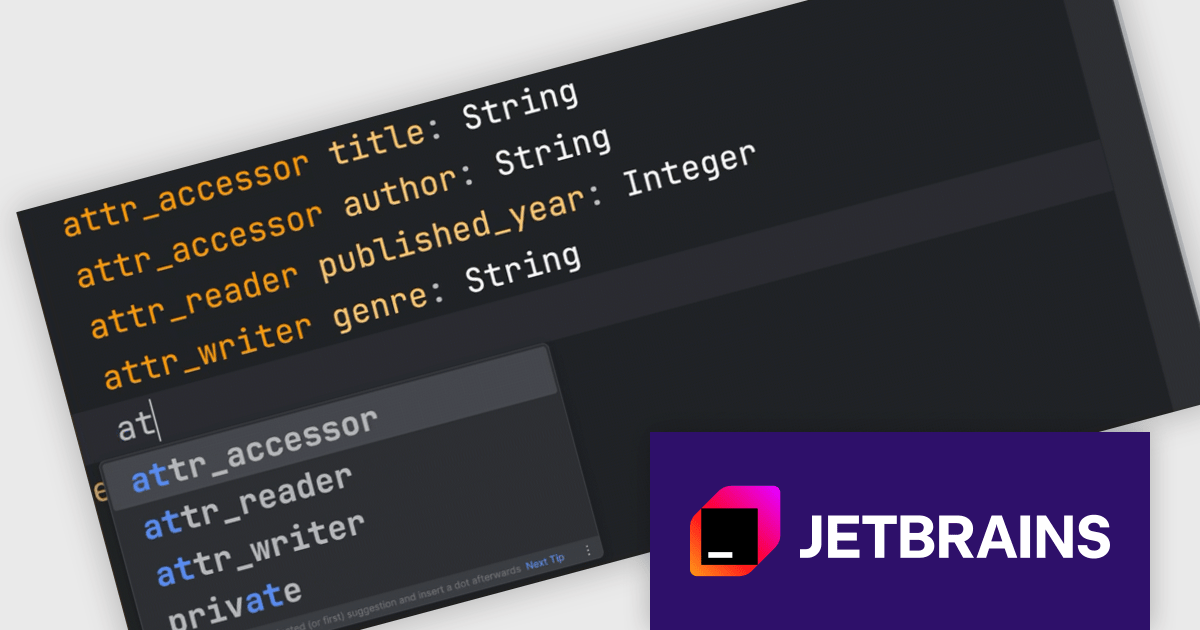
This RubyMine update extends the JetBrains AI Assistant plugin to better support RBS (Ruby Signature) files. It now provides context-aware code suggestions for RBS based on the structure and semantics of type definitions. Developers can also write prompts in plain English directly in the editor to generate or modify RBS code. These changes make it easier to work with typed Ruby by reducing the manual effort involved in writing and updating signatures.
RubyMine is licensed per user, and is available as a commercial annual subscription license. We can supply new subscriptions, subscription renewals, lapsed renewals, and additional user licenses. See our RubyMine licensing page for full details.
RubyMine is available to buy in the following products:
UltraEdit Core is a powerful text editor designed specifically for programmers, available on Windows, Linux, and macOS. It offers syntax highlighting and code structuring for a wide range of languages, enabling efficient code editing and comprehension. Additionally, UltraEdit Core supports large files beyond 4GB, regular expressions for complex searches, and integrates features like FTP, SSH, and scripting for streamlined development workflows.
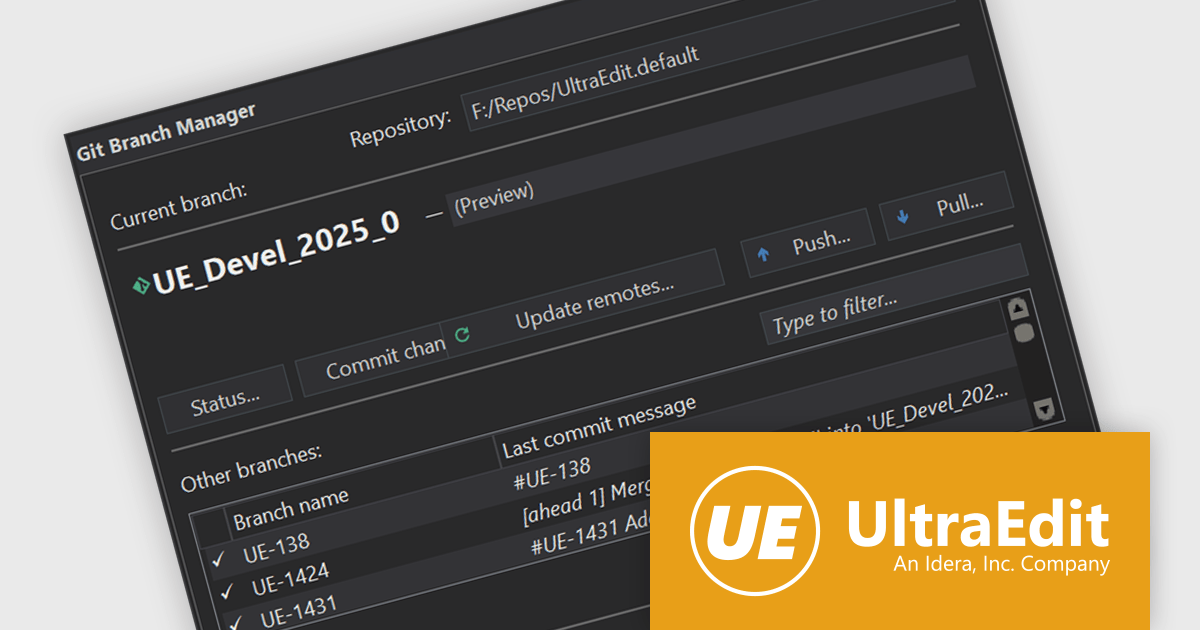
The UltraEdit Core 2025.0 release introduces Git integration as a native feature, offering source control management (SCM) directly within the text editor. Users can now perform essential Git operations such as pull, commit, and manage changes—all from inside UltraEdit—eliminating the need to switch to an external Git client or terminal. This enhancement helps developers working on version-controlled projects, especially those managing multiple repositories or collaborating across teams. By embedding Git functionality into the core editor, UltraEdit aligns itself with modern development environments that prioritize in-editor productivity and toolchain consolidation.
To see a full list of what's new in version 2025.0, see our release notes.
UltraEdit Core is licensed per user and is available as a Perpetual or Annual Subscription License. See our UltraEdit Core licensing page for full details.
UltraEdit Core is available to buy in the following products:

everviz is a cloud-based data visualization platform that helps users create visually appealing, interactive and customizable charts, maps, and other visuals. It provides a user-friendly interface that doesn't require any code or design skills, allowing users to quickly generate responsive visualizations with built-in support for accessibility. The platform provides the flexibility to embed these visualizations into web applications, or share them directly, and enables users to effectively engage with viewers across devices.
everviz has introduced a new feature that allows maps to display land-only boundaries, offering a more refined way to present geographic data. By removing ocean and lake areas—typically included in standard boundary datasets—this enhancement ensures that maps emphasize only the relevant land regions and countries. This is especially useful for visualizations where water bodies distract from the core data, making the maps both clearer and more visually appealing. The update aligns with everviz’s ongoing focus on customization and presentation quality, particularly for users working with maps and charts in analytical and reporting contexts.
everviz is available in two editions: Pro and Enterprise, both of which are annual subscription licenses that include support. See our everviz licensing page for full details.
For more information, see our everviz product page.
電話: (888) 850 9911
Fax: +1 770 250 6199


