


公式サプライヤー
公式および認定ディストリビューターとして200社以上の開発元から正規ライセンスを直接ご提供いたします。
当社のすべてのブランドをご覧ください。
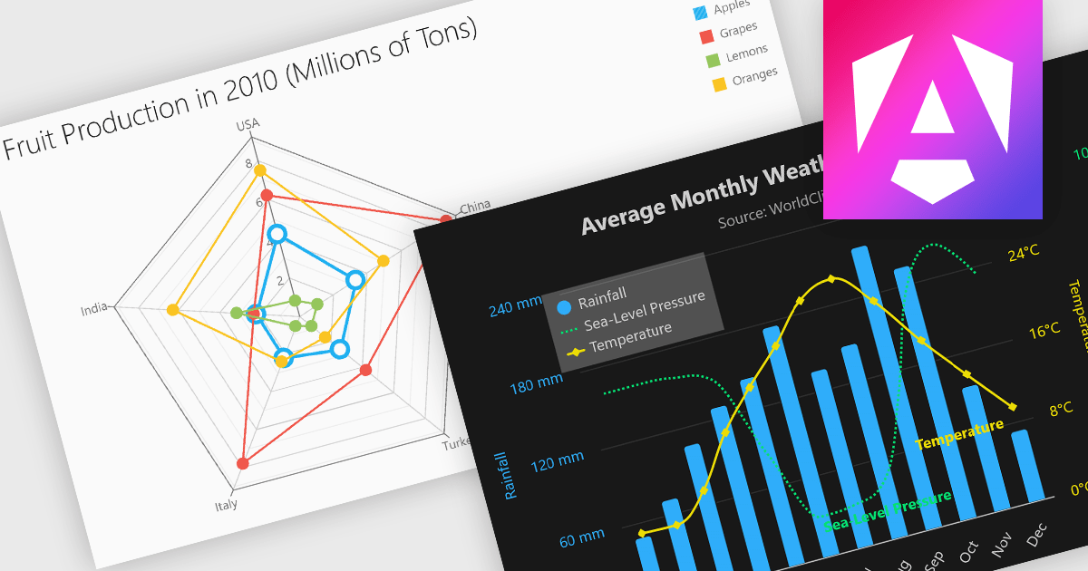
Multi-dimensional and relationship charts allow developers to present complex data structures and inter-variable relationships in a way that’s visually intuitive and analytically powerful. These chart types are essential for exploring correlations, comparing grouped metrics, and visualizing distributions across multiple dimensions. They are commonly used in statistical dashboards, performance analysis tools, and scientific applications where simple line or bar charts aren’t sufficient to capture the full context of the data.
Common charts include:
For an in-depth analysis of features and price, visit our Angular Chart components comparison.
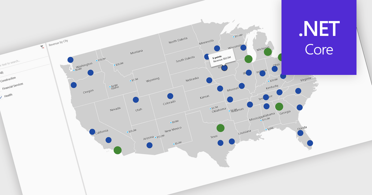
A map chart is a visual representation of data that displays values across geographic regions using colors, shading, or markers, making complex information easier to interpret. By placing data in a spatial context, map charts help users quickly identify regional patterns, trends, and outliers that might be overlooked in traditional tables or graphs. They are particularly useful for comparing values across countries, states, or counties, enabling clearer insights into geographically distributed data. Common use cases include illustrating population density, highlighting election results, analyzing sales performance by region, and presenting economic indicators. The key benefits of map charts include their ability to simplify complex datasets, provide intuitive comparisons, and support data-driven decision-making by visually connecting numbers with real-world locations.
Several .NET Core chart controls offer map charts including:
For an in-depth analysis of features and price, visit our .NET Core chart controls comparison.
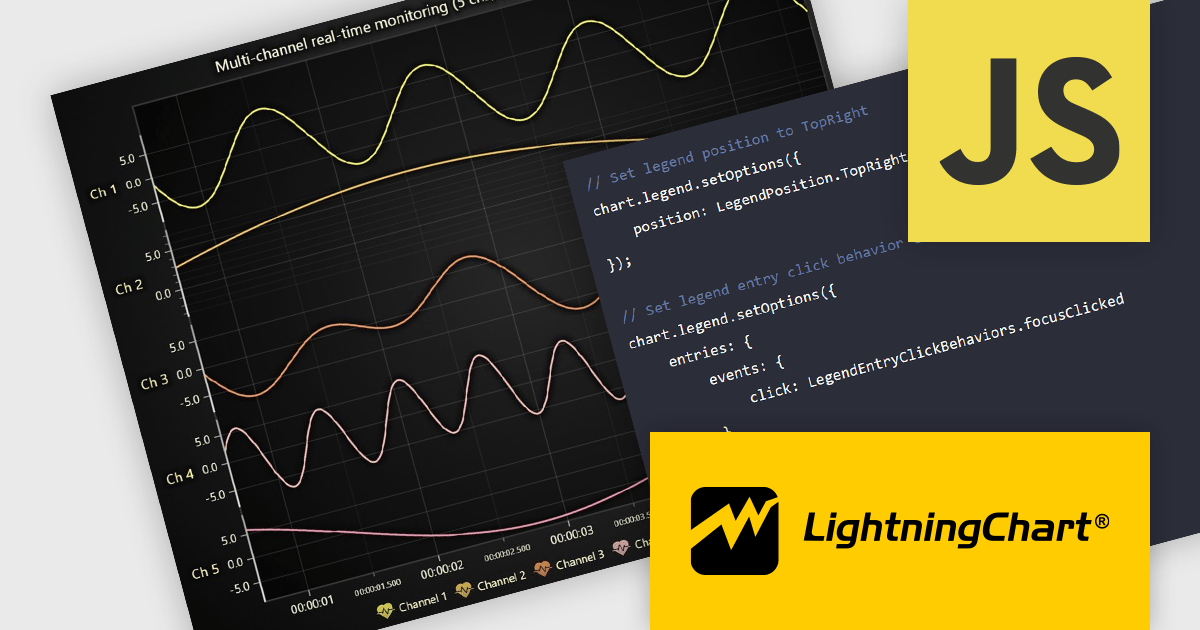
LightningChart JS is a high-performance JavaScript charting library that utilizes WebGL rendering and GPU acceleration to deliver exceptional performance for a wide range of data visualization needs. It is designed to handle large datasets and complex visualizations with ease, enabling developers to create interactive and visually appealing 2D and 3D charts. Ideal for applications demanding smooth real-time data updates, such as financial platforms, engineering tools, scientific research dashboards, and industrial monitoring systems, LightningChart JS provides a comprehensive API for customization and integration into web-based projects.
The LightningChart JS v8.0 update completely reworks legend functionality, making legends a property of the chart, removing visual obstructions, and improving adaptability to available space. The API configuration is now more intuitive and capable, with built-in options supporting a wider range of use cases. Plug‑in support also enables easy extension or customization of legend behavior. By default, legends now appear automatically beneath trends, reducing developer setup time, while still allowing you to manually create multiple legends when needed. You can position legends using built-in presets or define custom placements, and control click behavior using either the provided handlers or your own. When creating series, you can also exclude specific ones from appearing in legends, giving you fine-grained control over legend content.
To see a full list of what's new in v8.0, see our release notes.
LightningChart JS is licensed per developer and is available as an annual license with 1 year support. See our LightningChart JS licensing page for full details.
For more information, see our LightningChart JS product page.
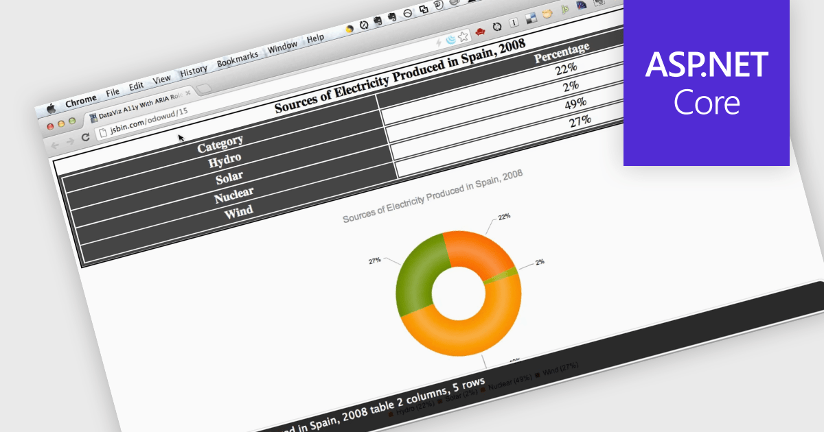
Screen readers, in the context of charts, are assistive technologies that convert digital text and interface elements into speech or braille, allowing users with visual impairments to navigate and understand graphical data on the screen. This involves adding semantic structure, descriptive labels, and metadata so the chart's content can be understood through auditory feedback, enabling users with visual impairments to understand trends, values, and relationships within the chart without needing to see the visual representation. Proper implementation not only improves usability, particularly in data driven environments, but also supports compliance with established accessibility standards such as WCAG (Web Content Accessibility Guidelines).
Several ASP.NET Core charting components support the use of screen readers, such as:
For an in-depth analysis of features and price, visit our comparison of ASP.NET Core chart components.
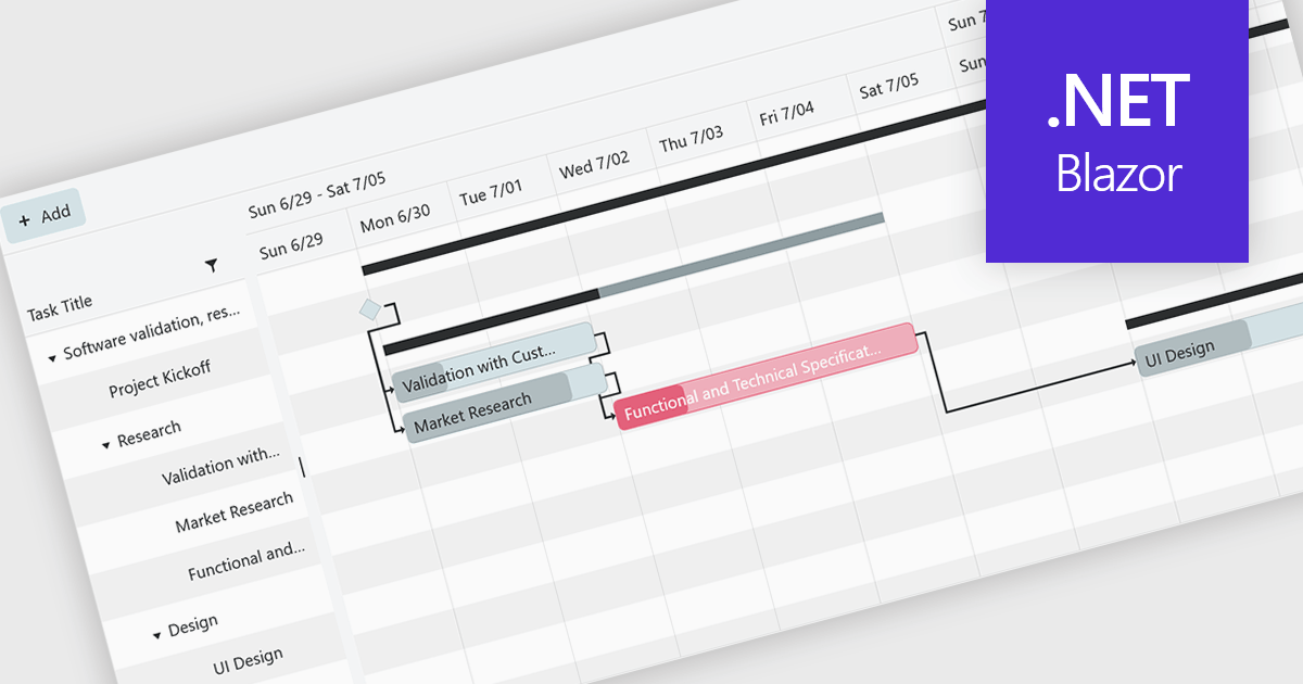
Gantt controls are invaluable tools for project management, particularly in visualizing and tracking the timeline of tasks, dependencies, and progress. These controls are ideal for illustrating project schedules, resource allocation, and critical paths. By providing a clear and concise overview of project milestones, Gantt controls facilitate effective planning, communication, and monitoring, ultimately helping organizations achieve project goals efficiently and on time.
Several .NET Blazor UI suites offer Gantt controls including:
For an in-depth analysis of features and price, visit our .NET Blazor UI suites comparison.
電話: (888) 850 9911
Fax: +1 770 250 6199


