


公式サプライヤー
公式および認定ディストリビューターとして200社以上の開発元から正規ライセンスを直接ご提供いたします。
当社のすべてのブランドをご覧ください。
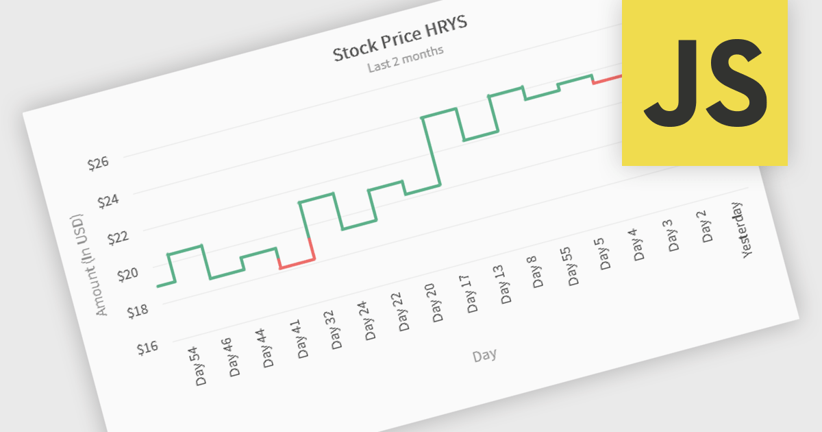
Kagi charts are a technical analysis tool that display price movement through vertical lines, ignoring time to focus on significant price changes. Thick lines indicate rising demand when prices break above previous highs, while thin lines signal increased supply when prices fall below previous lows. This clear visual format helps traders filter out noise, identify trends, and spot key breakouts or reversals. Ideal for analyzing market sentiment, Kagi charts are used across stocks, forex, and commodities to support confident, data-driven trading decisions.
Several JavaScript chart components provide Kagi charts, including:
For an in-depth analysis of features and price, visit our JavaScript charts comparison.
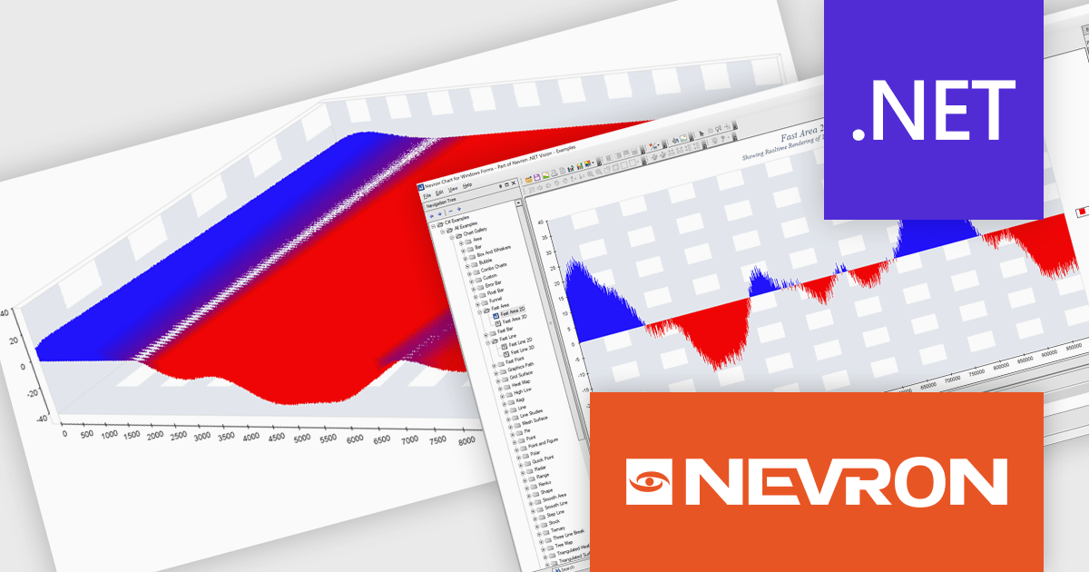
Nevron Chart for .NET is an advanced component suite designed for developers to add rich charting functionality to WinForms, WPF, ASP.NET and MVC applications. Covering any data visualization requirements it is an ideal solution for developing charting enabled presentation, business, scientific or financial applications. It boasts hardware acceleration for optimal performance, a flexible API for customization, and advanced interactivity features like zooming, panning, and tooltips to enhance user engagement with your data.
The Nevron Chart for .NET 2025.1 update introduces the new 'NFastAreaSeries', enabling real-time rendering of millions of data points using GPU acceleration. This addition significantly enhances performance for area charts, making it well-suited for high-volume data visualization scenarios. It complements existing fast-rendering series and includes optimizations that improve rendering efficiency across both imperial and metric units. Combined with automatic culture-based unit selection, the update ensures a responsive and localized user experience for developers building advanced data visualization applications.
To see a full list of what's new in 2025.1, see our release notes.
Nevron Chart for .NET is licensed per developer machine and is available as a perpetual license with 1 year subscription and support. See our Nevron Chart for .NET licensing page for full details.
Nevron Chart for .NET is available to buy in the following products:
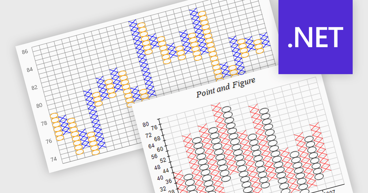
A point and figure (P&F) chart is a financial charting technique used to track price movements by plotting directional changes in price without reference to time. It focuses exclusively on significant price changes, filtering out minor fluctuations to highlight clear trends and reversals. Instead of plotting prices continuously, it uses columns of Xs and Os to represent rising and falling prices, respectively, based on predefined price increments. This chart type provides a straightforward view of supply and demand dynamics, making it particularly effective for identifying support and resistance levels, breakout patterns, and trend direction. Its simplicity helps traders and analysts focus on essential price action, reducing the noise found in traditional time-based charts.
Several .NET charting components provide you with point and figure charts, including:
For an in-depth analysis of features and price, visit our comparison of .NET chart components.

LightningChart Python is a high-performance visualization library designed for real-time analytics and large-scale data rendering. Utilizing GPU acceleration and WebGL, it efficiently processes millions of data points in 2D and 3D with smooth, interactive visuals. Some example chart types include Line graphs, Scatter plots, Heatmaps, Area plots, Box plots, 3D Surface graphs and Mesh plots, and it supports UI elements such as CustomTicks, interval Bands and Constant Lines. It seamlessly integrates with Python’s data ecosystem, including numpy, pandas, and GUI frameworks like PyQt and PySide, making it a powerful tool for interactive dashboards, financial analytics, scientific simulations, and engineering applications.
The LightningChart Python v1.2 update improves multidimensional data analysis capabilities by enabling Parallel Coordinate charts to be embedded directly into dashboards, allowing developers to integrate complex data comparisons within interactive visual reporting environments. This integration simplifies the comparison of complex data sets across multiple dimensions in a unified interface, so you can see relationships, correlations, clusters, and outliers across many dimensions at once.
To see a full list of what's new in v1.2, see our release notes.
LightningChart Python offers two licensing options: the subscription-based Data Scientist License for internal, non-public facing usage and the perpetual, per-seat Software Developer License for commercial use with professional support and deployment keys. Both licenses allow one active session per user, with developer licenses assigned individually. See our LightningChart Python licensing page for full details.
For more information, see our LightningChart Python product page.
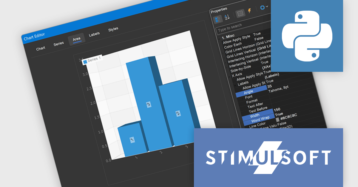
Stimulsoft Dashboards.PYTHON is a data visualization tool specifically designed for building interactive dashboards within Python applications. It combines a client-side JavaScript engine for data processing with a designer component to craft dashboards and a viewer for displaying them. This empowers developers to create clear and informative visual representations of data directly within their Python projects.
The Stimulsoft Dashboards.PYTHON 2025.3.1 update enhances 3D chart usability by introducing new axis label settings that improve how labels are displayed in complex data visualizations. Developers can now rotate labels to align with chart angles, define a maximum width to prevent overlap, and enable word wrap to maintain readability in constrained spaces. These additions provide greater control over chart formatting, allowing for clearer presentation of axis data, especially in dashboards with dense or multilingual content.
To see a full list of what's new in 2025.3.1, see our release notes.
Stimulsoft Dashboards.PYTHON is licensed per developer and is available as a perpetual license with 1 year support and maintenance. See our Stimulsoft Dashboards.PYTHON licensing page for full details.
Stimulsoft Dashboards.PYTHON is available individually or as part of Stimulsoft Ultimate.
電話: (888) 850 9911
Fax: +1 770 250 6199


