


公式サプライヤー
公式および認定ディストリビューターとして200社以上の開発元から正規ライセンスを直接ご提供いたします。
当社のすべてのブランドをご覧ください。
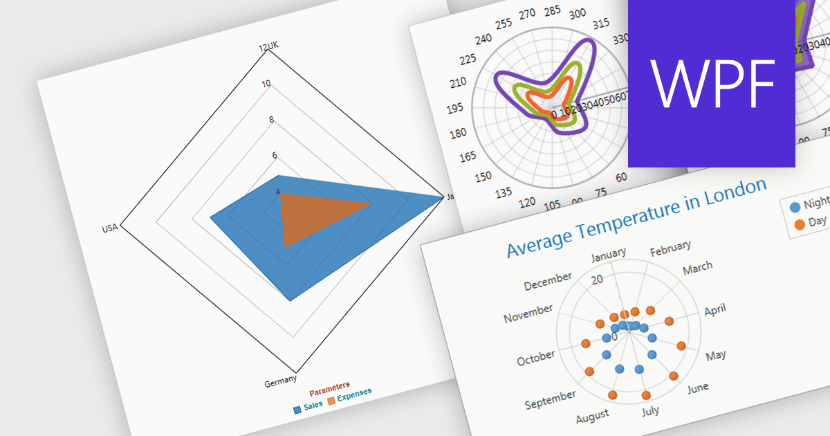
Radar and polar charts are both visualizations for displaying multiple data Radar charts specifically connect the data points to form a web-like shape, highlighting relative strengths and weaknesses across categories. Polar charts focus on the angular relationship between data points. Both are ideal for comparing sets of data with several variables, making them valuable tools in fields like performance analysis, where strengths and weaknesses across different metrics need to be understood.
Several WPF chart components support radar and polar charts, including:
For an in-depth analysis of features and price, visit our comparison of WPF chart components.

Exporting charts as images offers several advantages. It allows for easy sharing in documents, presentations, and social media without relying on the recipient having the original software. Popular formats include JPEG, PNG, and SVG. JPEGs offer small sizes for low bandwidth scenarios, while PNGs are ideal for charts with sharp lines and flat colors. SVGs are vector-based, enabling infinite scaling without quality loss, making them perfect for charts that may be resized frequently.
Several ASP.NET Core chart controls offer the ability to export charts to images including:
For an in-depth analysis of features and price, visit our ASP.NET Core chart controls comparison.
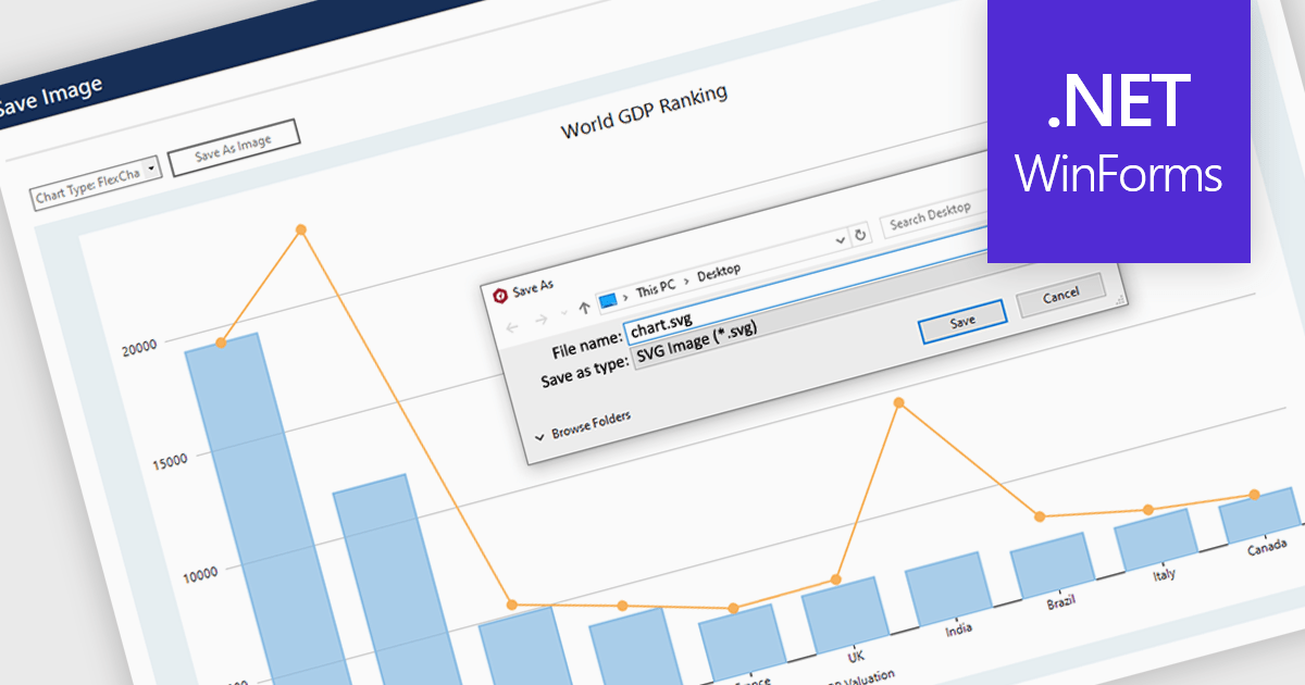
SVG export gives your users the ability to output charts in the Scalable Vector Graphics format. This offers superior quality for both print and web displays, ensuring that your charts remain crisp and detailed at any zoom level. This feature is particularly beneficial for professionals who require high-resolution graphics for presentations, reports, or publications. The SVG format also allows for easy editing and resizing without loss of quality, making it ideal for use across various media. Users can effortlessly integrate their analytical outputs into dynamically scalable projects and retain the aesthetic integrity of their visual data, streamlining the process from data exploration to communication.
Several WinForms chart controls offer SVG export including:
For an in-depth analysis of features and price, visit our WinForms chart controls comparison.

Pie charts are a useful and easily understood tool for visualizing data breakdowns at a glance, particularly when representing percentages of a whole. Their strength lies in highlighting the relative proportions between a small number of categories within a dataset. While less effective for complex comparisons or trends over time, pie charts can be an effective choice to communicate compositions and dominance within a dataset.
Several Blazor Chart controls offer Pie charts including:
For an in-depth analysis of features and price, visit our Blazor Chart controls comparison.
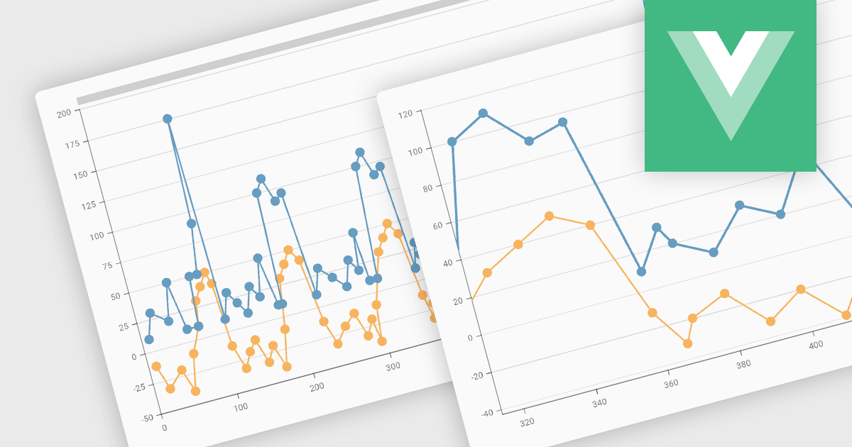
Zooming functionality in a chart component empowers users to delve deeper into complex datasets. By allowing for magnified views of specific areas, users can identify trends, outliers, and patterns that might be obscured in a broader, more generalized view. This interactivity fosters a richer understanding of the data and facilitates more informed decision-making for end users.
Several Vue.js chart controls support zooming including:
For an in-depth analysis of features and price, visit our comparison of Vue.js Charts.
電話: (888) 850 9911
Fax: +1 770 250 6199


