













公式サプライヤー
公式および認定ディストリビューターとして200社以上の開発元から正規ライセンスを直接ご提供いたします。
当社のすべてのブランドをご覧ください。
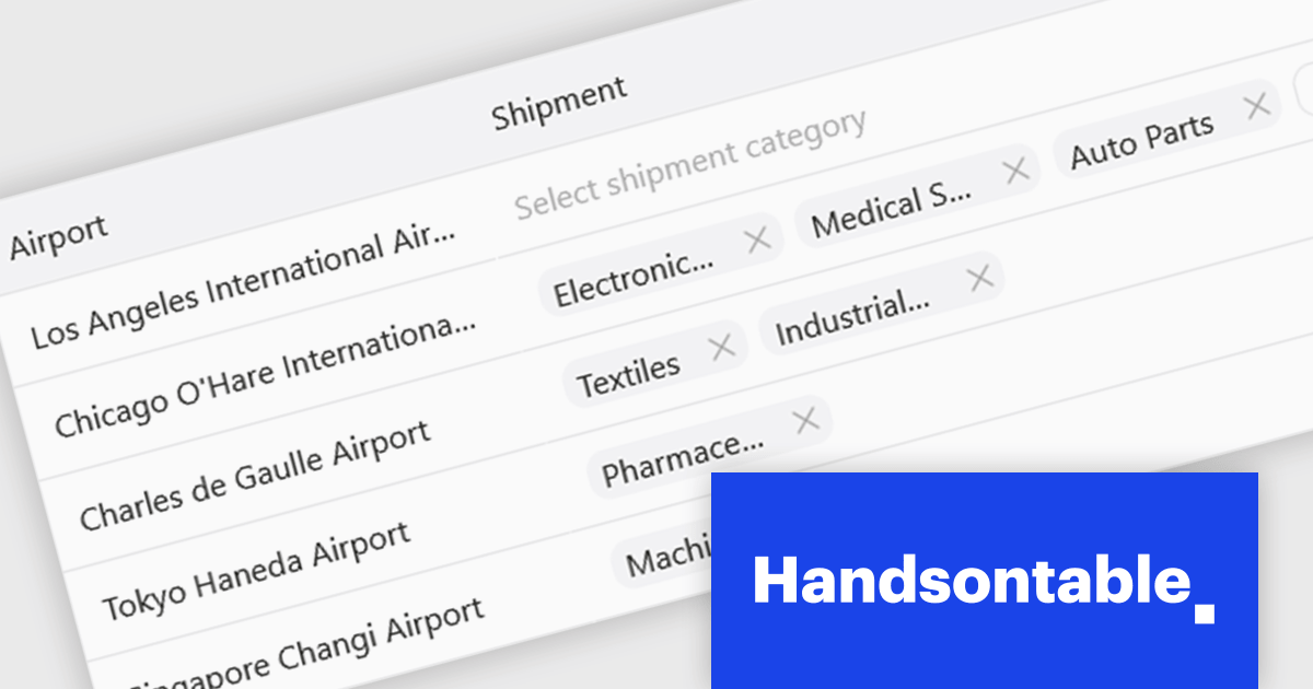
Handsontable is a JavaScript library designed to help developers build interactive data grids into their web applications. Offering a familiar spreadsheet-like interface, it allows users to edit, sort, and filter data with ease. Highly customizable and compatible with popular frameworks like React and Angular, Handsontable empowers developers to build robust data manipulation features into their web applications.
The Handsontable 17.0.0 update adds a new MultiSelect cell type that allows a single cell to hold multiple values, making it well suited for data such as tags, user roles, product categories, or shipment contents. Instead of restricting entries to one option, users can choose any number of items from a dropdown interface that includes search and filtering capabilities for quickly locating options. Full keyboard navigation ensures efficient interaction for power users.
To see a full list of what's new in version 17.0.0, see our release notes.
Handsontable is licensed per developer and is available as an Annual or Perpetual license with 1 year support and maintenance. See our Handsontable licensing page for full details.
For more information, visit our Handsontable product page.
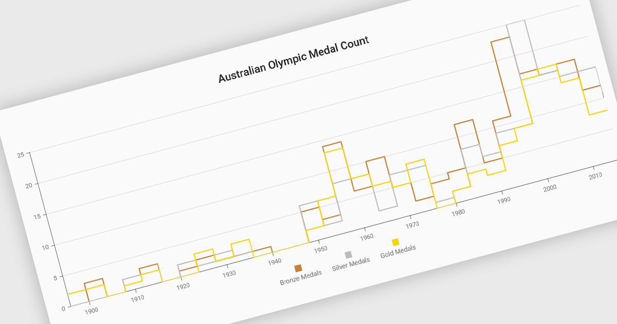
Step line charts are a variation of line charts that display changes between data points as a series of horizontal and vertical segments rather than diagonal lines. This structure highlights discrete transitions between values, making it easier to show when a change occurs and how long a value remains constant before the next update. Step line charts are useful for representing processes where values shift at specific moments, such as pricing tiers, system states, or configuration thresholds. By clearly separating periods of stability from points of change, the chart type helps developers and analysts interpret state-based or event-driven data with greater precision.
Several Vue.js chart components support the step line chart type, including:
For an in-depth analysis of features and price, visit our comparison of Vue.js charting components.
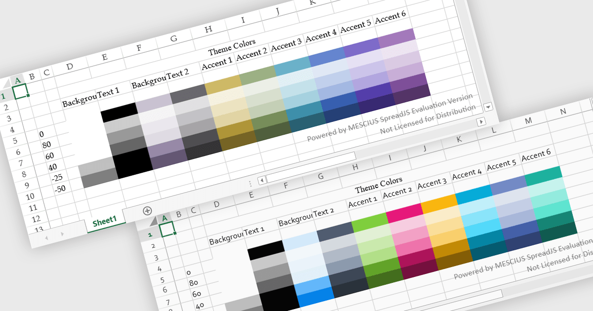
Spreadsheet themes provide a consistent visual style by applying coordinated colors, fonts, and formatting across an entire workbook. Instead of manually styling individual elements, users can quickly apply a theme to ensure tables, charts, and data ranges follow the same design. This improves readability, enhances data presentation, and helps maintain a professional and cohesive look across reports. Themes are particularly useful when creating business dashboards, financial reports, or shared team documents, where consistent formatting and clear visual hierarchy make data easier to interpret and align with company branding.
Several JavaScript spreadsheet controls offer support for applying themes including:
For an in-depth analysis of features and price, visit our JavaScript spreadsheet controls comparison.
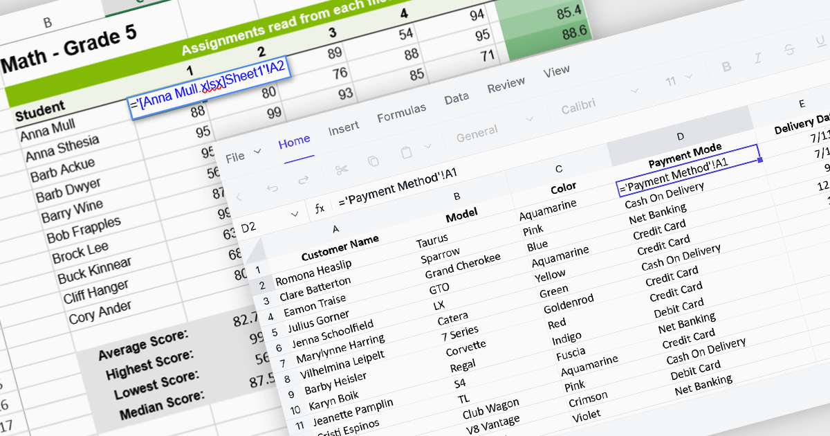
Cross-worksheet calculations allow spreadsheet components to reference and compute values across multiple sheets within the same workbook. This capability enables developers to build more advanced data models, where formulas can pull information from different worksheets to support summaries, aggregations, and linked analysis. By allowing data to be organized across separate sheets while remaining connected through formulas, applications can present complex datasets in a structured and scalable way without sacrificing calculation accuracy or performance.
Several Angular spreadsheet controls offer support for cross-worksheet calculations including:
For an in-depth analysis of features and price, visit our Angular spreadsheet controls comparison.
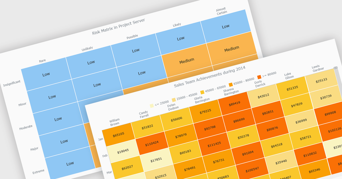
A heat map is a data visualization that displays values in a grid of colored cells, where color intensity represents the magnitude or importance of the data. This approach makes it easy to quickly identify patterns, trends, and outliers that may be difficult to see in traditional tables. Heat maps improve data analysis by visually highlighting relationships between two variables and enabling quick comparisons across datasets. They are commonly used in risk matrices, performance monitoring, sales analysis, and user behavior tracking, where color-coded insights help users focus on the most significant information.
Several JavaScript chart controls support the Heat map chart types, including:
For an in-depth analysis of features and price, visit our comparison of JavaScript chart controls.
電話: (888) 850 9911
Fax: +1 770 250 6199


