


公式サプライヤー
公式および認定ディストリビューターとして200社以上の開発元から正規ライセンスを直接ご提供いたします。
当社のすべてのブランドをご覧ください。
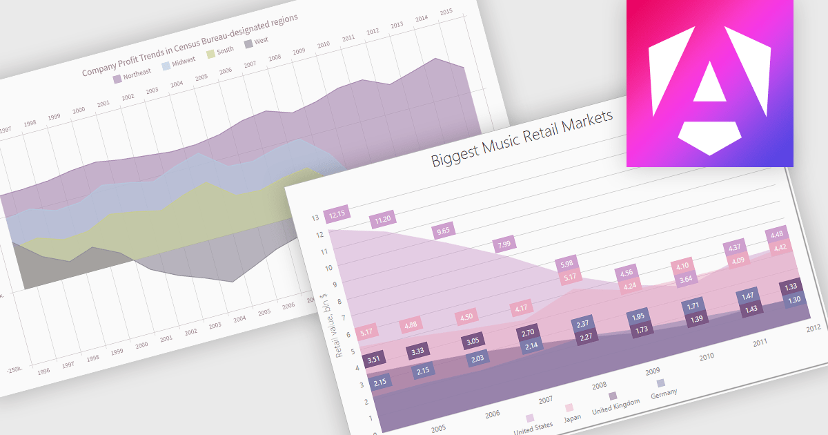
An area chart is a visualization tool that displays data as a filled area bounded by a line and the x-axis. It's particularly effective for illustrating trends and changes in data over time. By filling the area beneath the line, it visually represents the cumulative value of the data, making it easier to understand overall trends. This makes area charts ideal for visualizing metrics like sales over time, inventory levels, or stock prices.
Several Angular chart controls offer area charts including:
For an in-depth analysis of features and price, visit our Angular chart controls comparison.
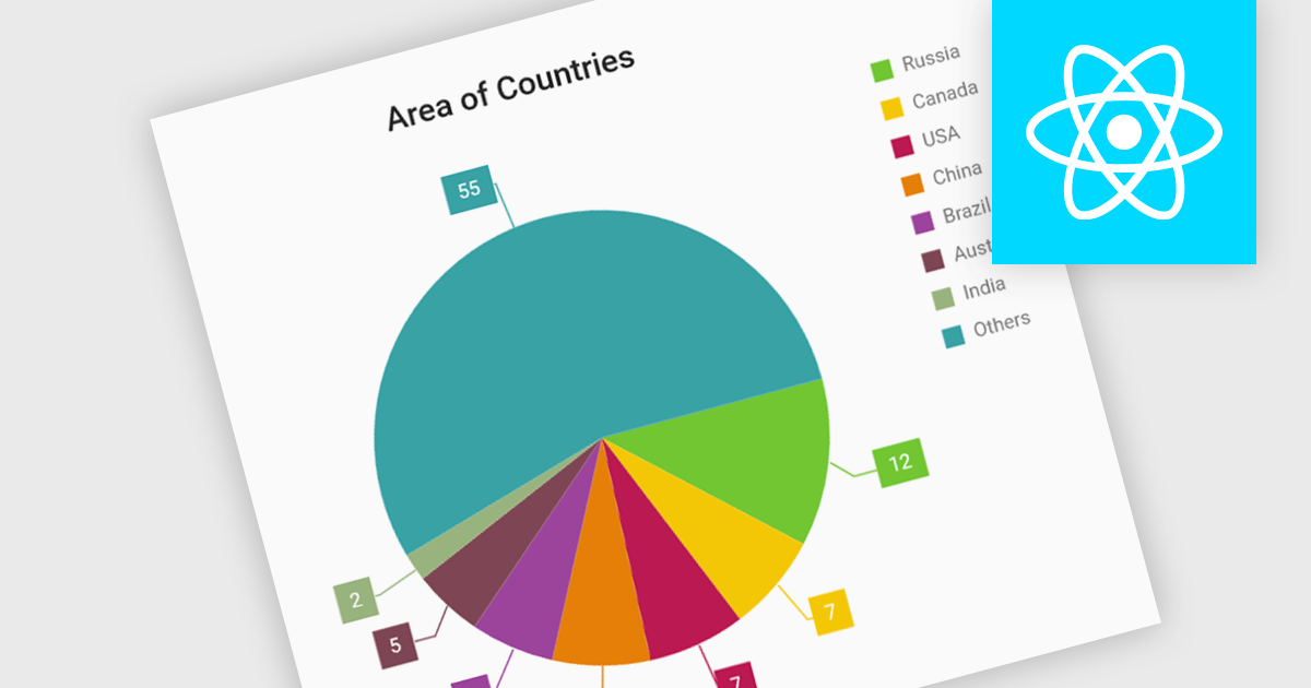
Pie charts are circular diagrams that visually represent data as slices of a whole. Each slice represents a category, with its size proportional to its share of the total. They are particularly effective for illustrating categorical data, such as market shares, demographics, or budget allocations. Pie charts offer a clear and intuitive way to compare relative quantities, making it easy to identify the dominant categories and their contributions to the overall composition.
Several React chart controls offer pie charts including:
For an in-depth analysis of features and price, visit our React chart controls comparison.
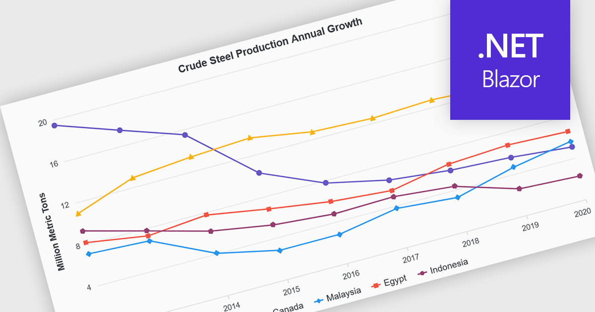
Line charts are visual representations of data points connected by lines, often used to illustrate trends, patterns, or changes over time. They are particularly effective for displaying continuous data sets, such as stock prices, temperature variations, or sales figures. By connecting data points, line charts provide a clear and intuitive understanding of how values evolve over a specific period. This visual representation aids in identifying trends, making comparisons, and predicting future outcomes.
Several Blazor chart controls offer line charts including:
For an in-depth analysis of features and price, visit our Blazor chart controls comparison.
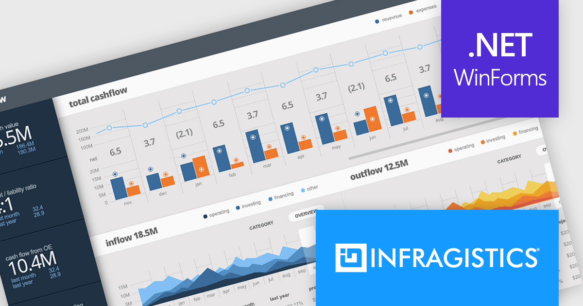
Infragistics Ultimate UI for Windows Forms is a comprehensive suite of over 100 pre-built UI controls and components designed to accelerate Windows Forms application development. It offers a rich feature set including grids, charts, dashboards, reports, and Microsoft Office-style UI elements, enabling developers to create visually appealing, high-performing, and touch-enabled applications with minimal coding effort.
The Infragistics Ultimate UI for Windows Forms 24.1 release introduces a powerful new feature for the UltraDataChart: Data Legend and Data Tooltip Grouping. This innovative enhancement allows users to effectively categorize and organize large datasets by grouping related series together. When multiple series share the same group text, they are visually clustered together within both the data legend and tooltips, providing a clear and intuitive representation of the data. This feature significantly improves data comprehension and analysis, making it easier for users to extract meaningful insights from complex datasets.
To see a full list of what's new in 24.1, see our release notes for Infragistics Ultimate UI for Windows Forms.
Infragistics Ultimate UI for Windows Forms is licensed per developer and is available as a perpetual license with 1, 2 or 3 year support and maintenance subscription. See our Infragistics Ultimate UI for Windows Forms licensing page for full details.
Infragistics Ultimate UI for Windows Forms is available to buy in the following products:

Infragistics Ignite UI for Angular is a comprehensive suite of Angular components and UI controls designed to accelerate development of high-performance, enterprise-grade web applications. It offers a rich collection of data grids, charts, and other UI elements, along with advanced features like pivoting, docking, and hierarchical data management. Built on Angular, the toolkit integrates seamlessly into existing projects and provides a foundation for building modern, responsive, and interactive user interfaces.
Ignite UI for Angular's Pivot Grid now offers horizontal row dimension expansion, providing developers with greater flexibility in data visualization. In this mode, child elements of a row dimension are displayed horizontally within the same multi-row layout instead of vertically. This approach allows for a more compact and potentially informative representation of hierarchical data, enabling users to easily compare related data points within a single row context. Developers can dynamically toggle between horizontal and vertical expansion modes to suit their specific data analysis requirements.
To see a full list of what's new in version 24.1 (18.1.0), see our release notes.
Infragistics Ignite UI for Angular is part of Infragistics Ignite UI which is licensed per developer and is available as a Perpetual License with a 1, 2 or 3 year support and maintenance subscription. See our Infragistics Ignite UI licensing page for full details.
Infragistics Ignite UI for Angular is available in the following products:
電話: (888) 850 9911
Fax: +1 770 250 6199


