


公式サプライヤー
公式および認定ディストリビューターとして200社以上の開発元から正規ライセンスを直接ご提供いたします。
当社のすべてのブランドをご覧ください。
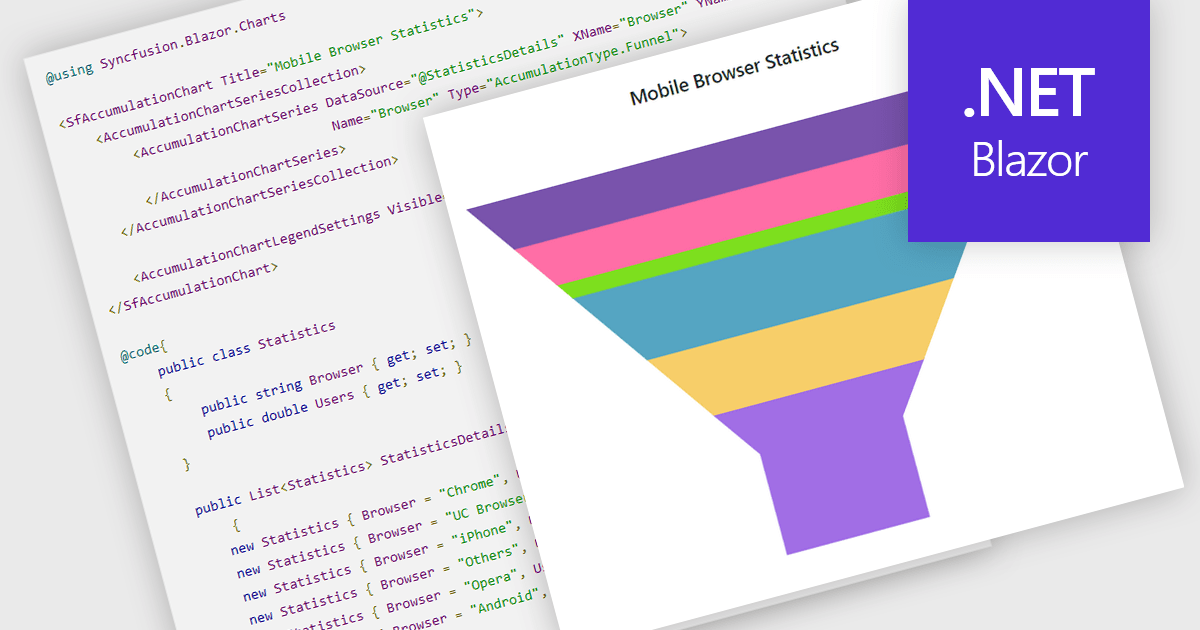
Funnel charts are a type of data visualization that depicts data in a linear process that often narrows down at each stage, resembling a funnel. They are especially useful for emphasizing steps in a process, displaying drop-off rates, and finding bottlenecks in workflows. Funnel charts are useful because they visually show the continual reduction of data throughout phases, providing clear insights into conversion rates and process efficiency. This enables engineers and business analysts to quickly find areas for improvement, optimize procedures, and create more accurate data-driven decisions.
Several .NET Blazor chart controls offer funnel charts including:
For an in-depth analysis of features and price, visit our .NET Blazor chart controls comparison.
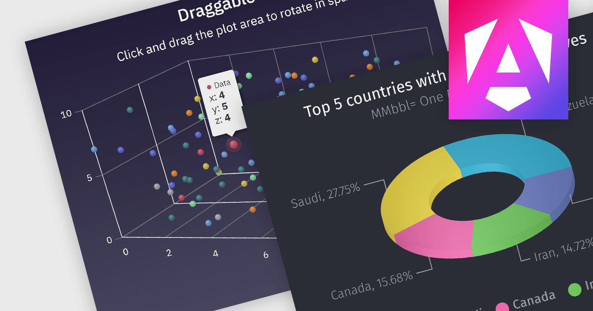
3D charts allow data visualization with depth along a third axis. This capability goes beyond traditional 2D charts, offering a more immersive and informative view. 3D charts are particularly beneficial for complex datasets with multiple variables, as they can reveal patterns and relationships that might be obscured in a flat format. Use cases include showcasing product sales across regions and demographics, visualizing financial trends over time, or depicting scientific data with multiple dimensions.
Several Angular chart controls offer 3D charts including:
For an in-depth analysis of features and price, visit our comparison of Angular chart controls.
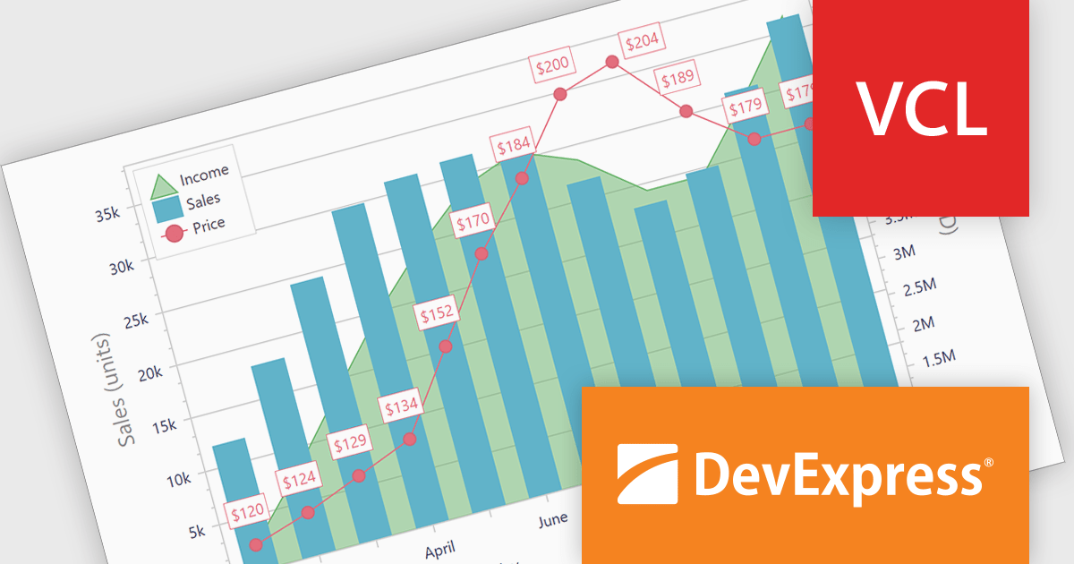
DevExpress VCL Subscription is a comprehensive suite for Delphi and C++ Builder developers that includes high-performance UI components, reporting tools, data visualization elements, and application templates. It lets you build rich, data-driven business applications with ease, offering ongoing updates, technical support, and royalty-free distribution rights, perfect for boosting developer productivity and delivering polished software experiences.
The DevExpress VCL Subscription 24.1 chart control adds support for secondary axes. This innovative feature allows you to overlay an additional Y axis on your chart. This means you can plot data measured in, for example, temperature (degrees Celsius) alongside values in percentage. Each axis has its own scale and labels, keeping your chart clear and avoiding the need to convert units or create separate charts. This is particularly useful for comparing data sets that would otherwise be difficult to display on a single scale.
To see a full list of what's new in version 24.1, see our release notes.
DevExpress VCL Subscription is licensed per developer and is available as a Perpetual License with a 12 month support and maintenance subscription. See our DevExpress VCL Subscription licensing page for full details.
For more information, visit our DevExpress VCL Subscription product page.
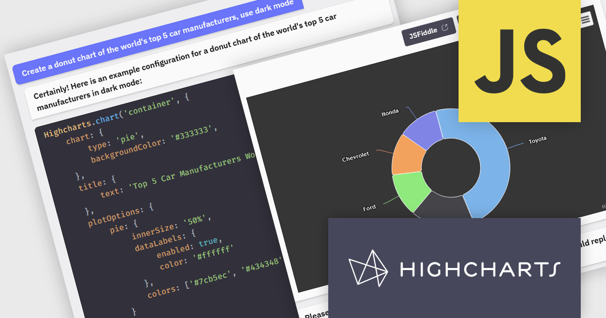
Highcharts is a JavaScript charting framework that allows web developers and data analysts to generate dynamic, visually appealing charts and graphs for websites and web applications. It can display a variety of chart types, including line, spline, area, column, bar, pie, scatter, and many more. Highcharts is well-known for its ease of use, rich documentation, and ability to handle huge datasets efficiently. Features include responsive design, accessibility support, and cross-browser compatibility. Its customization capabilities allow users to create bespoke data visualizations that increase engagement and provide insightful data presentations.
The Highcharts GPT add-on (powered by ChatGPT), and GitHub Copilot support in Highsoft products provide software developers with significant productivity enhancements by integrating AI-driven code assistance directly into their workflow. The Highcharts GPT add-on leverages natural language processing to generate and customize complex chart configurations, reducing the time and effort required for manual coding and enabling developers to focus on higher-level design and functionality. GitHub Copilot integration further streamlines development by offering intelligent code completions and suggestions, facilitating rapid prototyping and error reduction. Together, these Artificial Intelligence tools enhance coding efficiency, improve accuracy, and accelerate the development of sophisticated data visualizations.
For more information see the Highcharts GPT and Highcharts + Github Copilot blog posts.
Highcharts Core is licensed on an annual or perpetual basis, OEM licenses, and Advantage Renewals. It is licensed per Developer and has several license options including Internal, SaaS, SaaS+, and Self Hosted. See our Highcharts Core licensing page for full details.
Learn more on our Highcharts Core product page.
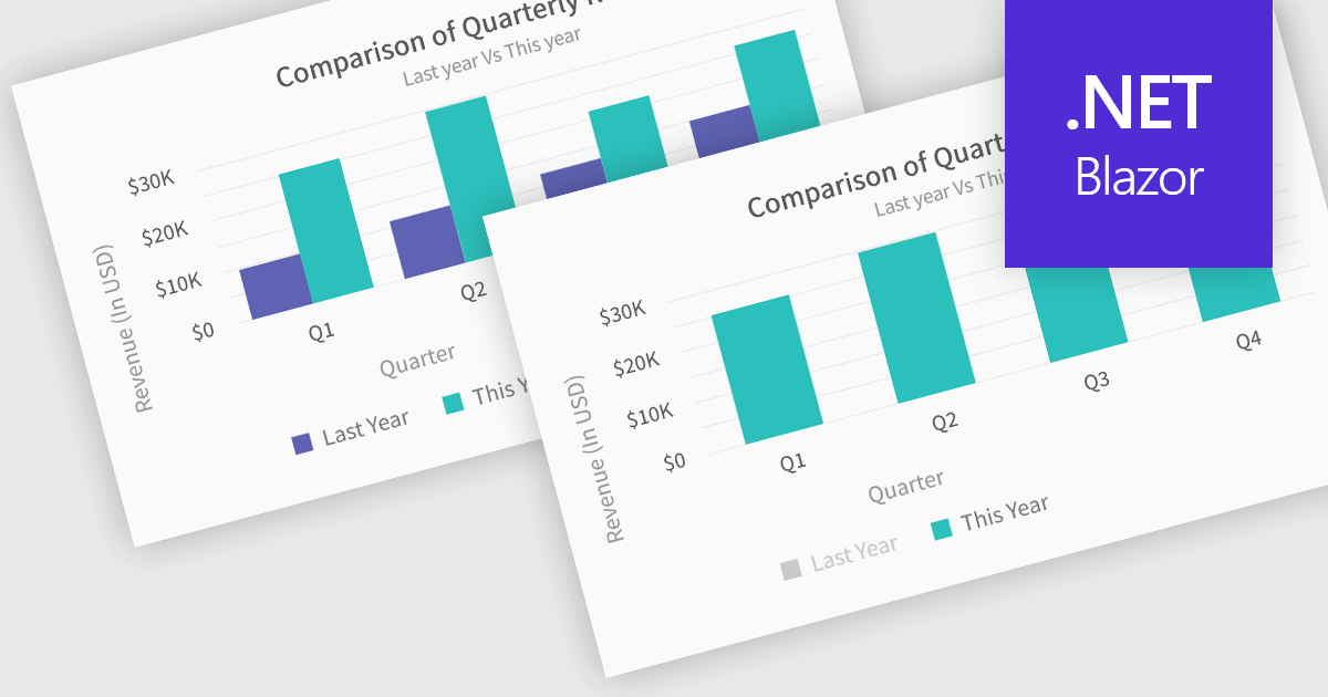
In chart controls, show/hide series functionality empowers developers to dynamically control the visibility of individual data sets. This allows users to focus on specific series, enhancing data comprehension and analysis. By selectively hiding irrelevant series, developers can declutter the chart, making it easier for users to identify trends and patterns within the data of interest.
Several .NET Blazor chart controls offer show/hide series support including:
For an in-depth analysis of features and price, visit our .NET Blazor chart controls comparison.
電話: (888) 850 9911
Fax: +1 770 250 6199


