


公式サプライヤー
公式および認定ディストリビューターとして200社以上の開発元から正規ライセンスを直接ご提供いたします。
当社のすべてのブランドをご覧ください。
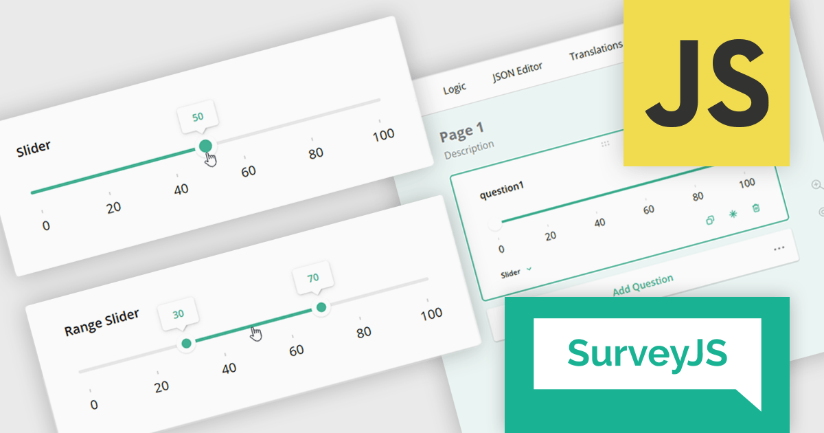
SurveyJS is a family of extensible JavaScript libraries designed to help developers build robust form management systems fully integrated into their web applications. These libraries work seamlessly with any backend system and are fully compatible with modern JavaScript frameworks, including React, Angular, and Vue.
The SurveyJS 2.2.0 update introduces new Slider and Range Slider question types that enable developers to implement more interactive and precise input mechanisms within surveys. These components support a wide range of configuration options, including customizable minimum and maximum values, step sizes, labeled scales, and tooltip formatting. The Range Slider further enhances flexibility by allowing respondents to select and drag a value range using dual thumbs, with optional constraints on range length. Both question types can be seamlessly bound to text input fields, offering a more responsive and accessible data collection experience in custom survey workflows.
To see a full list of what's new in version 2.2.0, see our release notes.
SurveyJS is licensed per developer with a one-time payment for indefinite use. Access to updates and technical support is available through a subscription. See our SurveyJS Survey Creator licensing page for full details.
Learn more on our SurveyJS Survey Creator product page.
OptimaJet is a global software vendor dedicated to providing developer-centric tools that streamline enterprise application development. Since 2013, the company has supported organizations across industries such as finance, government, logistics, and insurance. With offices in the United States and Hong Kong, OptimaJet delivers scalable, cost-effective solutions designed to accelerate development and adapt to changing business needs.
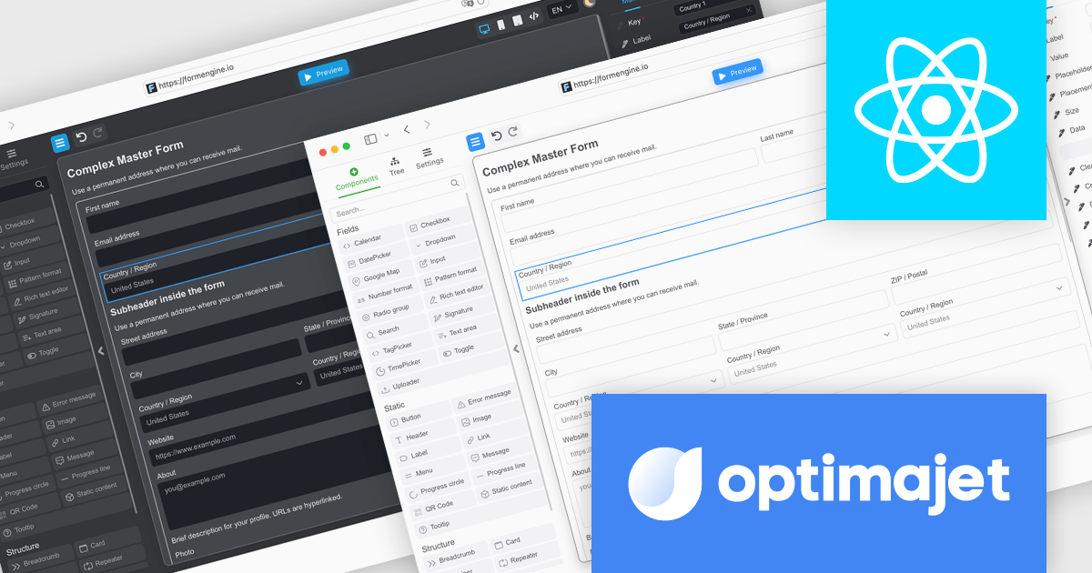
FormEngine is a powerful React-based drag-and-drop form builder that enables visual creation of complex web forms without the need for frontend coding. Forms are stored as JSON and rendered dynamically at runtime, allowing teams to build and update forms quickly while maintaining full control over structure and data flow. It is ideal for internal business tools, onboarding processes, and any application requiring flexible, frequently updated forms.
Through this partnership, ComponentSource extends its portfolio with a modern React-based solution that supports developers in building adaptive, data-driven forms with ease. Offering OptimaJet's FormEngine reflects ComponentSource’s ongoing commitment to equipping development teams with high-quality tools that simplify complex tasks, accelerate delivery, and enhance the flexibility of enterprise applications.
FormEngine, by OptimaJet, is licensed based on usage type, number of domains, and included components, with options for internal use, SaaS deployment, or OEM integration. See our FormEngine licensing page for full details.
For more information visit our OptimaJet brand page.

Wijmo is a complete collection of extensible, fast, flexible JavaScript UI components written in TypeScript. The framework-agnostic Wijmo components include first-class support for top frameworks including Angular, React, Vue and Web Components. Wijmo Enterprise has over 100 dynamic JavaScript UI components to help cut your development time in half and build lightweight, high-performance JavaScript applications using your favorite JavaScript framework.
On June 25, 2025 at 11:00 AM EDT, MESCIUS (formerly GrapeCIty) will be presenting a CodeClinic Live Webinar, exploring the 25 UX laws to give your apps an advantage over the competition. Learn why they are important, how to follow the industry's best practices, and how to apply them, assessing various popular web applications.
Register for the LIVE webinar today, and mark your calendar for June 25.
ComponentOne Studio WPF by MESCIUS is a comprehensive suite of controls designed to enhance the development of WPF applications. It offers a range of powerful and flexible UI components such as data grids, charts, and data visualization tools that integrate seamlessly into WPF projects. This suite enables developers to create modern, responsive, and visually appealing applications with greater efficiency, leveraging robust features and customization options. Its components are optimized for performance and ease of use, allowing for the rapid development of high-quality WPF applications that meet complex business requirements.
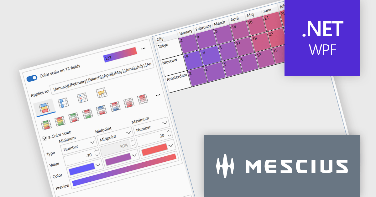
The ComponentOne Studio WPF 2025 v1 update introduces a new Rules Manager UI Library that enables end-users to define, apply, and persist conditional formatting rules directly at runtime. This addition eliminates the need for developers to hardcode rule logic, streamlining customization and reducing maintenance. With support for gradient fills, progress bars, and value-based symbols, the Rules Manager enhances data visualization, making it easier for users to interpret trends and thresholds. Designed to work with FlexGrid, FlexPivot, DataGrid, and ListView controls, it offers a flexible and consistent formatting experience across the application.
To see a full list of what's new in 2025 v1, see our release notes.
ComponentOne Studio WPF is licensed per developer on a perpetual basis and includes a 12 month subscription. See our ComponentOne Studio WPF licensing page for full details.
ComponentOne Studio WPF is available individually or as part of ComponentOne Studio Enterprise.
Actipro Avalonia UI Pro is a suite of professionally designed UI controls, themes, and components specifically built for the Avalonia UI framework. It empowers developers to craft beautiful, modern cross-platform applications while leveraging their existing C# and WPF skills. Actipro offers a range of controls from essential navigation and data visualization components to advanced charting and scheduling features, all adhering to its signature high-quality design and seamless integration with Avalonia.
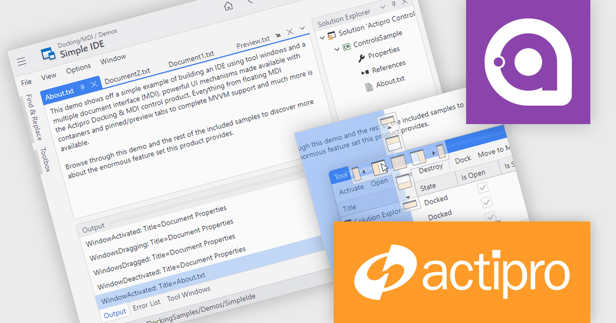
The Actipro Avalonia UI Pro 25.2.0 release adds a Docking/MDI (Multiple Document Interface) control library, bringing Visual Studio-style window management to cross-platform Avalonia applications. This new feature allows end users to freely drag, dock and rearrange windows, with full support for persisting their layout preferences. Mirroring capabilities found in modern integrated development environments (IDEs), the library is ideal for building applications that require complex customization. It also includes comprehensive support for data-binding, ensuring compatibility with Model-View-ViewModel (MVVM) design patterns to ease integration into existing application architectures.
To see a full list of what's new in 25.2.0, see our release notes.
Actipro Avalonia UI Pro is licensed per developer and is available as a Perpetual license with 1 year support and maintenance. See our Actipro Avalonia UI Pro licensing page for full details.
Learn more on our Actipro Avalonia UI Pro product page.
電話: (888) 850 9911
Fax: +1 770 250 6199


