


公式サプライヤー
公式および認定ディストリビューターとして200社以上の開発元から正規ライセンスを直接ご提供いたします。
当社のすべてのブランドをご覧ください。
DevExtreme Complete is a robust suite of tools by DevExpress designed to streamline the development of high-performance web applications. It includes a wide range of UI components for modern frameworks such as Angular, React, Vue, and jQuery, making it ideal for developers aiming to create responsive, cross-platform applications with ease. With features like rich data visualization, interactive grids, form controls, and adaptive layouts, it empowers developers to deliver polished and user-friendly interfaces. Whether you're building enterprise dashboards or consumer-facing apps, DevExtreme Complete provides the flexibility and power to meet complex requirements while maintaining performance and usability.
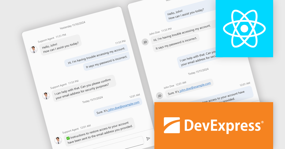
The DevExtreme Chat Component (v24.2) introduces a versatile solution for integrating instant communication into web applications. It supports one-on-one and group interactions, AI and chatbot connectivity for intelligent support, and extensive customization options to create tailored user experiences. With features like typing indicators, popup integration, accessibility compliance, and internationalization, it offers a flexible and inclusive communication platform suitable for a wide range of scenarios, from customer support to team collaboration.
To see a full list of what's new in version 24.2, see our release notes.
DevExtreme Complete is licensed per developer and is available as a Perpetual License with a 12 month support and maintenance subscription. See our DevExtreme Complete licensing page for full details.
DevExtreme Complete is available to buy individually or as part of the following products:
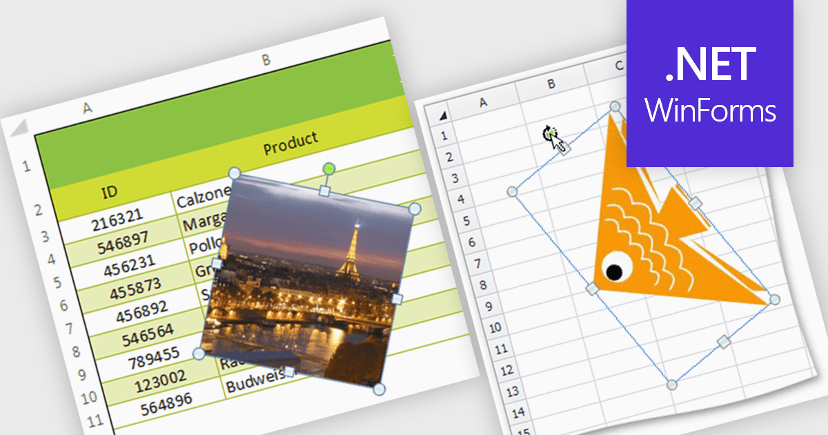
Image support within a spreadsheet component allows developers to seamlessly integrate and manipulate images directly within the spreadsheet environment, enabling features such as inserting, resizing, positioning, and formatting images within cells or as background elements. By embedding images alongside numerical or textual data, users can enhance data visualization, streamline report generation, and provide richer context for decision-making, ultimately improving communication and enabling more effective data analysis within applications.
Several WinForms spreadsheet components support inserting images, including:
For an in-depth analysis of features and price, visit our WinForms spreadsheet controls comparison.
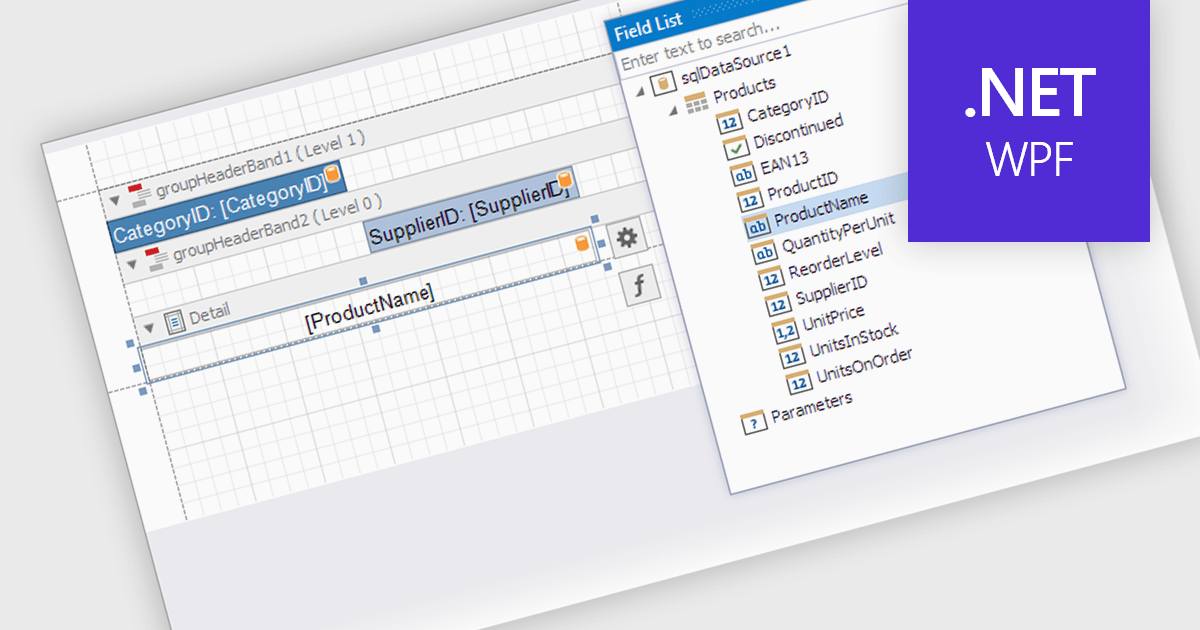
Data filtering and grouping in a .NET WPF reporting control are essential features that enable developers to organize, analyze, and present data effectively within an application. Data filtering allows users to specify criteria to display only relevant subsets of data, reducing noise and focusing on meaningful information. Grouping arranges data into categorized segments based on shared attributes, facilitating a structured and hierarchical view. These capabilities enhance user experience by making reports more intuitive and insightful while improving performance by minimizing data processing overhead. Together, filtering and grouping empower developers to create dynamic, user-friendly reports that meet diverse business requirements with precision and clarity.
Several .NET WPF reporting controls offer data filtering and grouping including:
For an in-depth analysis of features and price, visit our comparison of .NET WPF Reporting Controls.
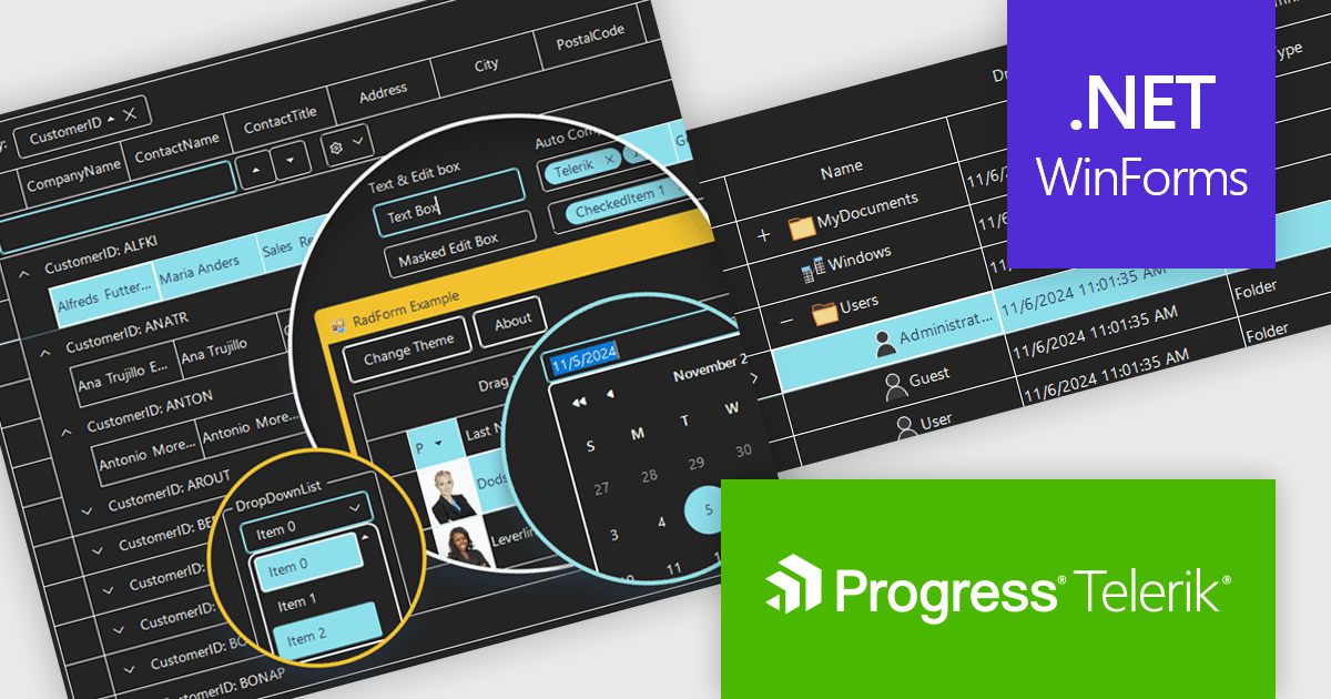
Telerik UI for WinForms is a comprehensive UI library offering over 160 versatile controls designed to streamline the development of modern, data-rich desktop applications. With features like built-in High DPI support, extensive customization options, and components ranging from grids and charts to schedulers and rich text boxes, it empowers developers to craft visually appealing and feature-packed Windows Forms applications.
The Telerik UI for WinForms 2024 Q4 update introduces the Windows 11 High Contrast Theme, providing developers with an essential tool to enhance accessibility and meet the needs of users with visual impairments or those who prefer high-contrast displays. This new theme aligns with Windows 11's modern design principles, ensuring consistency with the operating system's native appearance. By incorporating this theme, developers can create applications that are both visually appealing and inclusive, addressing diverse user requirements while maintaining seamless integration and ease of implementation within existing projects.
To see a full list of what's new in 2024 Q4, see our release notes.
Telerik UI for WinForms is licensed per developer and is available as a perpetual license with a one year support subscription, which is available in three tiers: Lite, Priority or Ultimate. See our Telerik UI for WinForms licensing page for full details.
Telerik UI for WinForms is available individually or as part of the following products:
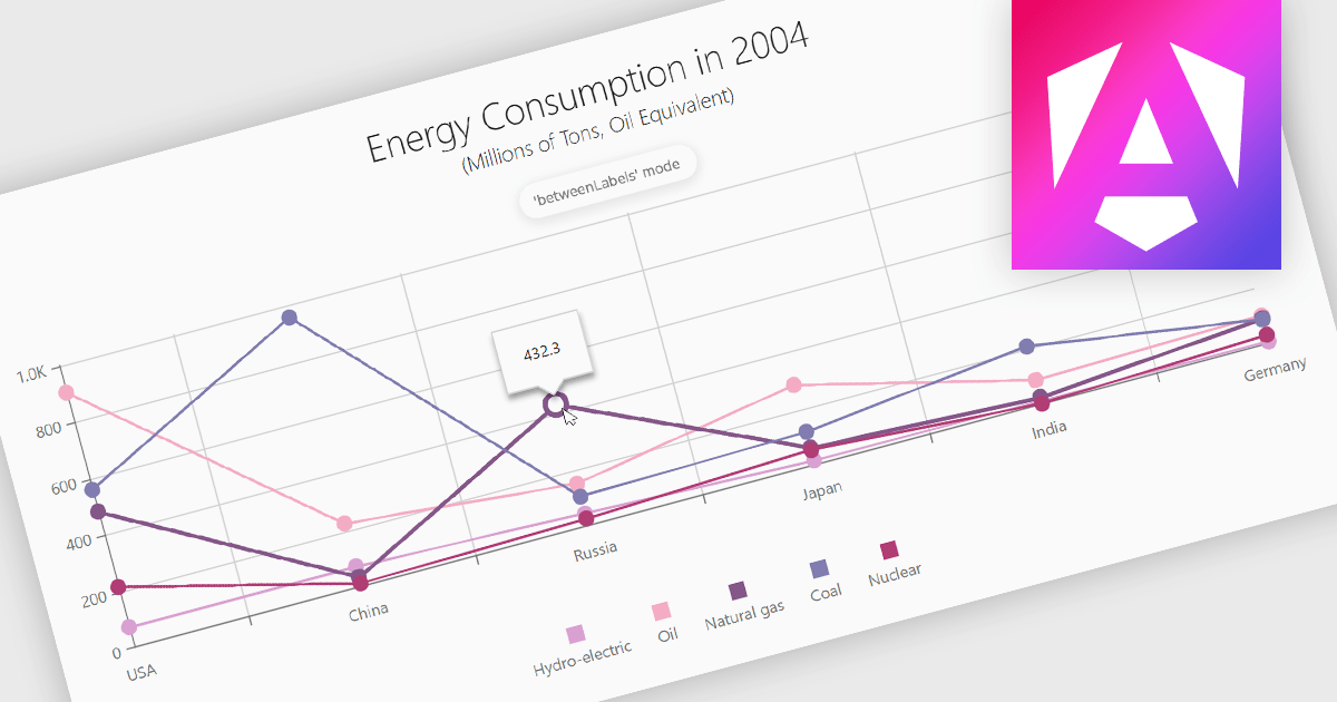
Line charts are a fundamental data visualization tool used to represent quantitative values over a continuous interval, such as time, by connecting data points with straight lines. They are particularly effective for analyzing trends, comparing multiple data sets, and identifying relationships or patterns within large or complex datasets. For software developers, line charts provide a clear and efficient way to present dynamic data, support interactive features for deeper analysis, and enhance decision-making by making critical insights easily accessible through a customizable and intuitive format.
Several Angular chart controls offer line charts including:
For an in-depth analysis of features and price, visit our comparison of Angular Charts.
電話: (888) 850 9911
Fax: +1 770 250 6199


