


公式サプライヤー
公式および認定ディストリビューターとして200社以上の開発元から正規ライセンスを直接ご提供いたします。
当社のすべてのブランドをご覧ください。

IronPrint for .NET is designed to simplify and streamline the integration of printing functionalities into your applications. It prioritizes accuracy, ease of use, and speed, allowing developers to efficiently generate high-quality printed outputs from various data sources within their software. IronPrint for .NET empowers developers with comprehensive control over the printing process. It allows for both silent printing (Windows only) and printing with a user-friendly dialog box. It offers granular customization options including paper size, orientation, DPI, number of copies, printer selection, margin adjustments, and grayscale printing. IronPrint for .NET provides valuable functionalities for retrieving printer information, including a list of available printers on various platforms (Windows, iOS, and Android). This rich feature set empowers developers to create applications that cater to diverse printing needs and user preferences.
IronPrint for .NET is licensed based on the number of developers, organization locations and projects, and is available as a Perpetual license with one free year of product updates and support services. See our IronPrint for .NET licensing page for full details.
IronPDF for .NET is available to buy in the following products:
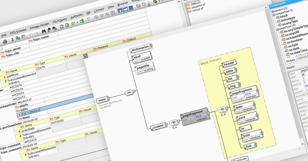
DTD to XSD conversion is the process of translating the structure and validation rules defined in a Document Type Definition (DTD) into an XML Schema Definition (XSD). Both define the structure of XML documents, DTD is an older method for defining the legal building blocks of an XML document, whereas XSD offers richer capabilities and stricter validation. Conversion involves mapping DTD elements, attributes, and constraints to their equivalent XSD counterparts, handling differences like content models and data types. XSD offers several advantages over DTD, including support for data types, namespaces, and greater extensibility, which allows for more precise and comprehensive definitions of XML document structures.
Several structured document tools allow you to convert DTD to XSD, including:
For an in-depth analysis of features and price, visit our comparison of structured document tools.
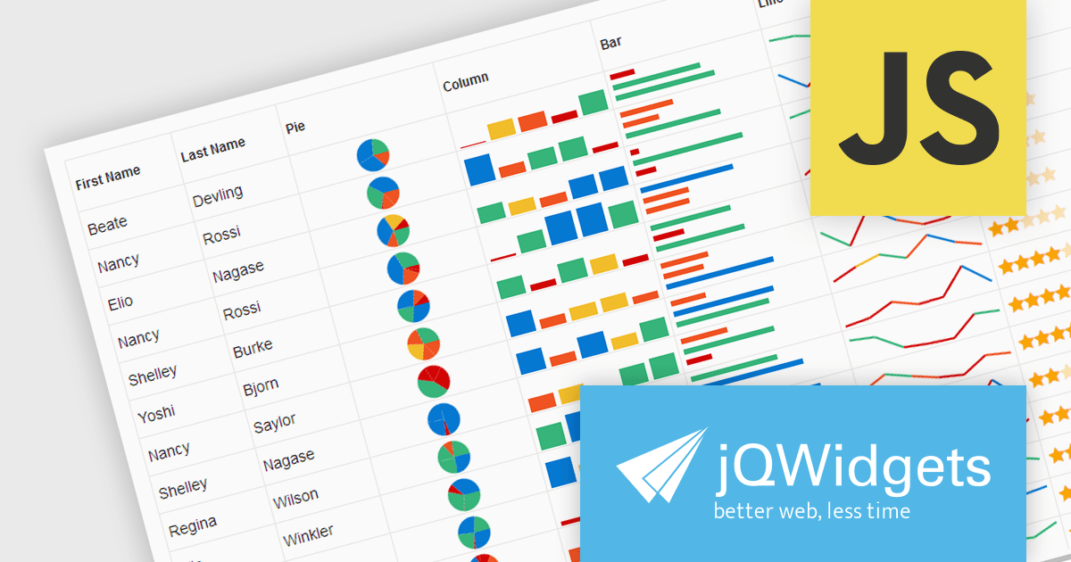
jQWidgets is a comprehensive JavaScript UI framework offering a robust collection of over 60 widgets, themes, and utilities for building professional-grade, cross-platform web applications. Built on jQuery, HTML5, and CSS, it provides extensive functionality including data grids, charts, navigation, input validation, and more. jQWidgets simplifies web development, ensuring your applications work seamlessly across desktop browsers, tablets, and smartphones.
The jQWidgets v19 release introduces support for integrating sparklines directly into jqxGrid. These miniature charts, plotted directly within grid cells, provide a quick and insightful way to visualize trends and patterns in your data without requiring additional charting libraries. This enhancement significantly bolsters jqxGrid's data visualization capabilities, allowing you to create more informative and engaging data presentations.
To see a full list of what's new in v19.0.0, see our release notes.
jQWidgets is licensed per developer and is available as a Perpetual license 1 year support and maintenance. See our jQWidgets licensing page for full details.
Learn more on our jQWidgets product page.
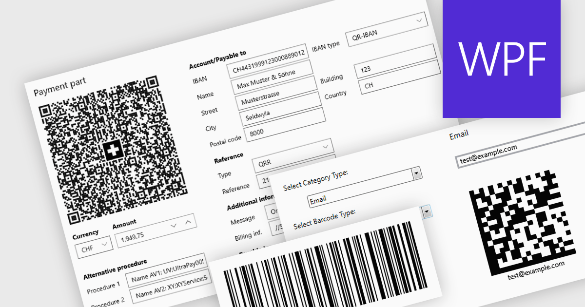
Barcode components in UI Suites offer software developers a pre-built solution for integrating barcode generation into applications. These components typically handle the encoding of various barcode formats, streamlining development time and effort. By leveraging barcode components, developers can quickly implement features like product lookups, inventory management, and asset tracking, without needing to delve into the complexities of low-level barcode processing. This not only saves development resources but also ensures consistent and reliable barcode handling within the application.
Several WPF UI Suites feature a barcode component including:
For an in-depth analysis of features and price, visit WPF UI Suites comparison.
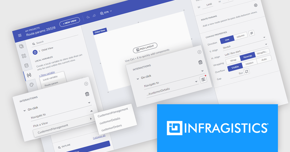
Infragistics App Builder is a cloud-based WYSIWYG drag and drop tool that eliminates the complexity of user interface design and development so you can build business apps faster than ever before. Start your app from scratch or choose from a library of pre-built templates or responsive screen layouts and customize them easily. The low-code App Builder brings a toolbox of 60+ UI controls to kick-start your next digital product design.
The latest App Builder release adds support for route parameters, allowing developers to build powerful user-specific navigation experiences. This functionality acts like variables, enabling the storage and utilization of values passed within the URL, which allows for targeted content display, data manipulation, and personalized application interactions. This helps you avoid hardcoding values and makes your app logic more adaptable and reusable.
To see a full list of what's new, see our release notes.
Infragistics App Builder is licensed per developer as an annual subscription. See our Infragistics App Builder licensing page for full details.
For more information, visit our Infragistics App Builder product page.
電話: (888) 850 9911
Fax: +1 770 250 6199


