Actipro Micro Charts for UWP(英語版)
ダッシュボード、レポート、グリッド用に最適化されたチャートコンポーネント
Actipro Software 社の製品
2002 年より日本国内にてComponentSourceで販売中。
価格:¥ 24,750 (税込)〜 バージョン: 22.1.x 更新日: Nov 29, 2023
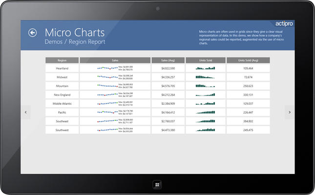
Micro charts are a special form of chart that are meant to be used in small spaces, to help visualize quantitative data. Use micro charts to quickly convey data and trends in your custom dashboards, reports, and grids. Numerous chart types are included, everything from bar charts to 100% stacked area charts, giving you all the tools you need to create appealing data presentations.

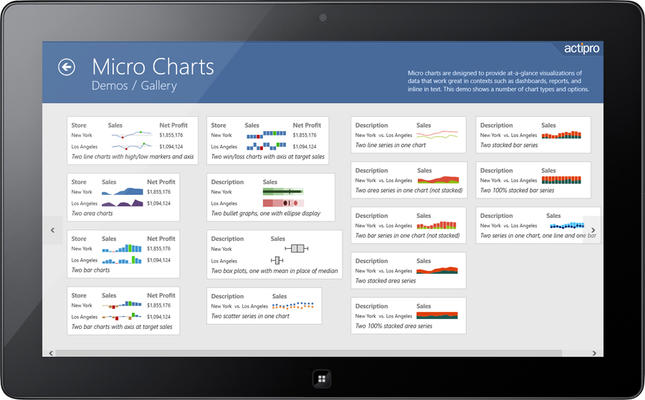
Bullet graphs are used to simultaneously display and evaluate data. They show a single data value with contextual information to give the value further meaning. The actual value is represented by a featured measure bar, and is juxtaposed with a comparative value displayed as a bar perpendicular to it. The featured and comparative values are then placed in the context of specific ranges such as poor, average, and excellent. Bullet graphs were originally designed to replace meters and gauges in a more compact way while still being informative. They are most suited to display a value that has other related values to be compared to, such as last year's mark, a goal or target, or a projected future value. Examples include annual income or expenses data, sales data, and performance ratings data.

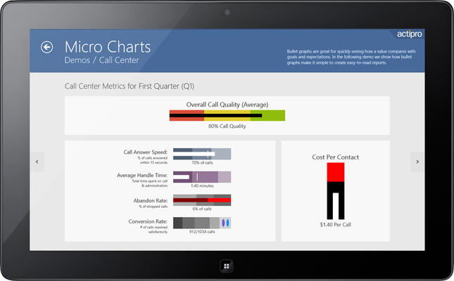
A heat map is a grid where each cell renders color and/or size differences to reflect data values. Actipro's heat map presenter control is the marker used in each heat map cell, and automatically handles the color and/or size rendering for its particular data value representation. Box plots are charts used to visualize major statistical values, such as the mean, median, and quartile values of a data set. The mean and median can be shown as bars perpendicular to the chart. The upper and lower quartile values form the edges of a box that contains the middle half of the data.

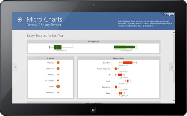
Line, area, bar charts, and their variations make it easy to show trends of data over time. This is extremely useful when building dashboards and reports for data such as sales figures and products sold. It allows the end user to instantly visualize data trends.

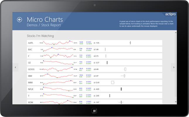
Line charts allow key data points such as the high and low price to be highlighted. This is important when rendering data for stock values. In addition, candlestick charts can be used to provide an alternate look on the price movement of a stock over time. The edges of the box define the opening and closing values, with the wicks extending to the highest and lowest values reached. The box is filled in when there is a loss for the time period. Candlestick charts can be stacked so that the price movements of multiple stocks can be compared against each other.

