公式サプライヤー
公式および認定ディストリビューターとして200社以上の開発元から正規ライセンスを直接ご提供いたします。
当社のすべてのブランドをご覧ください。

スクリーンショット: The UWP BulletGraph control serves as a replacement for dashboard gauges and meters, which typically don't display enough information, require too much space, and can be cluttered with useless and distracting decorations. 0 ...
リリースノート: Telerik DevCraft Ultimate includes the following updates: Kendo UI 2024 Q1- Grid added support for pasting from Excel. KendoReact 2024 Q1 (v7.1.0)- Added new AIPrompt component. Telerik JustMock- Added Microsoft.NET 8 compatibility. Telerik Report Server 2024 Q1- Data view now provides an option to ...
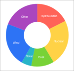
スクリーンショット: Donut Charts are circular charts which represent a variation of the Pie Charts and are capable of displaying multiple nested series. 0 ...
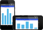
スクリーンショット: The Xamarin Chart control features a large collection of chart series. You can compare sets of data with horizontal and vertical Bar Charts. 0 ...
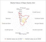
スクリーンショット: Radar Charts (also known as Spider Charts) are categorical charts which wrap the X axis in a circle or polygon. 0 ...

スクリーンショット: Bullet Charts are Categorical charts which are a variation of the Bar Charts. You can use them as a replacement for dashboard gauges and meters. 0 ...

スクリーンショット: The UWP Chart control supports annotations, which allow users to make notes of trends or observations on charts. 0 ...

スクリーンショット: Scatter Plot and Scatter Line Charts are the two main variations of Scatter charts and are suitable for displaying numerical data. 0 ...

スクリーンショット: Waterfall Charts are categorical charts which display the cumulative effect of sequentially introduced positive or negative values. 0 ...

スクリーンショット: Box Plot Charts are Categorical charts which graphically render groups of numerical data through their quartiles. 0 ...

スクリーンショット: Bubble Charts are Scatter charts which display data as points with coordinates and sizes that are defined by the value of their items. 0 ...

スクリーンショット: RangeArea Charts are categorical charts which represent a variation of the Area Charts. Unlike the Area Chart, which is filled to the axis, the Range Area chart is filled between its minimum ...
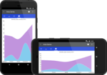
スクリーンショット: The Xamarin Chart control features a large collection of chart series. You can show trends with Line, Area and Spline Area Charts. 0 ...

スクリーンショット: The UWP Chart control allows displaying non-continuous data on the chart's plot area. Missing values will be represented as gaps. 0 ...

スクリーンショット: The UWP Chart control features a rich set of chart series from Bar, Line, Area, Pie, Scatter and Polar charts to different financial series. The control is optimized for performance on any device ...
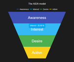
スクリーンショット: The ASP.NET Core Chart component offers several different chart types that can each be fully customized and stylized to fit your application. Use the Funnel chart to represent the stages ...

スクリーンショット: The ASP.NET Core Chart component offers several different chart types that can each be fully customized and stylized to fit your application. Use the Scatter or Bubble chart to visualize ...
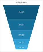
スクリーンショット: Funnel Charts display a single series of data in progressively decreasing or increasing proportions organized in segments. 0 ...

スクリーンショット: RangeBar Charts display data as bars where each bar represents a value range that spans between its minimum and maximum levels. Unlike the standard Kendo UI Bar Charts, which have anchored bars ... to their X axis, RangeBar Charts render floating bars. 0 ...

スクリーンショット: The Kendo UI chart lets you utilize modern browser technologies such as SVG or Canvas (with a fallback to VML for older IE versions) for interactive data visualizations. The Pie chart displays ...