公式サプライヤー
公式および認定ディストリビューターとして200社以上の開発元から正規ライセンスを直接ご提供いたします。
当社のすべてのブランドをご覧ください。

スクリーンショット: The UWP Expander control consists of a main content presenter and an expandable content presenter that can be collapsed/expanded by the end user. 0 ...

スクリーンショット: The UWP Gauge control helps you build business dashboards or craft graphical indicators. It includes a rich assortment of circular, linear and numeric gauge types and offers powerful customization capabilities. 0 ...

スクリーンショット: The UWP Grid lets you easily visualize rich data by customizing Grid cells to accommodate images, charts and other rich visuals. 0 ...
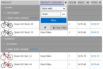
スクリーンショット: The UWP Grid lets you filter any type of data- string, decimal, Boolean, date and time. The various filtering functions will enable your users to apply any filtering criteria. 0 ...

スクリーンショット: The UWP Grid controls offers all selection modes- cell or row, single or multiple. As with the rest of RadGrid’s features, a specific selection mode can be enabled with a single property. 0 ...

スクリーンショット: The UWP Grid lets you enable ascending or descending sorting with a single property, and let your users sort data by tapping on column headers. 0 ...

スクリーンショット: The UWP HexView is an items control that arranges RadHexHubTile items in a honeycomb pattern. 0 ...

スクリーンショット: The UWP HubTile is a rectangular UI element designed specifically to update itself dynamically and show the latest up to date information from different services or apps even when they are not running. 0 ...

スクリーンショット: The UWP ListView control supports UI virtualization, pull to refresh, load on demand, item selection, filtering, grouping, sorting, header, footer, layout strategies, per item gestures, item reordering and animations. 0 ...

スクリーンショット: The UWP ListView control allows developers to group their app data by as many criteria as necessary. In addition, the control provides an easy way to visualize and customize the group headers. 0 ...
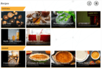
スクリーンショット: The UWP ListView control offers two built-in layout types. Stack arranges items in a vertical / horizontal scrolling list. Wrap arranges items in a wrapped grid. 0 ...

スクリーンショット: The UWP ListView control supports both single and multiple selection. 0 ...

スクリーンショット: The UWP LoopingList control allows users to visualize a list of data items in a single column with great performance and a looping capability. 0 ...
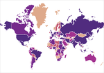
スクリーンショット: The UWP Map control is ultra fast thanks to the native C++ library, using Direct2D for rendering shapes. It can display spatial data from ESRI shapefiles, as well as any user defined content in a geographical context. 0 ...

スクリーンショット: The UWP NumericBox control provides functionality for selecting numeric values within a predefined range. It exposes a convenient API to customize its behavior to best fit customer’s business requirements. 0 ...
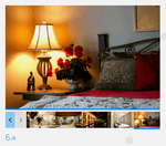
スクリーンショット: The UWP Pagination control allows for current page tracking and previous, next and exact page navigation. Use it in your application alongside other Item Controls to get more features and create detailed visualizations. 0 ...

スクリーンショット: The UWP RadialMenu is an innovative and space-saving toolbar providing the end user with variety of options to choose from. The RadialMenu is especially useful on touch devices as they enable the developers to place many commands and options in a flexible ...

スクリーンショット: The UWP Rating control provides the end-user with the ability to evaluate something by choosing from a range of rating items associated with a given value. The selection happens when one of the rating items is tapped or by applying a pan gesture over the ...
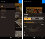
スクリーンショット: The UWP SideDrawer is a control enabling quick and easy navigation across all levels of your app. It can be accessed from anywhere within your app as it has four built-in opening directions and an array of predefined open/close animations. 0 ...

スクリーンショット: The UWP BulletGraph control serves as a replacement for dashboard gauges and meters, which typically don't display enough information, require too much space, and can be cluttered with useless and distracting decorations. 0 ...