Visual Basic 2005 / Lidor Systems / Telerik / Persimmon System - ベストセラー商品
Advanced dockable windows and tabbed documents management solution.
- Change the foundation of your app's user interface with a few clicks
- Take control of color schemes, fill styles, fonts, images and more
- With Drag and Drop, Multiple Activity Groups, TabMode and TabStrip
Web、モバイル、デスクトップ用のレポートアプリケーションを.NETで開発するためのあらゆるツールとサービスを備えたソリューション
- リレーショナル、多次元、ORM、カスタムデータソースからデータを取得
- PDF、Word、Excel、PowerPointなど、標準的なさまざまな形式のレポートを表示
- スタンドアロンのレポートデザイナーでエンドユーザーが独自のレポートを作成可能
Add rich hierarchical data presentation to your applications.
- Images, text and custom controls can be included in every node
- Provides fast list creation, XML encoding of node text, rich styling features, customizable appearance and theme support
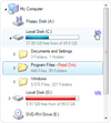
Add a combination of TreeView and ListView controls to your applications.
- Includes built-in Live Editor and advanced drag&drop support
- Supports XML encoding of nodes, columns and subitems
- Highly customizable appearance and theme support (including Vista)
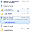
Add a detailed ListView to your .NET applications.
- Four views to display items: Details, Large Icon, Small Icon and List
- Includes built-in Live Editor and advanced drag&drop support
- Supports XML encoding of columns, items and subitems
Suite of 27+ advanced .NET User Interface components.
- Includes controls for docking & tabbed document management, data visualization, and grouping / organizing application layouts
- Controls have customizable appearance, multiple styles, XML load/save support
Rich data presentation controls for .NET Winforms applications.
- Includes TreeView, ListView, TreeListView and ListBox controls
- NEW - Built-in sorting and option to add custom sort operations
- NEW - Advanced formatting options by use of XML tags
開発工数の大幅削減標準化を強力推進するRADツール。
- 開発キットの実行環境が.NET Framework4対応
- 帳票エンジンに「シーオーリポーツ for .NET Ver.2」を選択可能
- ランタイムDLLを.NET Framework4でビルド
-
リリースノート:
RichTextBox Starting the selection with the shift from an empty cell, expands one more cell. 0 ...
続きを読む
この製品についてさらに結果を表示します。
-
リリースノート:
GridView ScrollBar background is now set to gray in the Office2019 theme which doesn't match the design. RichTextBox MoveSelectionCommandParameter class has been made public. The HandleDocumentCaretPositionChanging and ...
続きを読む
-
リリースノート:
DateTimePicker Improved visibility of focus border and background for when the 'RadDateTimePicker' is opened in 'Windows11' theme. PdfProcessing Introduced support for fonts that use simulated bold and italic forms. ZipLibrary Added ...
続きを読む
-
リリースノート:
Highlight Added a new Chip component. Added a new ChipList component. Added support for embedding file streams with PdfProcessing library. Editor Flash FLV format is no longer supported. PdfProcessing Exposed the IsBold property of FontBase. Added support ...
続きを読む
この製品についてさらに結果を表示します。
-
リリースノート:
Improves accessibility in HtmlChart, Menu, Timeline and FormDecorator. Common Added new Avatar control. Added new VerticalLine chart type. Added new VerticalArea chart type. Made accessibility improvements in HtmlChart, Menu, Timeline and FormDecorator. ...
続きを読む
-
リリースノート:
MultiSelect improves support for large datasets. MultiSelect Improved support for large datasets. PdfProcessing Added the ability to export the optional Signature's Filter property when exporting to a PDF file. SpreadProcessing Introduced support for ...
続きを読む
-
リリースノート:
Owner Draw events for drawing each part of the control. Serialization of partial set of nodes, color schemes and themes. Show nodes with their siblings and parent nodes only. Load on Demand option for partially loading data from an XML file, database or ...
続きを読む
この製品についてさらに結果を表示します。
-
リリースノート:
New RatingControl can use custom images to show rating values, includes a star image as the default image. New NumberedListControl presents a numbered list of items acting like a navigation panel. New Panel and TransparentPanel controls, presents a ...
続きを読む
-
リリースノート:
Pixel-based scrolling enabled for ListBox, TreeListView and TreeView controls New Key property in ObjectEventArgs, used to uniquely identify different objects Fully compatible with Visual Studio 2010 The Key which specifies the text from XML content is ...
続きを読む
-
リリースノート:
VisualStudio2015、VisualStudio2017の開発環境に対応。 VisualStudio2015、VisualStudio2017の開発環境に対応 自作検索ウィンドウの呼び出し方法に関する新機能の追加 LLL/.netのスクリーンショット ...
続きを読む
この製品についてさらに結果を表示します。
-
リリースノート:
V4.3での更新項目 VisualStudio 2013、および.NET Framework4.5.1での開発に対応。 帳票設計オプションを用いたレポート出力で、出力時に進行状況表示するダイアログの表示可否が指定可能。 ...
続きを読む
-
リリースノート:
Multi-column sorting Span subitems in multiple columns Serialization of partial set of items, color schemes and themes Load on Demand option for loading partial data from XML file, database or memory stream Owner Draw events for drawing each part of the ...
続きを読む
この製品についてさらに結果を表示します。
-
リリースノート:
Great performance improvement during data load and control layout update Partially visible controls remain active RightToLeft support for TreeView control New XML attributes assemblypath and resource for img tag, used to get references from embedded ...
続きを読む
-
リリースノート:
8 new built-in controls which can be used as a standalone and inside list controls using XML tags: CheckBox, ComboBox, DateTimePicker, ListControl, MonthCalendar, NumericUpDown, ProgressBar, TextControl Advanced filter which allows data to be filtered by ...
続きを読む
-
リリースノート:
TabControl with nested tabs, child tabs are shown under parent tab. Expander with vertical header and horizontal expand. SplitContainer now splits content using multiple tabs. Serialization of styles for all container controls. Create groups and items ...
続きを読む
この製品についてさらに結果を表示します。
-
リリースノート:
RichContentControl - new control, presents multiple pages of various objects arranged in custom layouts using HTML tags Tabs are now repainted when mouse cursors leaves their space GetPageAt and GetButtonAt methods now return correct page and button when ...
続きを読む
-
リリースノート:
Option to show tabs in hierarchy with ability to be shown in different sides. For this purpose the following properties are added: TabStripPlacement, for each page to determine the side on which page tab will be shown UseParentTabStripPlacement, which ...
続きを読む
-
リリースノート:
TabControl with nested tabs, child tabs are shown under parent tab. Serialization of styles now available. Align tabs to left, center or right side. Tooltips for command buttons. Each tab can have a tooltip. Nested child tabs can have different shape than ...
続きを読む
この製品についてさらに結果を表示します。
-
リリースノート:
Tabs are now repainted when mouse cursors leaves their space GetPageAt and GetButtonAt methods now return correct page and button when tabs have internal padding set to greater value Selecting of tabs is now corrected when tabs are placed in multiple ...
続きを読む
-
リリースノート:
TabControl with nested tabs, child tabs are shown under parent tab. Expander with vertical header and horizontal expand. SplitContainer now splits content using multiple tabs. Serialization of styles for all container controls. Create groups and items ...
続きを読む
この製品についてさらに結果を表示します。
-
リリースノート:
Multi-column sorting Span subitems in multiple columns Serialization of partial set of items, color schemes and themes Load on Demand option for loading partial data from XML file, database or memory stream Owner Draw events for drawing each control part ...
続きを読む
-
リリースノート:
New controls including ExplorerBar, ListBar and OutlookBar Multiple display modes Independently expandable groups Support to embed controls Different item types including text, image, panel and separator Context menus for each group and item Each group ...
続きを読む
-
リリースノート:
Multi-column sorting. Span sub-items in multiple columns. Serialization of a partial set of items, color schemes and themes. Load on Demand option for partially loading data from an XML file, database or memory stream. Owner Draw events for drawing each ...
続きを読む
この製品についてさらに結果を表示します。
-
リリースノート:
Great performance improvement during data load and control layout update Partially visible controls remain active New XML attributes Option to separately show/hide the scrollbars CurrentList property, represents a flat list of all nodes that are currently ...
続きを読む
-
リリースノート:
8 new built-in controls which can be used as a standalone and inside list controls using XML tags: CheckBox, ComboBox, DateTimePicker, ListControl, MonthCalendar, NumericUpDown, ProgressBar, TextControl Advanced filter which allows data to be filtered by ...
続きを読む
-
リリースノート:
Serialization of partial set of items, color schemes and themes. Load on Demand option for partially loading data from an XML file, database or memory stream. Owner Draw events for drawing each part of the control. Different item permissions including ...
続きを読む
この製品についてさらに結果を表示します。
-
リリースノート:
Option to embed new control: RatingControl which can use custom images to show rating values, includes star image as default Option to fix items on top or bottom side which can act like header and footer A new constructor which accepts strings and creates ...
続きを読む
-
リリースノート:
Row-based and pixel-based scrolling enabled New Key property in ObjectEventArgs, used to uniquely identify different objects Fully compatible with Visual Studio 2010 The Key which specifies the text from XML content is carried with the editing events ...
続きを読む


