


公式サプライヤー
公式および認定ディストリビューターとして200社以上の開発元から正規ライセンスを直接ご提供いたします。
当社のすべてのブランドをご覧ください。
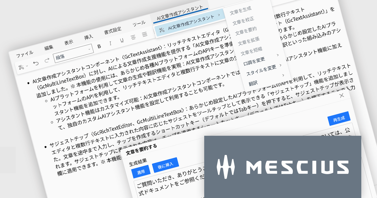
InputManJS(日本語版)V6Jでは、AI文章作成アシスタントコンポーネントGcTextAssistantが新たに追加されました。GcRichTextEditorやGcMultiLineTextBoxと連携し、これまで手作業だった文章作成やブラッシュアップをAIに任せられます。
GcTextAssistantは、事前に設定したAIプラットフォームのAPIを利用して、文章の生成、校正、要約、翻訳といったアシスタント機能を提供します。開発者は既存の入力画面にこのコンポーネントを追加するだけで、高度な文章支援をユーザーに提供できます。また、組み込みの機能だけでなく、用途に応じた独自のアシスタントを定義できる点も特徴です。自社の文書テンプレートに沿った文章提案や、特定ドメインの専門用語を意識した校正など、業務シナリオに合わせたカスタマイズが行えます。
ご利用には各種AIプラットフォームのAPIキーを準備し、InputManJS側に設定しておく必要があります。既存のWebアプリケーションにAIを取り入れたい場合、GcTextAssistantは最小限の改修で高い付加価値を加えられる有力な選択肢なります。
V6Jの新機能については、リリースノートをご覧ください。
製品詳細及び販売情報に関しては、InputManJS(日本語版)のサイトご参考ください
Kendo UI for Angular is a comprehensive suite of native Angular components designed to accelerate the development of modern web applications. Built from the ground up for Angular, it offers a wide range of UI elements, from data grids and charts to form controls and layout tools, ensuring high performance and integration with Angular's reactive architecture. Backed by robust documentation and regular updates, Kendo UI for Angular enables developers to build feature-rich, visually consistent applications with minimal overhead..
The Kendo UI for Angular 2025 Q4 update introduces diagram tooltips that provide developers with a straightforward way to surface additional information directly on hover without disrupting the structure of the diagram. This enhancement enables clearer communication of roles, statuses, and process details by presenting relevant context at the moment it is needed, reducing the need for extra labels or external references. As a result, developers can build diagrams that remain uncluttered and easy to navigate while still offering users immediate access to meaningful data.
To see a full list of what's new in 2025 Q4 (v21.0.0), see our release notes.
Kendo UI (which includes Kendo UI for Angular) is licensed per developer and has two licensing models: an annual Subscription License and a Perpetual License. The Subscription license provides access to the latest product updates, technical support, and exclusive benefits for a flat annual fee, and must be renewed to continue using the software. The Perpetual license is a one-time purchase granting access to the current released version and includes a one-year subscription for product updates and technical support. After this initial period, users can choose to renew the subscription element to continue receiving updates and support; otherwise, they may continue using the installed version available during their active subscription term but will forgo future updates and support. See our Kendo UI licensing page for full details.
Kendo UI for Angular is available in the following products:
An image listbox is a type of data editor and user interface component that, like the standard listbox, presents a list of selectable items but with the ability to display images alongside or instead of the textual items. By using an associated icon, thumbnail or other graphic for improved visual recognition, this format provides a visual reference for each item, allowing users to browse and select their input more efficiently when the items are more easily identified by appearance than by label. The combination of images with text in a structured, selectable list makes the image listbox valuable in applications that involve data selection, as visually enriched items are well suited in scenarios where users must choose from items that are better identified via imagery (such as product catalogs, avatars, icons, or file previews) rather than by text alone.
Several Angular data editor collections provide image listbox support, including:
For an in-depth analysis of features and price, visit our comparison of Angular data editor components.

For the past two years, ComponentSource has proudly partnered with MDBootstrap to bring high quality UI tools to developers worldwide. Through this partnership, customers gain easy access to MDB’s rich collection of responsive, modern components and templates that help teams build polished and efficient web applications.
Material Design for Bootstrap, widely known as MDB, is a leading front end framework created for developers, by developers. It offers more than five thousand UI components and templates that help teams create visually appealing and fully responsive applications that follow Material Design principles. Trusted by a global community of more than three million developers and designers, and chosen by organizations such as NASA, Amazon, Nike and IKEA, MDB continues to be a reliable and influential tool within the ComponentSource catalog.
The collaboration between ComponentSource and MDBootstrap delivers real benefits to the developer community by combining MDB’s high-quality design tools with ComponentSource’s global reach, licensing expertise, and dedicated customer service. Together, they simplify the adoption of MDB solutions, supporting teams as they build faster and deliver modern, consistent digital experiences. ComponentSource looks forward to the future and to many more years of helping developers create exceptional web applications.
Learn more about MDBootstrap.
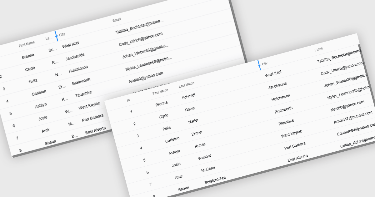
Resizable grid columns let users adjust the width of each column in a data table, giving them direct control over how information is displayed. This improves readability by preventing text from being cut off, reduces clutter by narrowing less important fields, and creates a cleaner, more efficient workspace. It is especially useful with large datasets, long product names, detailed descriptions, or mixed data types, such as expanding a “Description” column to read full text or narrowing numeric columns to compare figures quickly. Whether used in dashboards, admin panels, reporting tools, or data entry systems, column resizing enhances usability, speeds up analysis, and supports a more personalized viewing experience.
Several React grid controls offer support for expanding and resizing columns including:
For an in-depth analysis of features and price, visit our React grid controls comparison.
電話: (888) 850 9911
Fax: +1 770 250 6199


