


公式サプライヤー
公式および認定ディストリビューターとして200社以上の開発元から正規ライセンスを直接ご提供いたします。
当社のすべてのブランドをご覧ください。

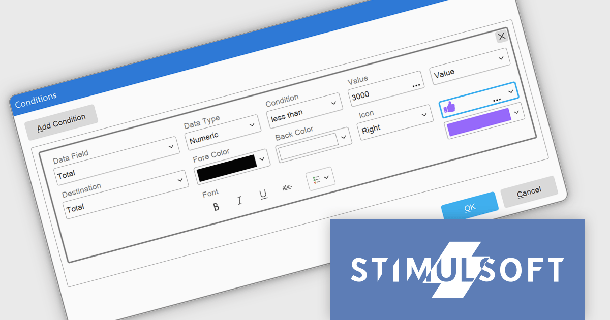
Conditional formatting enhances reports by dynamically applying styles, such as color changes, font adjustments, or icons, based on data-driven rules. This helps users quickly interpret complex data by highlighting trends, outliers, or critical values directly in the report. By visually emphasizing specific data points, conditional formatting ensures that reports are not just informative but also actionable, reducing the time needed to draw meaningful insights.
Several JavaScript reporting components allow you to add conditional formatting, including:
For an in-depth analysis of features and price, visit our comparison of JavaScript reporting components.

Dropdowns and list-based data editors in JavaScript are versatile UI components that offer flexibility and control to both users and developers. They facilitate the selection of options, with a structured way to display and interact with predefined data sets. These editors enhance the user experience by allowing streamlined input, offering features like single or multiple selection, visual representation with images, and checkbox integration. They are widely used in web applications for tasks such as form filling, filtering data, or setting configuration options.
Common dropdowns and list-based data editors include:
For an in-depth analysis of features and price, visit our JavaScript data editors comparison.
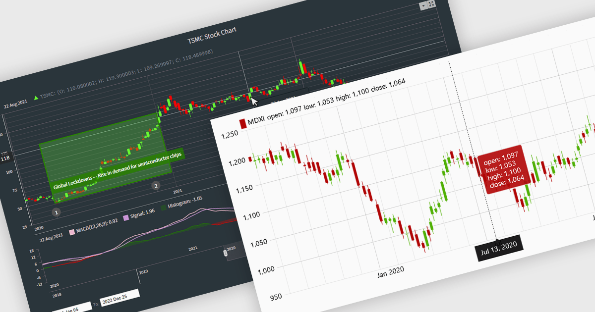
Candlestick charts are a powerful data visualization tool used to represent price movements within a specific time frame, displaying the opening, closing, high, and low prices in a single, compact graphical format. For software developers, integrating candlestick charts into applications enables users to analyze market trends, identify potential reversals, and make informed decisions with precise, actionable data. These charts are adaptable across various time frames, work seamlessly with technical indicators, and offer a clear visual representation that aids in interpreting complex financial data efficiently, making them an essential feature in trading platforms and analytics tools.
Several React chart controls offer candlestick chart support including:
For an in-depth analysis of features and price, visit our React chart controls comparison.
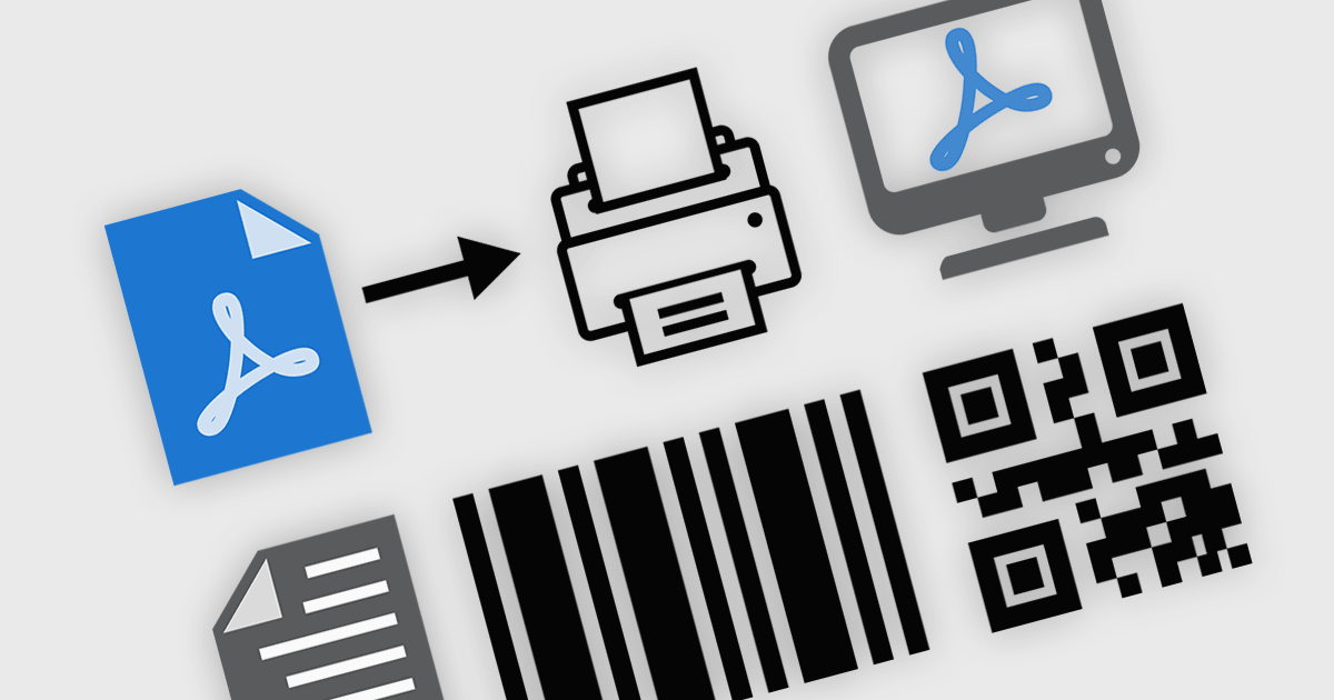
PDF viewer components with PDF reading and writing capabilities can greatly enhance modern web applications, enabling seamless interaction with documents directly within the browser. These components commonly allow users to view, edit, annotate, and export PDF files without relying on external software, streamlining document management. By leveraging the power of web technologies, they offer a versatile and efficient solution for integrating PDF workflows into web applications, enhancing productivity and improving the user experience in industries where PDF handling is critical.
Common features include:
For an in-depth analysis of features and price, visit our JavaScript / HTML5 PDF Viewer components comparison.
Stimulsoft Dashboards.WEB is a versatile suite of tools for crafting interactive data visualizations for web and desktop applications. It empowers developers to embed intuitive dashboards across various platforms, using the platform-specific components or a centralized cloud designer. With rich data analysis elements, extensive customization options, and pre-built templates, Stimulsoft Dashboards helps you transform complex data into clear, actionable insights for any audience.
The Stimulsoft Dashboards.WEB 2025.1.1 update introduces the ability to apply visual indicators in conditional formatting for table elements, providing users with a powerful tool to enhance data visualization. This feature allows icons or custom uploaded images to be dynamically applied to table cells based on predefined conditions, enabling more precise and intuitive representation of data. By integrating this functionality, developers can create dashboards that effectively highlight critical information, improve data readability, and deliver a more engaging user experience, all while maintaining flexibility for customization and alignment with specific project needs.
To see a full list of what's new in 2025.1.1, see our release notes.
Stimulsoft Dashboards.WEB is licensed per developer and is available as a perpetual license with 1 year support and maintenance. See our Stimulsoft Dashboards.WEB licensing page for full details.
Stimulsoft Dashboards.WEB is available individually or as part of Stimulsoft Ultimate.
電話: (888) 850 9911
Fax: +1 770 250 6199


