













公式サプライヤー
公式および認定ディストリビューターとして200社以上の開発元から正規ライセンスを直接ご提供いたします。
当社のすべてのブランドをご覧ください。
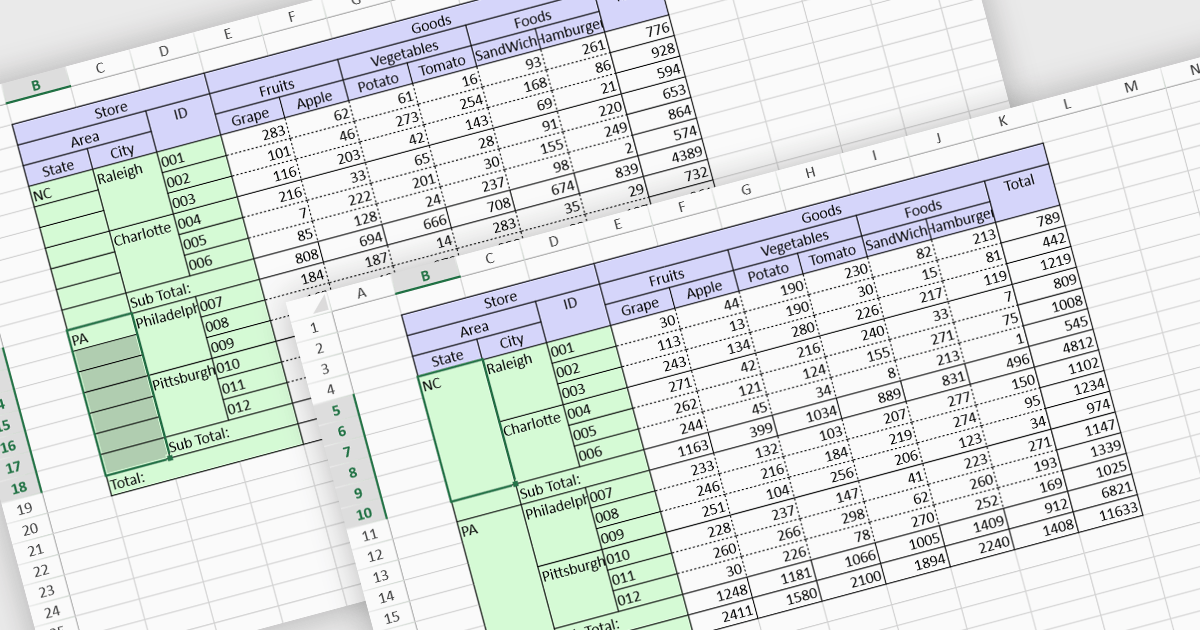
Cell merging is a spreadsheet feature that combines two or more adjacent cells into a single, larger cell, creating a unified space for data. This is particularly useful for creating visually organized and readable spreadsheets, allowing headers to span multiple columns or rows, enhancing clarity and alignment in complex data sets. By merging cells, users can create more structured layouts, making the data presentation cleaner and often easier to understand at a glance. For example, in financial reporting or project tracking sheets, merging cells can emphasize titles, group categories, or highlight specific sections of data, adding visual polish. It can also help when building dashboards, forms, and reports where visual hierarchy and structured information flow are essential for end-user readability and comprehension.
Several React spreadsheet controls offer the ability to merge cells including:
For an in-depth analysis of features and price, visit our React spreadsheet controls comparison.

Line annotations are digital markings that allow users to draw straight lines on documents. These lines can be used for various purposes, such as connecting related information, highlighting specific sections, or adding visual cues for reference. They are particularly useful for tasks that require comparison, measurement, or the creation of diagrams or flowcharts directly within the PDF.
Several React PDF viewer controls offer support for line annotations including:
For an in-depth analysis of features and price, visit our React PDF viewer controls comparison.
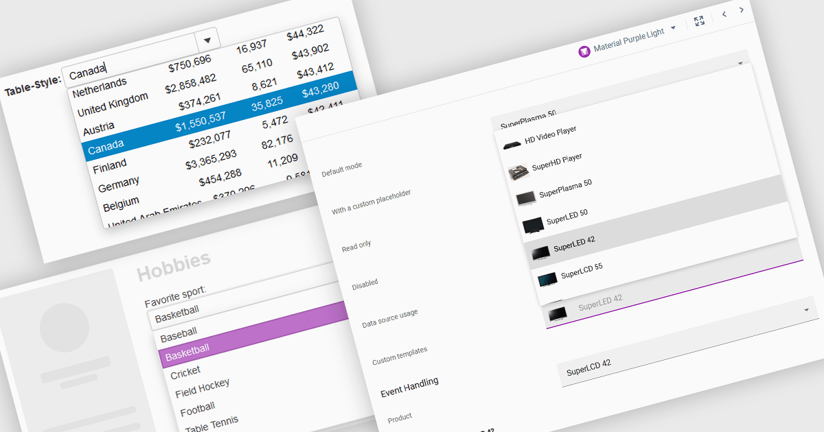
ComboBoxes for Angular are versatile form controls that allow users to select from a predefined list of options or input custom values directly. They provide a flexible and efficient way to handle data entry by combining the ease of selection with the ability to manually input text. For developers, ComboBoxes streamline the user experience by reducing the need for additional input fields while maintaining a clean interface. They enhance data validation and user efficiency, as they can filter large datasets based on user input and bind seamlessly to Angular models, ensuring smooth integration within dynamic forms and grid-based editors.
For an in-depth analysis of features and price, visit our Angular Data Editors controls comparison.
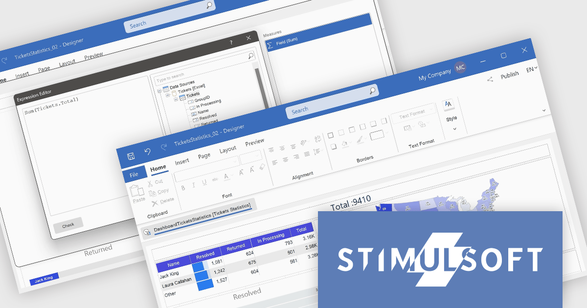
Stimulsoft Dashboards.WEB is a versatile suite of tools for crafting interactive data visualizations for web and desktop applications. It empowers developers to embed intuitive dashboards across various platforms, using the platform-specific components or a centralized cloud designer. With rich data analysis elements, extensive customization options, and pre-built templates, Stimulsoft Dashboards helps you transform complex data into clear, actionable insights for any audience.
The Stimulsoft Dashboards.WEB 2024.4.1 release adds the ability to create Measures within the Text dashboard element, which significantly enhances the flexibility and functionality of dashboards by allowing users to dynamically incorporate calculated values into text elements. This feature enables more informative and contextualized reports, as users can seamlessly display and update relevant metrics directly within the text, eliminating the need for separate data visualization components. This not only streamlines dashboard creation but also improves data accessibility and understanding for end-users.
To see a full list of what's new in 2024.4.1, see our release notes.
Stimulsoft Dashboards.WEB is licensed per developer and is available as a perpetual license with 1 year support and maintenance. See our Stimulsoft Dashboards.WEB licensing page for full details.
Stimulsoft Dashboards.WEB is available in the following products:
Stimulsoft Dashboards.PYTHON is a new data visualization tool specifically designed for building interactive dashboards within Python applications. It combines a client-side JavaScript engine for data processing with a designer component to craft dashboards and a viewer for displaying them. This empowers developers to create clear and informative visual representations of data directly within their Python projects.
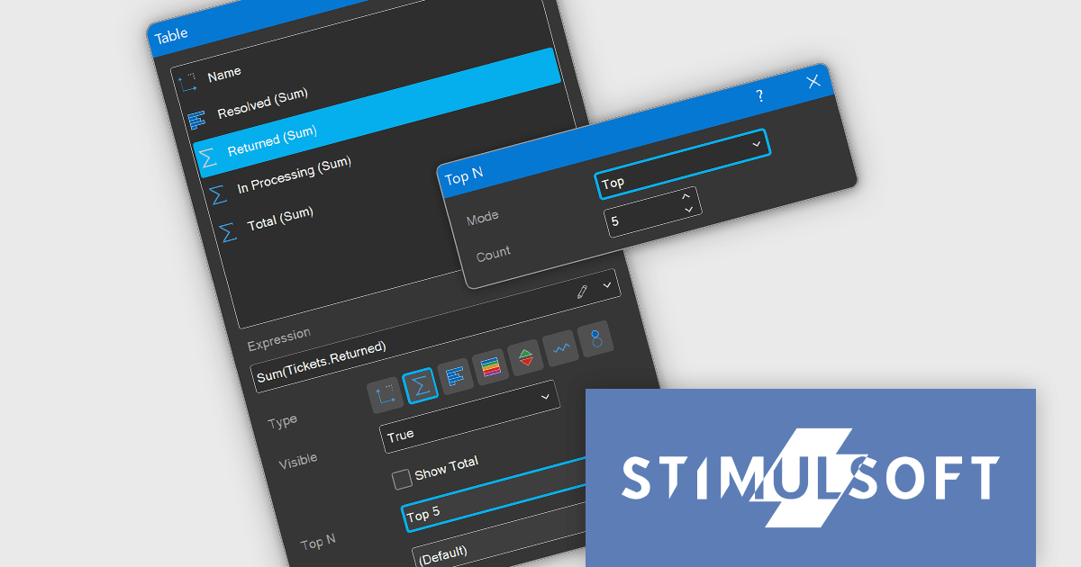
The Stimulsoft Dashboards.PYTHON 2024.4.1 release adds the ability to display the best values for Measure fields in the Table and Cards dashboard elements. Users can now easily identify and visualize the most relevant or extreme values within their datasets. By specifying the desired number of top or bottom values, users can focus on critical information and gain valuable insights more efficiently.
To see a full list of what's new in 2024.4.1, see our release notes.
Stimulsoft Dashboards.PYTHON is licensed per developer and is available as a perpetual license with 1 year support and maintenance. See our Stimulsoft Dashboards.PYTHON licensing page for full details.
Stimulsoft Dashboards.PYTHON is available in the following products:
電話: (888) 850 9911
Fax: +1 770 250 6199


