


公式サプライヤー
公式および認定ディストリビューターとして200社以上の開発元から正規ライセンスを直接ご提供いたします。
当社のすべてのブランドをご覧ください。
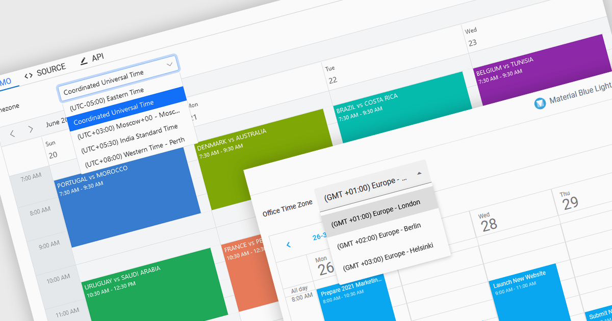
Time zone support in a scheduling component enables users to create, view, and manage events across different regions without manual time conversion. It automatically adjusts appointments based on the user’s local time zone and accounts for daylight saving time (DST) changes, ensuring accurate scheduling. This feature is particularly beneficial for global teams, remote workers, and businesses coordinating across multiple time zones. For example, an international company can schedule a meeting for participants in New York, London, and Tokyo, and each attendee will see the event in their local time. Time zone support eliminates confusion, reduces scheduling errors, and improves efficiency in cross-border collaboration.
Several JavaScript products offer scheduling components with time zone support including:
Explore our range of JavaScript scheduling components.
Need help to find the right software license, upgrade or renewal? Call, Email, or Live Chat with our experts.

PrizmDoc Viewer by Accusoft is a web-based document viewing solution that supports over 100 file types and integrates seamlessly into applications via REST APIs. It offers secure, high-quality rendering for document collaboration, allowing users to view, annotate, redact, and convert documents without client-side installations. Designed for cross-platform compatibility, it ensures consistent document access and interaction across various devices. PrizmDoc Viewer enhances enterprise content management, legal tech, and financial services, providing a reliable, customizable interface for efficient document handling.
The PrizmDoc Viewer v14.2 update introduces an AI-powered document summarization feature that significantly enhances user efficiency by generating concise summaries of lengthy documents. This new capability allows users to quickly understand the main points and key insights of documents without the need to read through every detail. For software developers, this means they can implement a solution that reduces the time needed for users to process large volumes of information, enabling faster and more informed decision-making. By incorporating this feature, developers can improve the user experience and productivity of their applications.
To see a full list of what's new in v14.2, see our release notes.
PrizmDoc Viewer is available as Self-Hosted, Cloud-Hosted or Private Cloud-Hosted deployments. Billed on an annual subscription basis, you will need to renew your license each year to continue to use the software. The price is based on the number of servers or the number of transactions you require, depending on your deployment method. See our PrizmDoc Viewer licensing page for full details.
For more information, see our PrizmDoc Viewer product page.
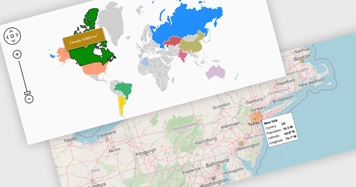
Map components enable the integration of dynamic maps within applications, often enabling features such as zooming, markers, and layers. These maps enhance user experience by displaying geospatial data in real time and across devices. Benefits include responsiveness and high performance, with common use cases such as tracking deliveries, visualizing demographic data, or displaying store locations interactively.
Several React UI suites provide map controls including:
For an in-depth analysis of features and price, visit our React chart controls comparison.

SpreadJS by MESCIUS is a high-performance JavaScript spreadsheet component designed to seamlessly integrate Excel-like functionality into web applications. It empowers developers to deliver robust spreadsheet experiences within their applications, complete with features like data import/export, complex formulas, conditional formatting, and extensive customization options. SpreadJS caters to a wide range of use cases, from financial modeling and data analysis to project management and interactive dashboards, ultimately allowing developers to build feature-rich and user-friendly web applications.
In this blog post, MESCIUS Product Marketing Specialist Mackenzie Albitz demonstrates how to leverage the SpreadJS JavaScript spreadsheet API to effortlessly import and read Excel files from designated URLs. Steps include:
Detailed JavaScript and HTML code is included to help you along.
Read the complete blog and learn how to integrate a spreadsheet component into your web applications without the need for an external program.
SpreadJS is licensed per developer and includes 1 Year Maintenance (major and minor version releases and unlimited support phone calls). SpreadJS requires an Annual or Perpetual Deployment License. The optional Add-ons are available at an additional cost, and require a SpreadJS license. See our SpreadJS licensing page for full details.
For more information, visit our SpreadJS product page.
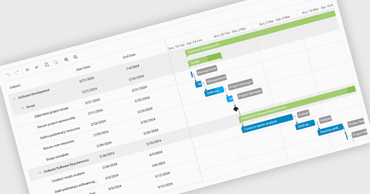
Gantt charts, a specialized type of bar chart, are invaluable tools for project management, particularly in visualizing and tracking the timeline of tasks, dependencies, and progress. These charts are ideal for illustrating project schedules, resource allocation, and critical paths. By providing a clear and concise overview of project milestones, Gantt charts facilitate effective planning, communication, and monitoring, ultimately helping organizations achieve project goals efficiently and on time.
Several React chart controls provide Gantt charts including:
For an in-depth analysis of features and price, visit our React chart controls comparison.
電話: (888) 850 9911
Fax: +1 770 250 6199


