


公式サプライヤー
公式および認定ディストリビューターとして200社以上の開発元から正規ライセンスを直接ご提供いたします。
当社のすべてのブランドをご覧ください。

ActiveReportsJS by MESCIUS is a JavaScript reporting toolkit that empowers developers to design and embed interactive reports within web applications. It offers a standalone report designer for crafting reports and a JavaScript report viewer component for seamless integration into web frameworks like React or vanilla JavaScript. This solution streamlines report creation, facilitates data visualization, and delivers a user-friendly report experience.
The ActiveReportsJS 5.1 update introduces a Master Report feature, which improves report design efficiency by allowing developers to create reusable templates that define common elements such as headers, footers, and styles. Multiple reports can inherit shared components, reducing redundancy and simplifying maintenance. Developers can ensure consistency across reports and make global updates more efficiently, making it easier to scale for larger applications. Using a master report template is valuable in dynamic web applications, where maintaining uniform reporting structures is crucial for delivering a cohesive user experience.
To see a full list of what's new in 5.1, see our release notes.
ActiveReportsJS is licensed on an annual subscription or perpetual basis and is available as a Single Deployment License for non-commercial use, and as a Single Domain License or Unlimited Domain License for commercial and/or SaaS use. See our ActiveReportsJS licensing page for full details.
Learn more on our ActiveReportsJS product page.
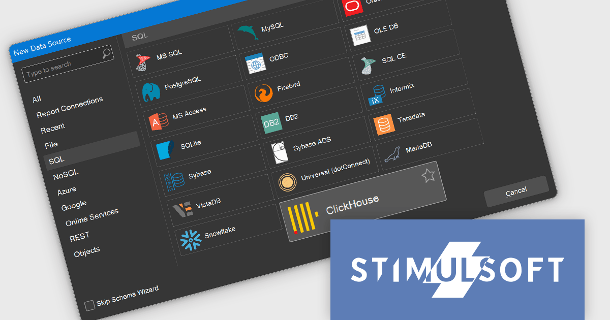
Stimulsoft Reports.WEB is a cross-platform reporting solution designed for integration within web applications. It leverages a client-server architecture for report generation, viewing, printing, and exporting directly in web browsers. Its powerful .NET report engine offers efficient report processing, a user-friendly HTML5 report designer for building reports with various data sources and visualizations, and an interactive HTML5 viewer for seamless report display within web applications. This integration allows developers to implement robust reporting functionalities without browser plugins or additional client-side dependencies.
The Stimulsoft Reports.WEB 2024.4.1 release adds the ability to connect to the ClickHouse online data storage and exchange service directly from the report designer. This eliminates the need for complex data extraction and transformation processes, streamlining the reporting workflow and improving efficiency. By connecting to ClickHouse, users can leverage its powerful analytical capabilities and real-time data processing features to generate dynamic and informative reports.
To see a full list of what's new in 2024.4.1, see our release notes.
Stimulsoft Reports.WEB is licensed per developer and is available as a perpetual license with 1 year support and maintenance. See our Stimulsoft Reports.WEB licensing page for full details.
Stimulsoft Reports.WEB is available in the following products:

Stimulsoft Dashboards.JS is a JavaScript library designed for building interactive dashboards within web applications. It offers a comprehensive suite of tools for data processing, visualization, and dashboard design. Compatible with any HTML5 browser, it allows you to create a variety of dashboards for various purposes and integrates seamlessly with popular JavaScript frameworks like React and Vue.js.
The Stimulsoft Dashboards.JS 2024.4.1 release introduces new white and black dashboard style along with a new preset style for report components which offers a modern, sleek aesthetic with improved readability, making key data more distinguishable and reducing eye strain. This design ensures consistency across reports, enhances brand cohesion, and provides a professional, visually engaging experience. With easy application and customizable elements, users can quickly adapt their dashboards to suit their needs, while maintaining a uniform look. Optimized for both desktop and mobile, this new style streamlines the creation of visually appealing, user-friendly reports.
To see a full list of what's new in 2024.4.1, see our release notes.
Stimulsoft Dashboards.JS is licensed per developer and is available as a Perpetual license with 1 year support and maintenance. See our Stimulsoft Dashboards.JS licensing page for full details.
Stimulsoft Dashboards.JS is available in the following products:

Vue diagrams are interactive visual representations, used to illustrate complex data structures, workflows, or system architectures. They leverage Vue's reactivity and component-based architecture to dynamically update as data changes, providing developers with an intuitive way to display and manage intricate relationships in real-time. Vue diagrams enhance the clarity of application logic, simplify debugging, and improve user experience by offering a clear, visual way to represent processes or data flows. This ultimately leads to more efficient development and better communication of complex concepts within the application.
Several Vue.js UI suites offer diagram controls including:
For an in-depth analysis of features and price, visit our Vue js UI suite comparison.

Red Carpet Subscription by /n software is an all-inclusive developer toolkit offering a comprehensive library of development tools, network management utilities, and enterprise adapters. This subscription grants access to all products and updates, including new releases, for a flat fee per developer, streamlining your workflow and ensuring your team has the latest resources to tackle any communication or security protocol challenge.
The Red Carpet Subscription Vol. 3 2024 update introduces enhanced security and compliance capabilities with the implementation of AS4 rollover certificates and the AS4 ENTSOG v4 profile. AS4 rollover certificates ensure uninterrupted data exchange by automatically handling the transition to new digital certificates, mitigating potential security risks. The AS4 ENTSOG v4 profile, a standardized protocol for electronic data interchange, provides a more robust and secure framework for business-to-business communication within the energy sector, particularly for European entities. By incorporating these features, Red Carpet Subscription empowers users to maintain secure and compliant data exchange while adhering to industry-specific standards.
To see a full list of what's new in Red Carpet Subscription Vol. 3 2024, see our release notes.
Red Carpet Subscription is licensed per developer and is available as a Perpetual License with a 12 month support and maintenance subscription. See our Red Carpet Subscription licensing page for full details.
For more information, visit our /n software Red Carpet Subscription product page.
電話: (888) 850 9911
Fax: +1 770 250 6199


